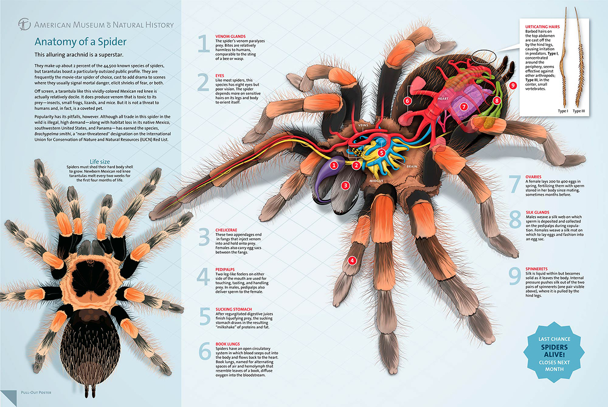
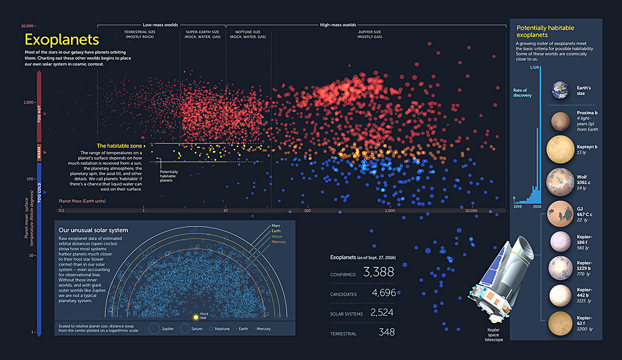
COMBINING THE VISIBLE AND THE INVISIBLE.
I’m following a “looking upwards” theme this week. Monday’s post was about the sky: https://wp.me/s7LiLW-sky
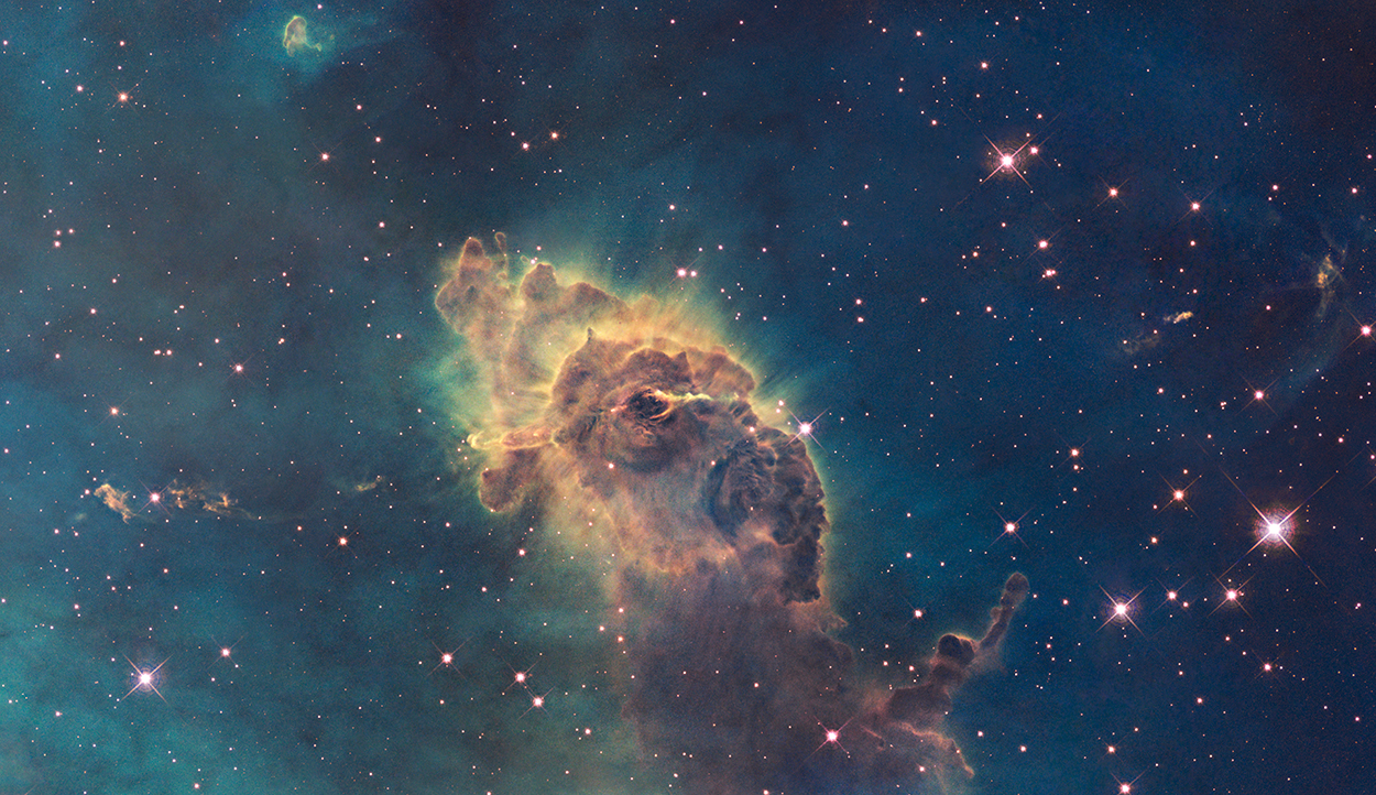
Above is a Hubble Space telescope image of the Carina Nebula (which is between 6,500 and 10,000 light years from Earth). This is termed a “visible light image,” but several colors (gathered in separate black and white images using different filters) were combined to make it. Yes, the colors are all individually visible to the human eye, but would the Carina Nebula look exactly like this from the Starship Enterprise? Well… no.
Infrared reveals stars inside the column of gas and dust.
Cassiopeia A (approximately 11,000 light years away) is a remnant of an exploded star. The Chandra X-Ray Observatory produced these images. Isolating the X-rays of different elements reveals what’s been left behind.
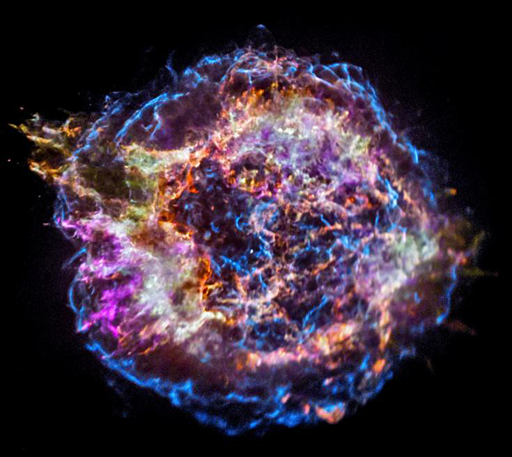
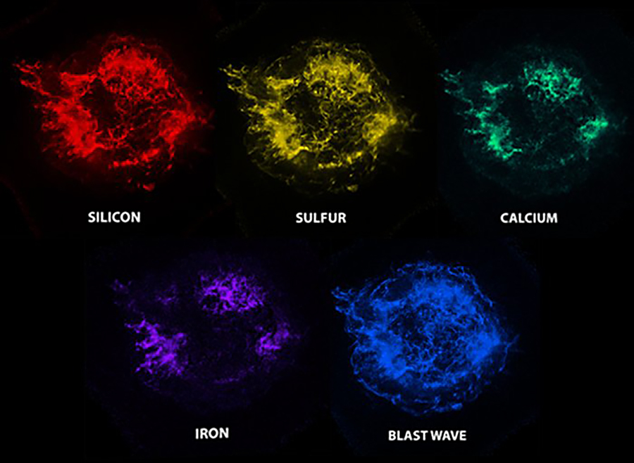
So contrary to some ideas circulating online, astronomers don’t assign colors to ultraviolet, X-rays and gamma rays to make the images more appealing to the public. Colors are informational, and visualize the information that is reaching us from space. A fortunate by-product is the stunning images that we’re used to seeing.
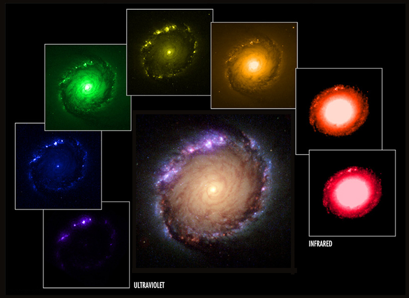
A broadband image of galaxy NGC 1512 using seven filters from ultraviolet to infrared.
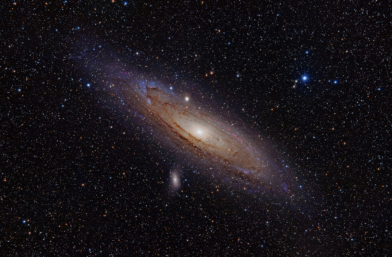
The Andomeda galaxy in ultraviolet. Blue is far-ultraviolet light, yellow is near-ultraviolet.
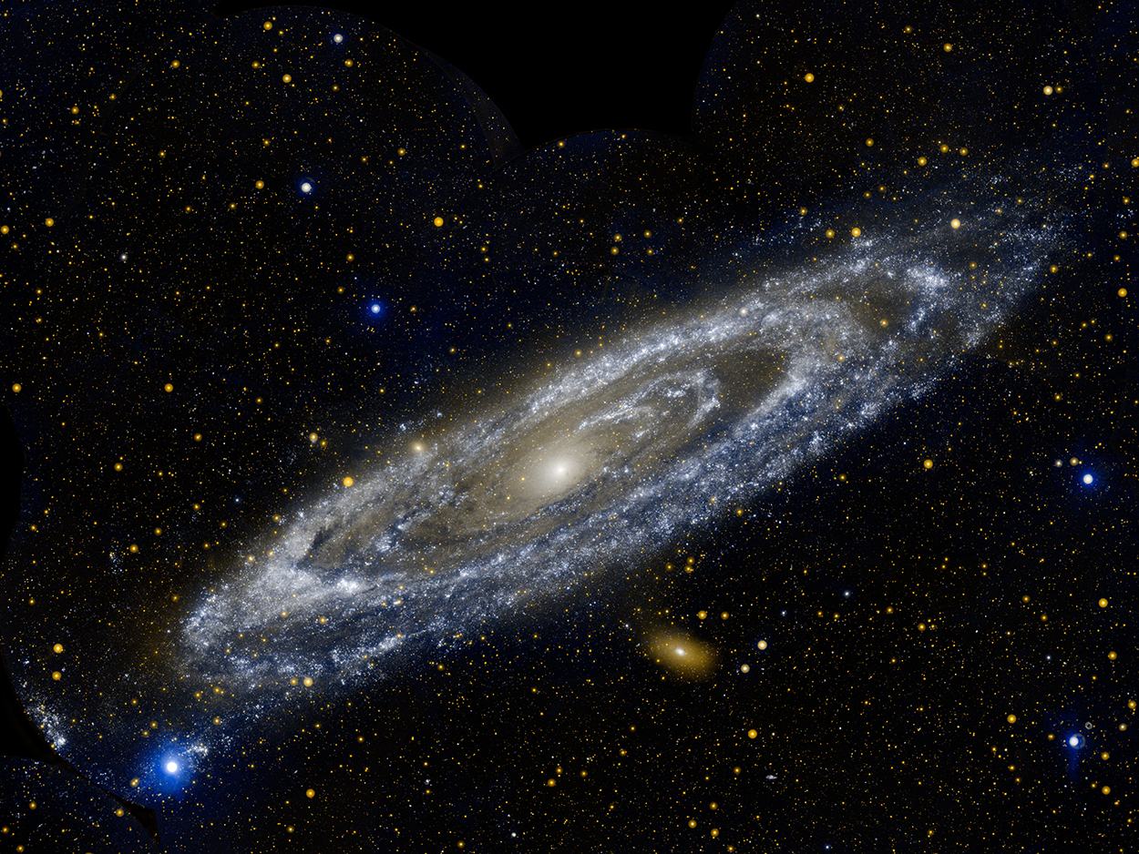
Another image of Andromeda taken with a hydrogen-Alpha filter. Photograph by Adam Evans.
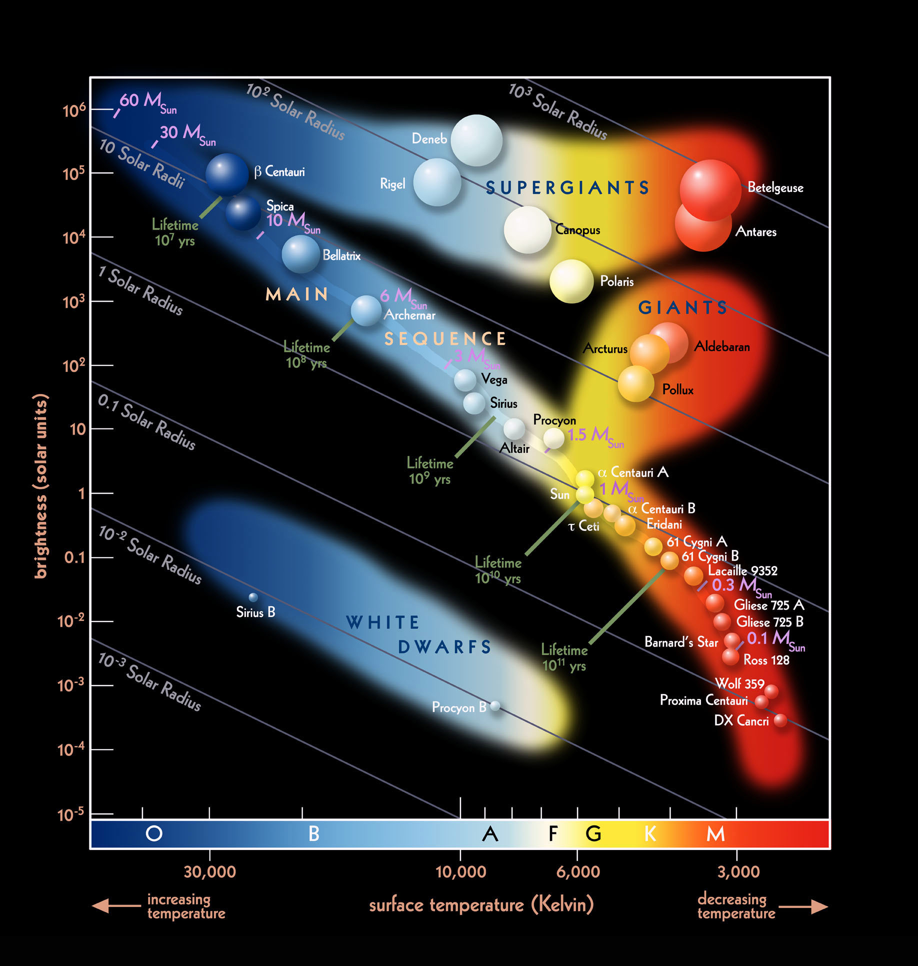
A Hertsprung-Russell diagram is a scatter plot where the vertical axis is brightness and the horizontal axis is surface temperature (color). Stars are categorized by letters that indicate decreasing temperature: O,B,A,F,G,K, and M, and then subdivided within each type by numbers where 0 is hottest and 9 is coldest. Our Sun is classified G2V. The V means it is a main-sequence star, which is the most common type of star in the universe. Click on the image for a larger version.

Looking back at the Earth
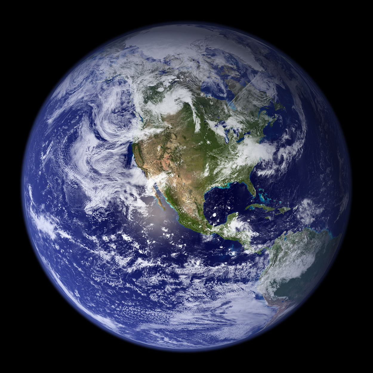
NASA’s iconic Blue Marble (the one that was on the first iPhone’s lock screen) is a composite image that was created by Robert Simmon in 2002. Four months of data from the Terra satellite were combined and wrapped onto a digital sphere in a 3D program. Various other effects were applied in Photoshop to create what Simmon has described as a “hyper-realistic” image of the Earth.
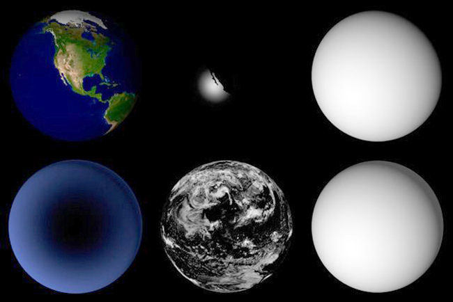
Some of the Photoshop layers.
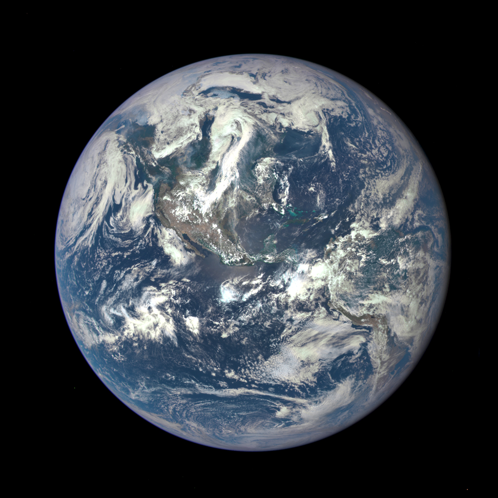
A complete unadjusted image from the Deep Space Climate Observatory spacecraft taken in 2015.
Adviser for this post: Ahmad Shamloumehr, a graduate student in Physics and Astronomy, here at Ohio University.
All images are NASA or ESA, except where noted.


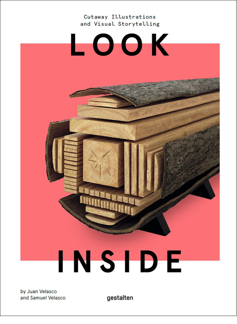
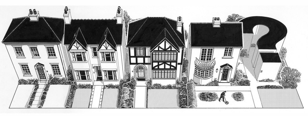
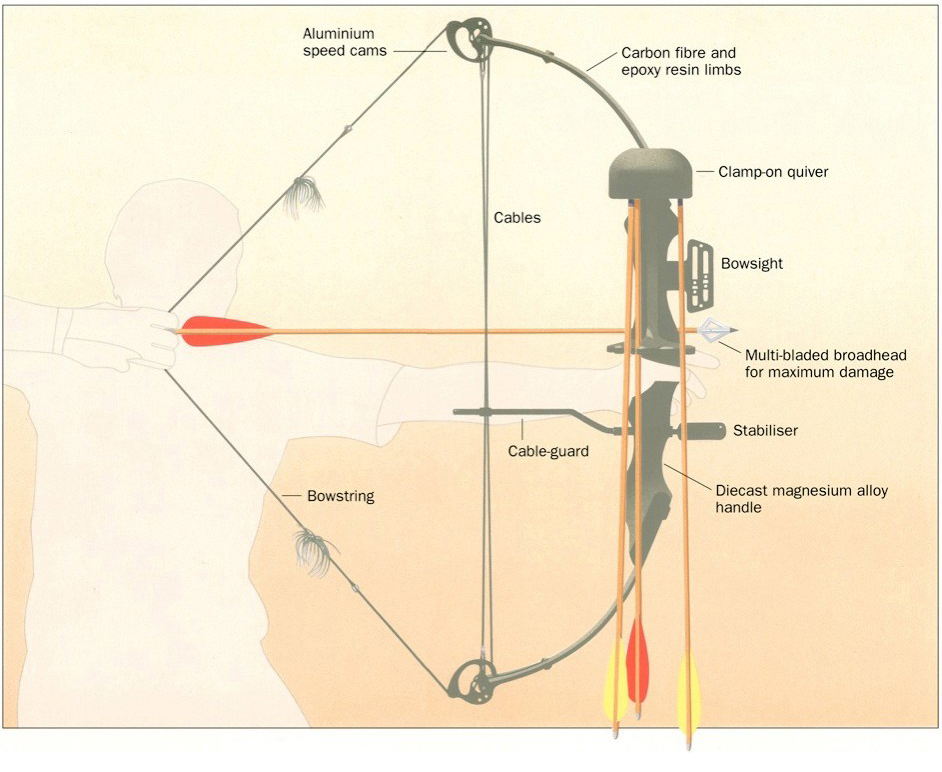


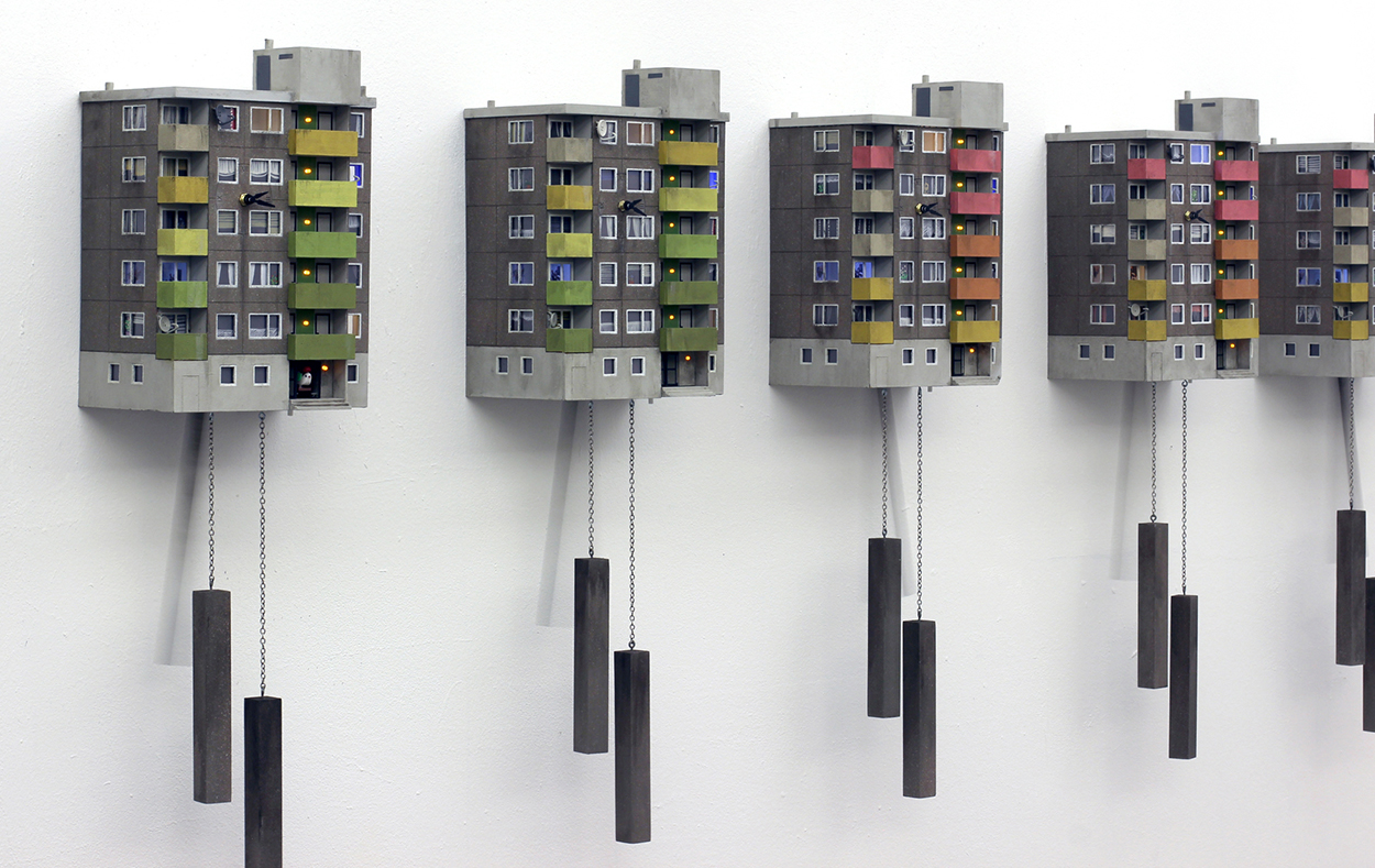


 Images © Marcus Lyons.
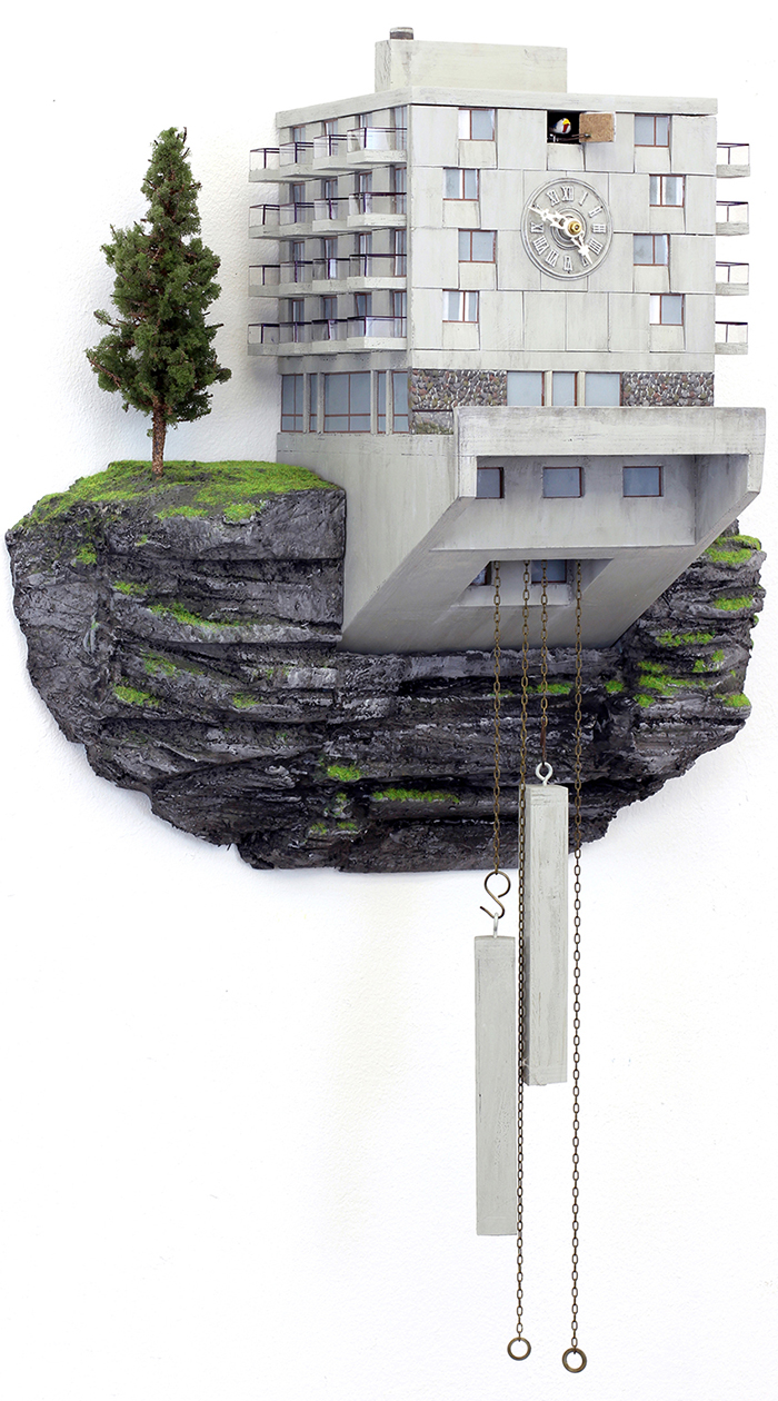