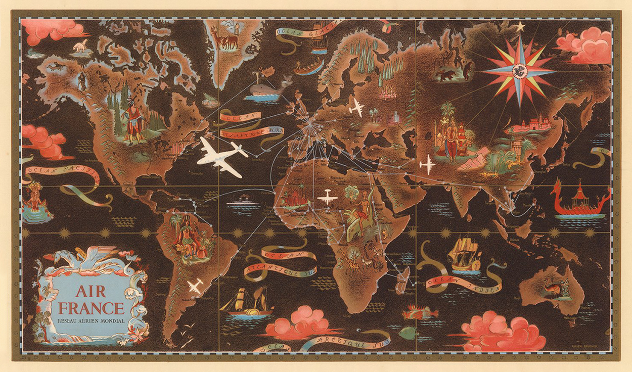
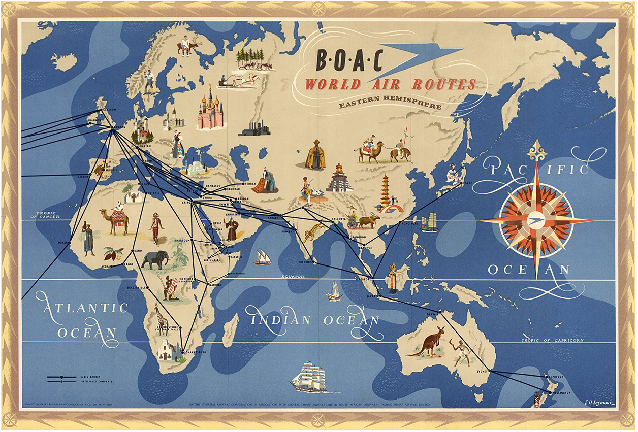
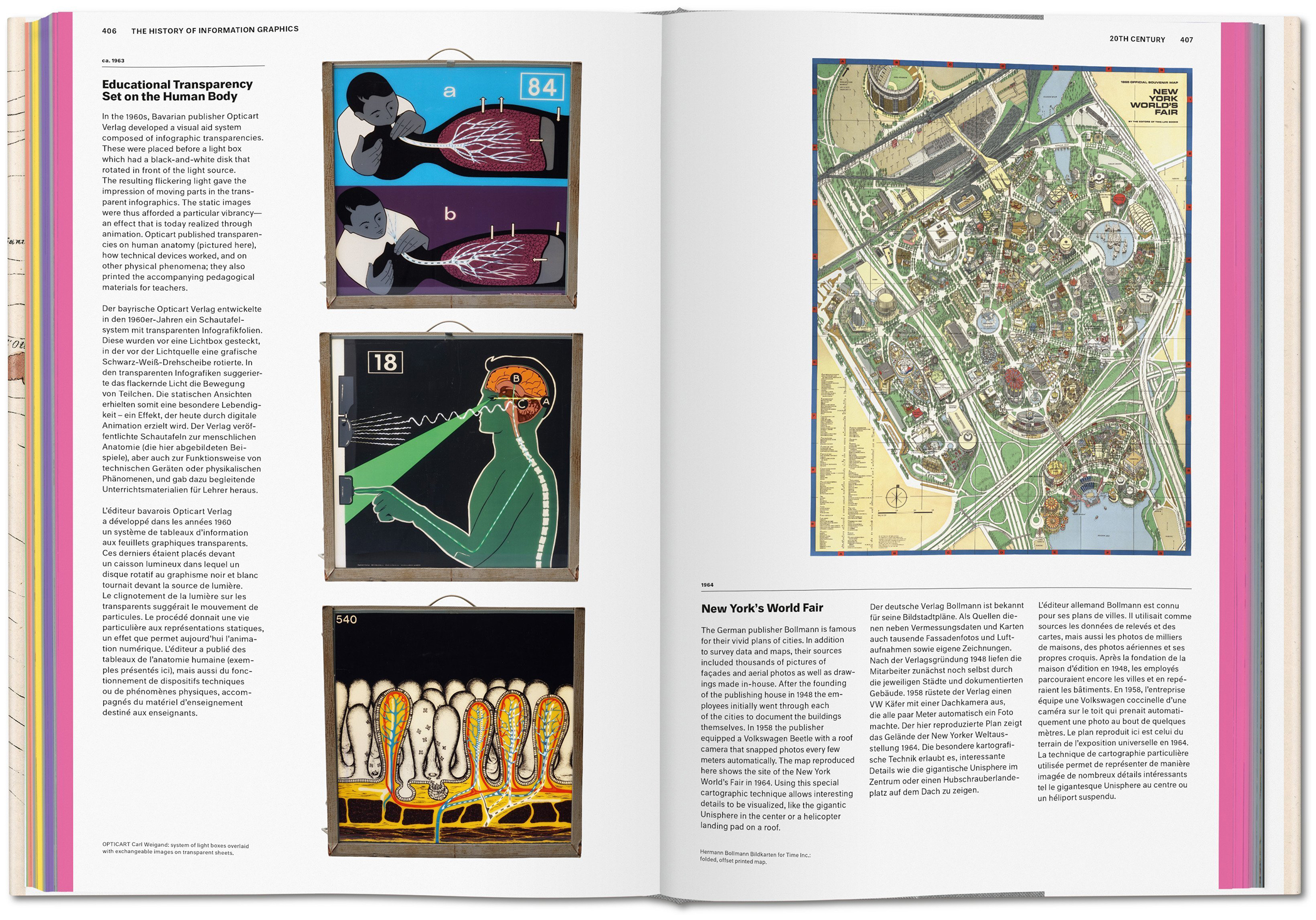
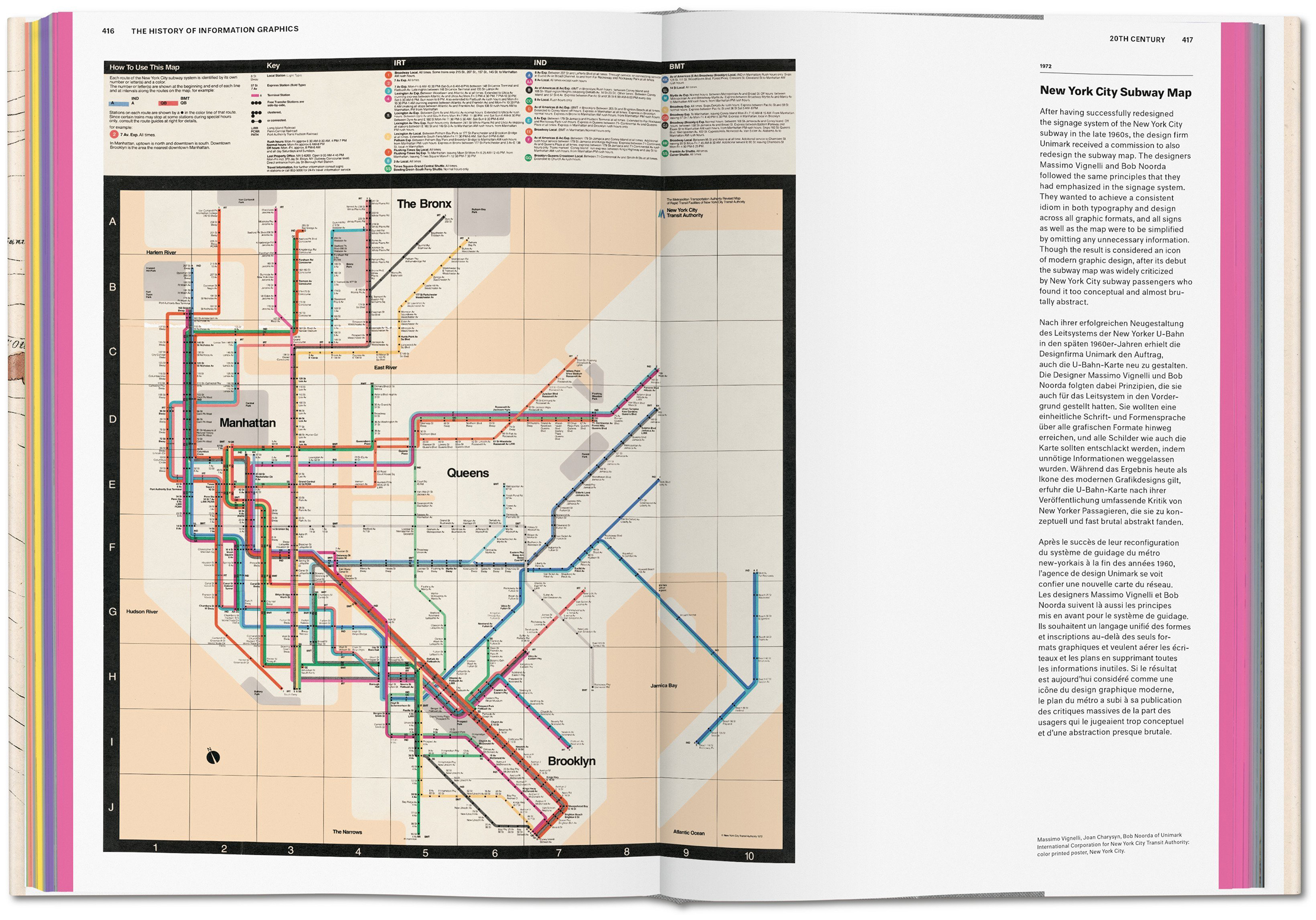
MAPS POWERED BY DATA.
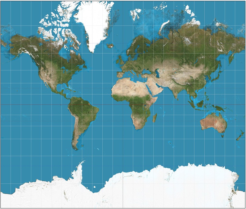
James Cheshire and Oliver Uberti’s latest book doesn’t follow the traditional idea of an atlas that depicts visible geographical features. This collection of maps, developed using large datasets, reveals hidden patterns that tell a specific story.
The U.S. and U.K. editions are available here: https://www.atlasoftheinvisible.com
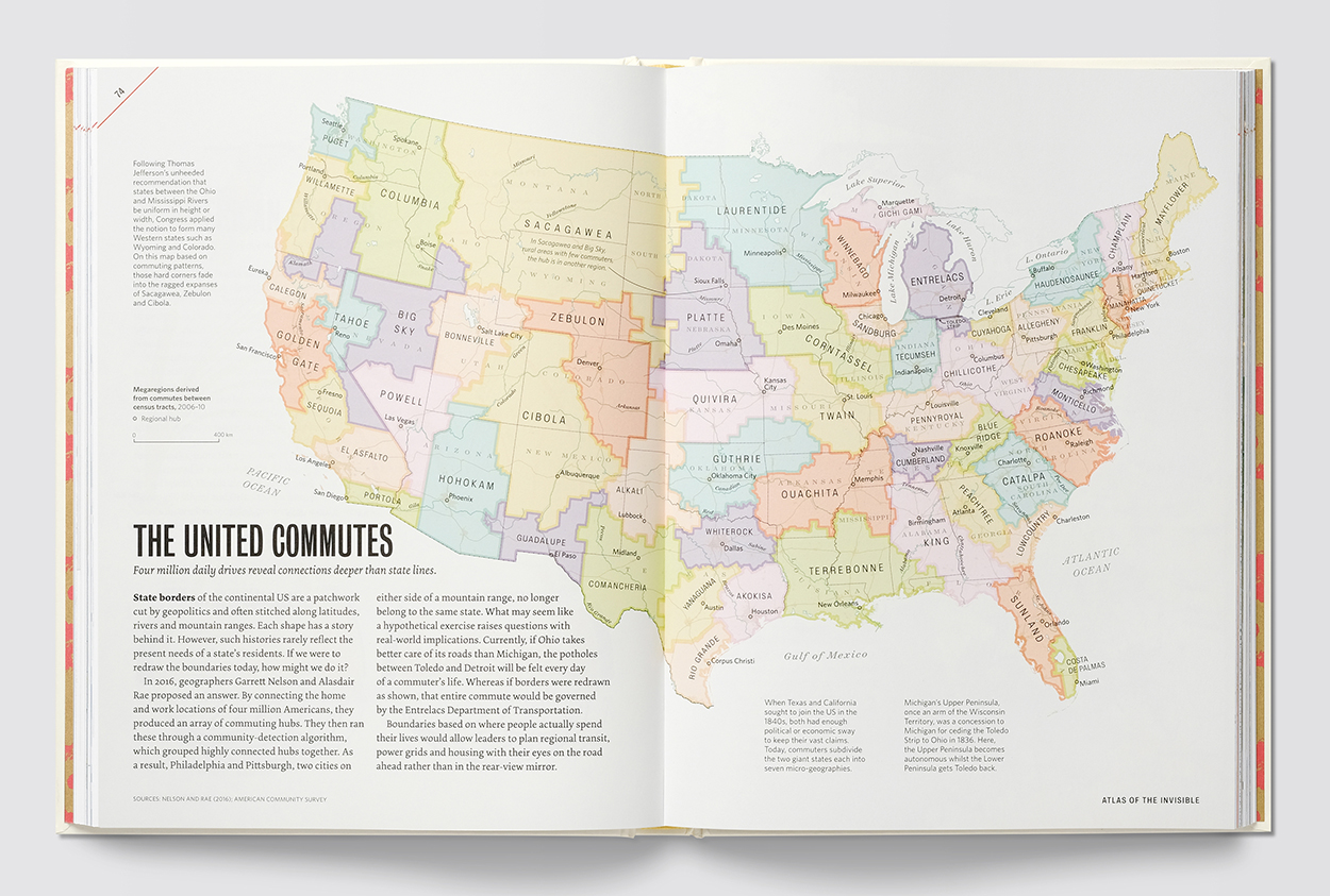
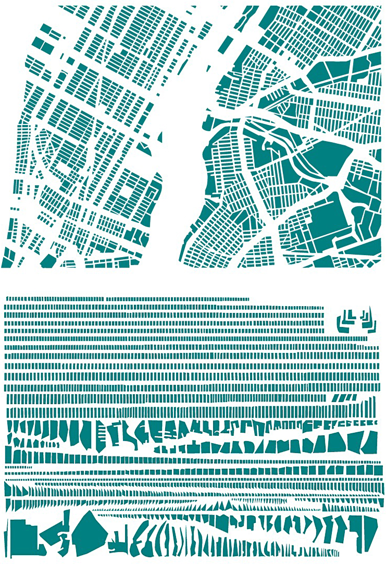
Below, boundaries based on commuting.
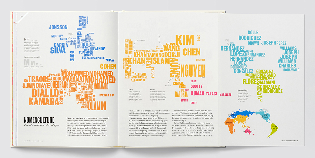
Names by continent.
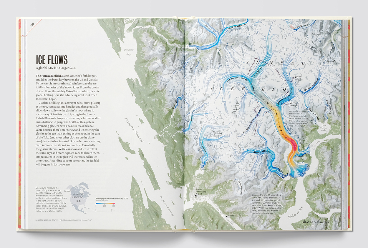
Glacial movement.
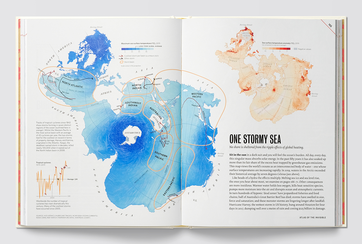
The world’s oceans connected.
MAKING DATA-DRIVEN MAPS
I asked Oliver and James about the way the ideas were developed. This is very much a geographer (James) and designer (Oliver) collaboration, from ideas to initial plots, back and forth (through GitHub) looking for a strong story before moving towards the final visuals. They describe this sequence as “topic/data/angle/form.” It’s a rigorous process: around 50% of the initial ideas for the Atlas didn’t make it into the book. Overall, they’re trying to avoid being too generalist, and instead hone in on a focused narrative. A clear primary takeaway, followed by secondary and tertiary information.
Here’s the process for two aircraft-related maps that had different developmental approaches. Carbon Overhead is a visualization that evolved toward greater simplicity, Bombshell Reports was more about wrangling added complexity. In both cases, the formal choices were in response to the angles Oliver and James had chosen for each topic.
An editor’s note here about the importance of words: In both the examples below, and throughout the book, the use of carefully-crafted text (written by the authors) introduces and supports the graphics.
CARBON OVERHEAD
TOPIC: Flight data
ANGLE: Choosing to fly is one of the most carbon-intensive choices an individual can make.
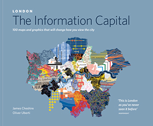
The carbon idea was originally inspired by this graphic from one of their previous books, “London: The Information Capital.” Incoming flights to London’s airports were colored by their continent of origin.
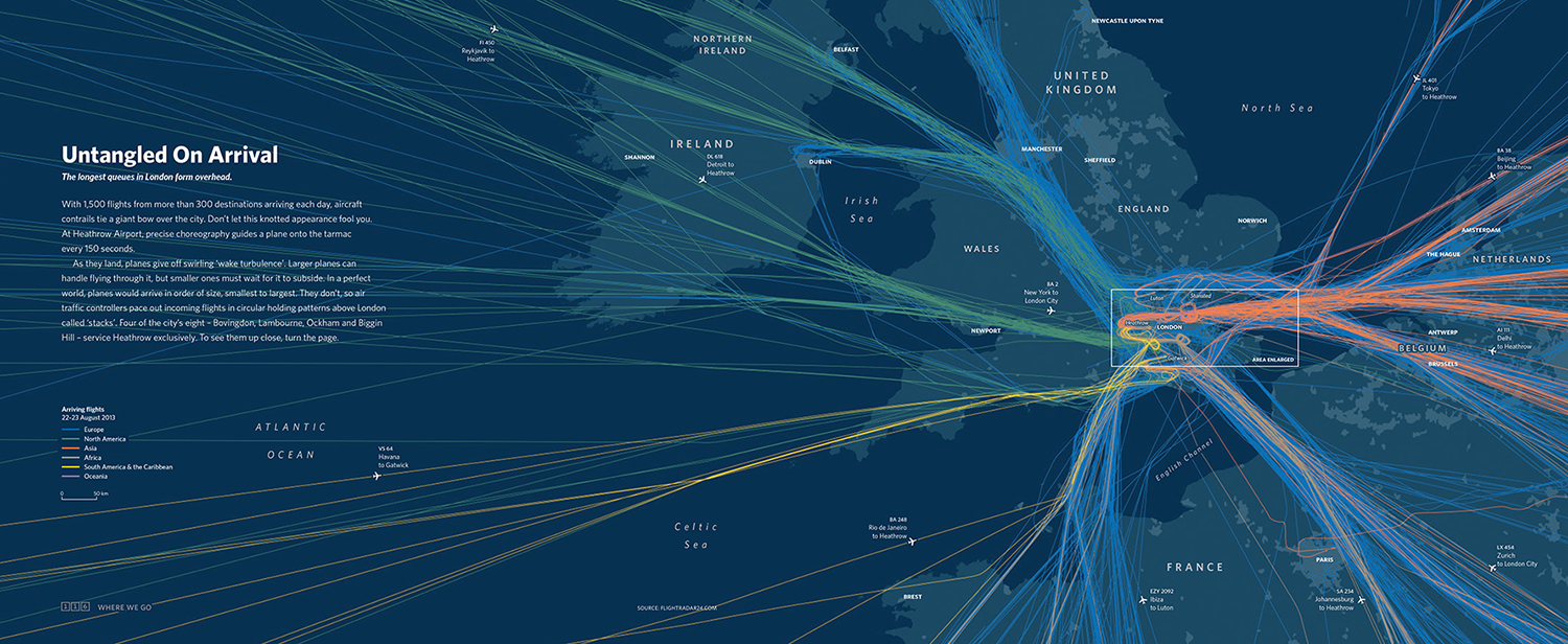
The first step for the new graphic was to see what the flight data looked like plotted across all of Europe. In this complex tangle of lines, blue indicates low altitude where planes take off and land.

Next, James began to clean the data, while Oliver dropped a recolored plot into a layout to begin thinking about the overall spread design. (It was not ideal to have the book’s gutter bisecting the continent.)
Note that they don’t wait until the end of a project to put things into a layout. They test layouts early: 1) to ensure the exports will work on the page, and 2) because when they don’t, that discovery often informs new approaches.

Oliver began to explore whether a celestial color palette might better suit the density of lines at different altitude levels.

Ultimately, they realized that for a story about the impact of airplane emissions, it was clearer and more appropriate to reduce the color scheme to black lines only. Oliver shifted the text to a righthand panel to allow the gutter to fall in a less intrusive area. A locator map orients readers since James and Oliver chose to keep labels off the main image, which resembles a charcoal drawing.

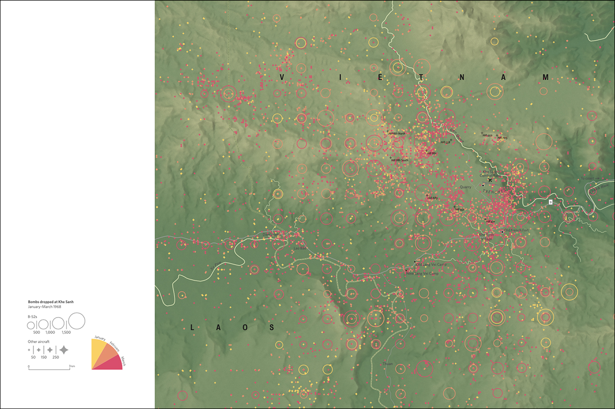
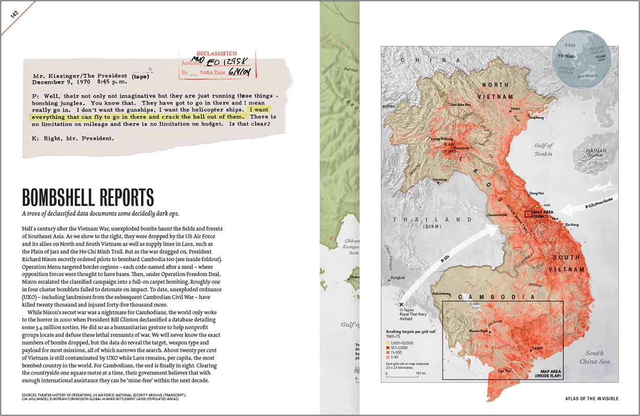
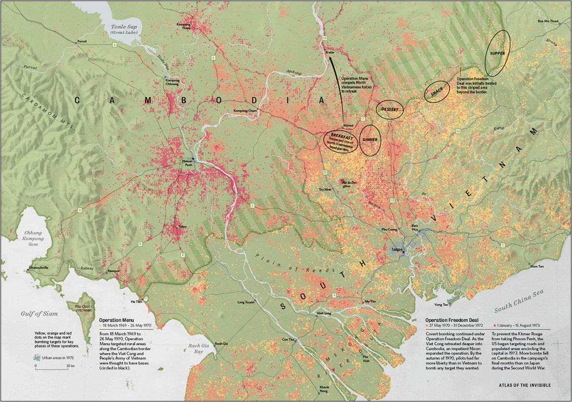
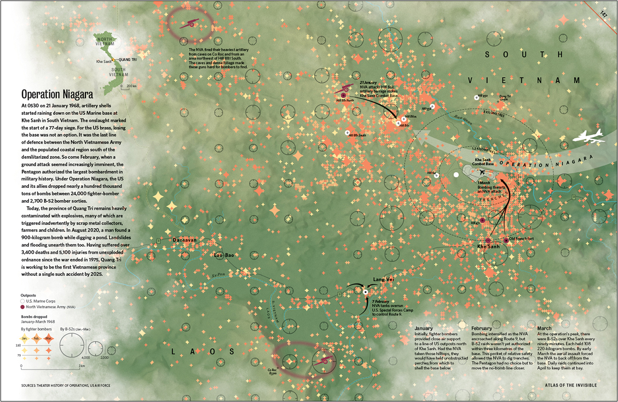
BOMBSHELL REPORTS
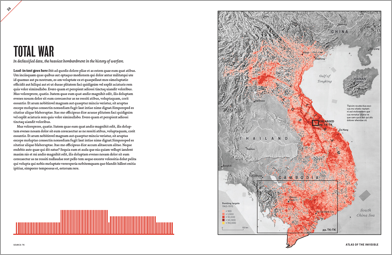
TOPIC: Declassified data on the secret bombing of Cambodia and Laos during the Vietnam War, plus the largest bombardment in military history (Khe Sanh).
ANGLE: Knowing where bombs fell helps nonprofit groups locate and defuse these lethal remnants of war.
Here, Oliver was using James’s initial exports to block out how a three-part story might be arranged across multiple pages: a) bombing in a region; b) bombing in one country; c) bombing in one particular battle.
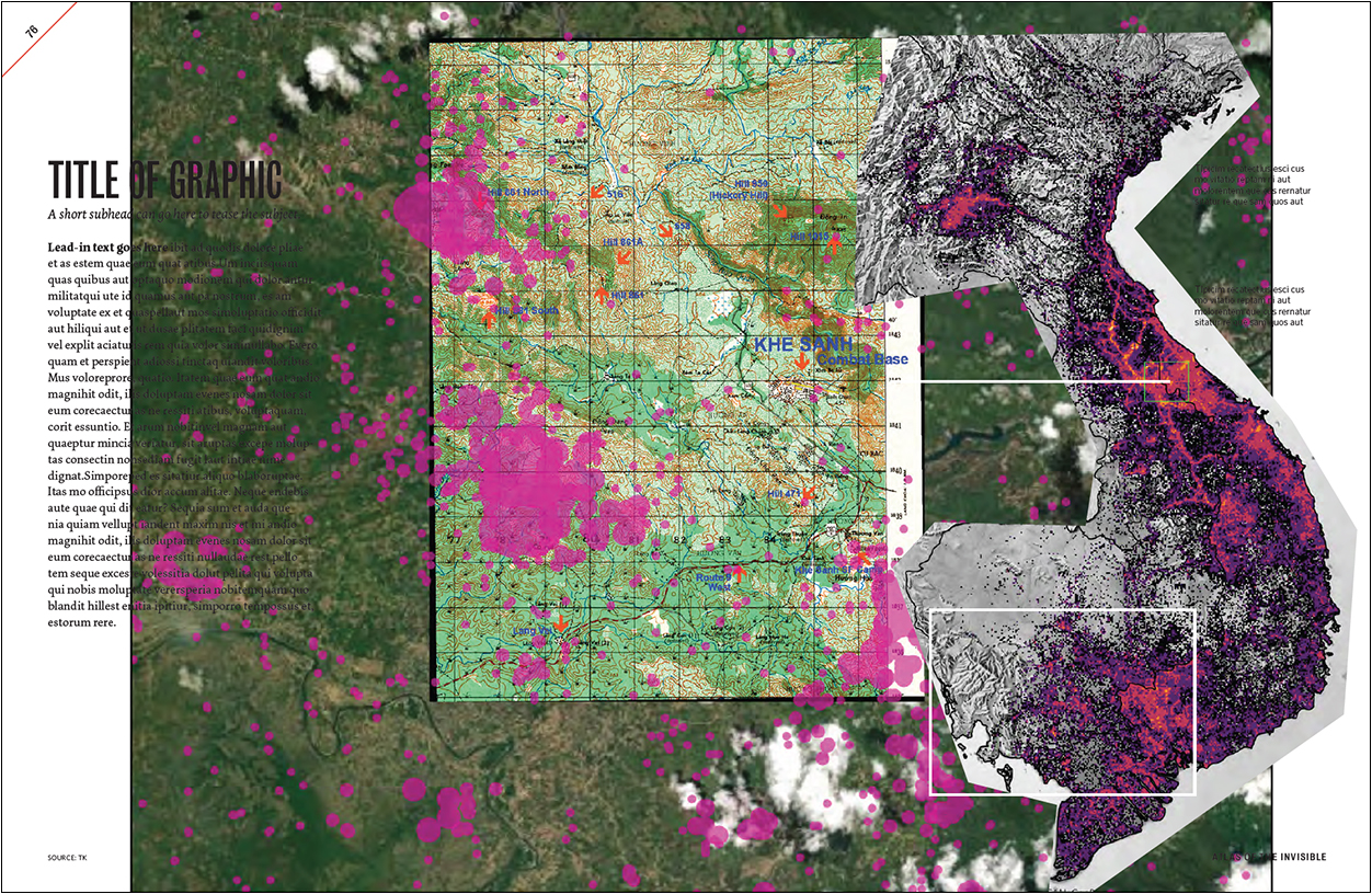
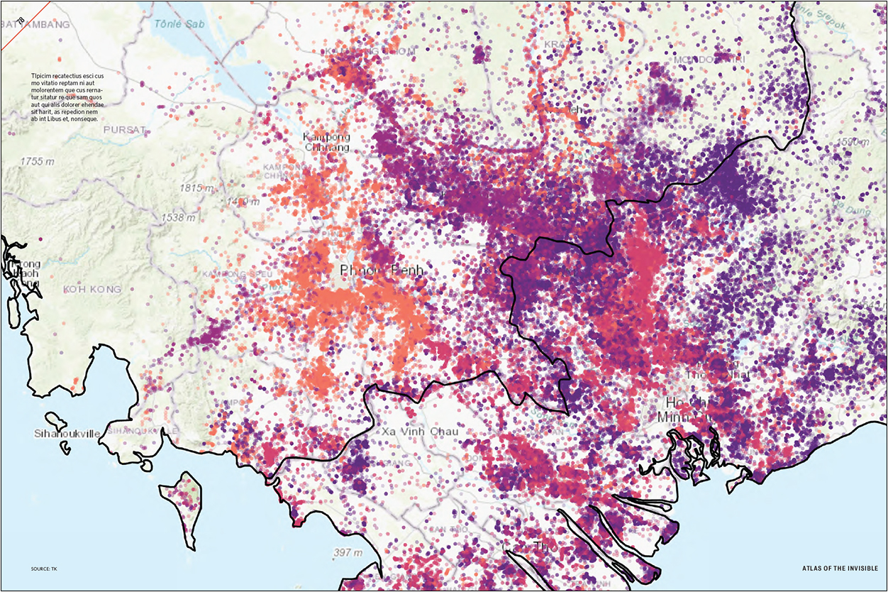
More-developed rough spreads: On the Cambodia map, data is colored by year. On the Operation Niagara map, data is sorted by aircraft type and colored by month. Oliver and James realized that there was too much going on.
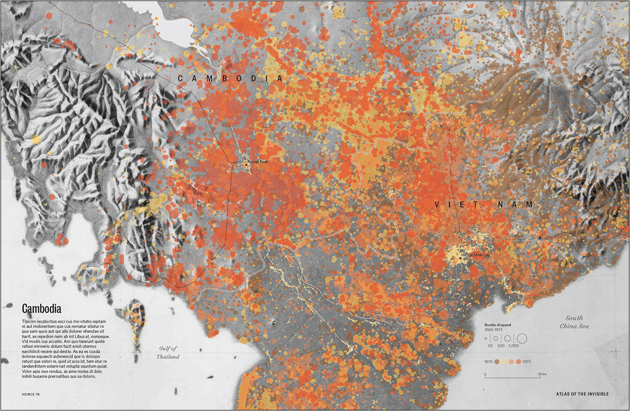
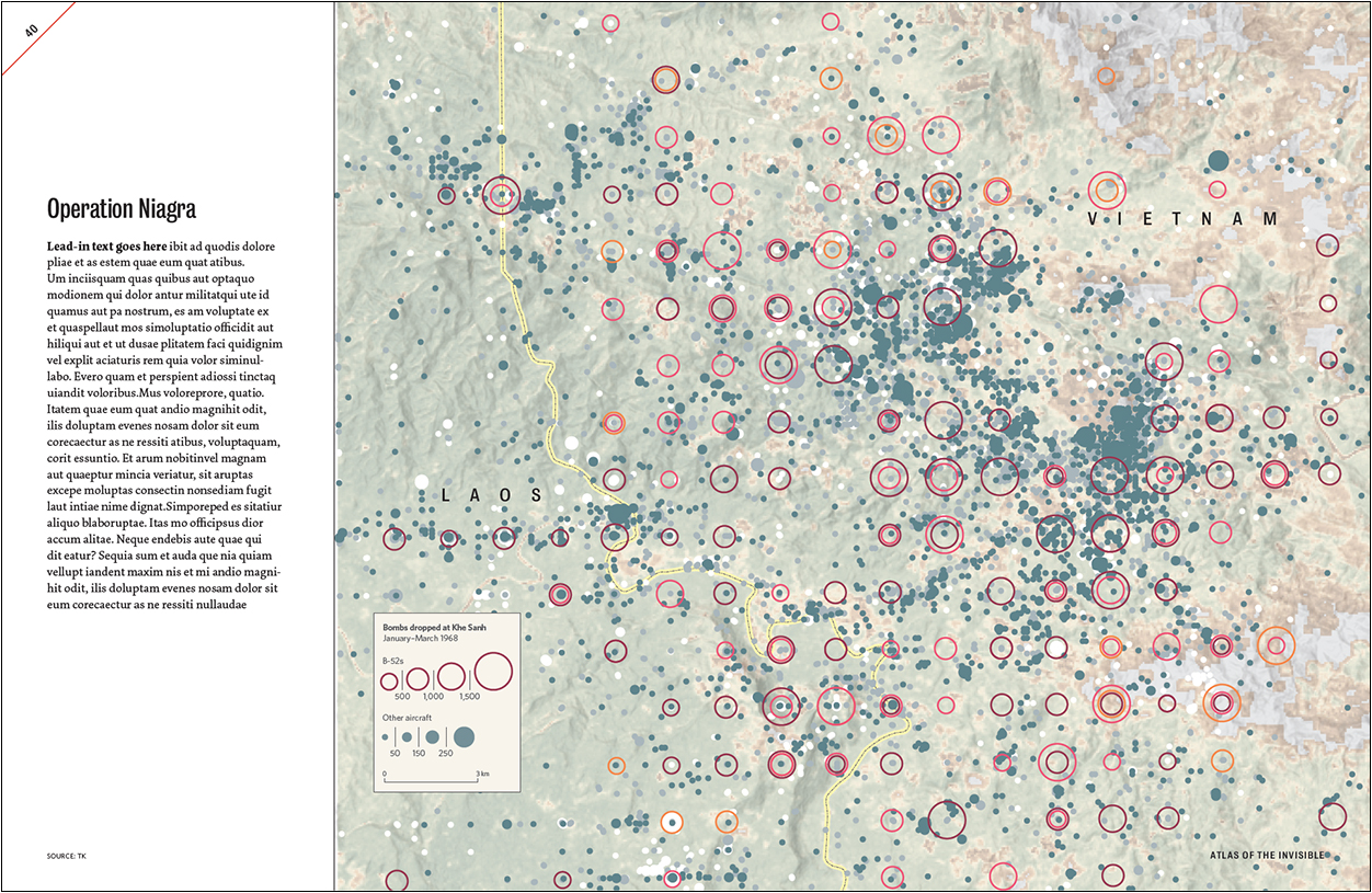
At this point, the basemaps were being revised to show Cambodia and South Vietnam’s roads, rivers, railways and urban areas in 1975. On the Khe Sanh map (below), the elevation and vegetation basemap were recolored to reduce visual noise.
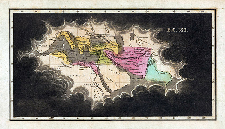
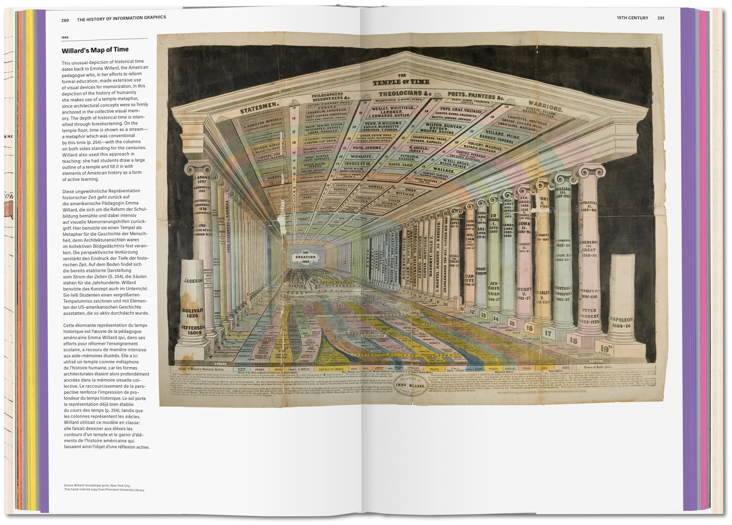
For the Operation Niagara map, Oliver needed a place to put the text, captions and locator map. Then he remembered a map James once showed him by Emma Willard (1836, from the David Rumsey Map Collection) that isolates a geographic area through a gap in the clouds.
The final pages (below) have a right-hand gatefold. The data on the Cambodia map was regrouped and recolorized into three missions instead of five years. James and Oliver also did away with graduated quantities in favor of targets. That made it easier to see the change when Nixon ordered bombings—illegally— across the border in Cambodia. On the Khe Sanh map, all B-52 bombs were grouped together, and the month-by-month color coding was reserved for fighter bomber sorties only. For greater clarity, the bombs-dropped quantities in the key were regrouped from four bins to three.
The authors
James Cheshire is a Professor of Geographic Information and Cartography at University College London.
https://jcheshire.com
Oliver Uberti is a freelance map and infographic creator, and a former senior design editor for National Geographic.
https://www.oliveruberti.com
Previous collaborations
Where the Animals Go (2016): https://www.oliveruberti.com/where-the-animals-go
London: The Information Capital (2014): https://www.oliveruberti.com/the-information-capital


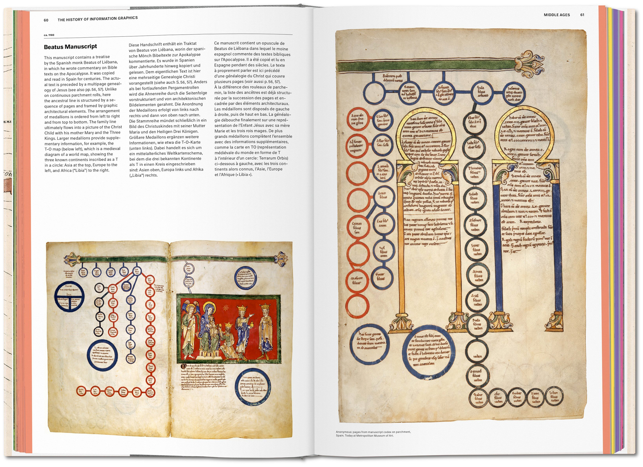


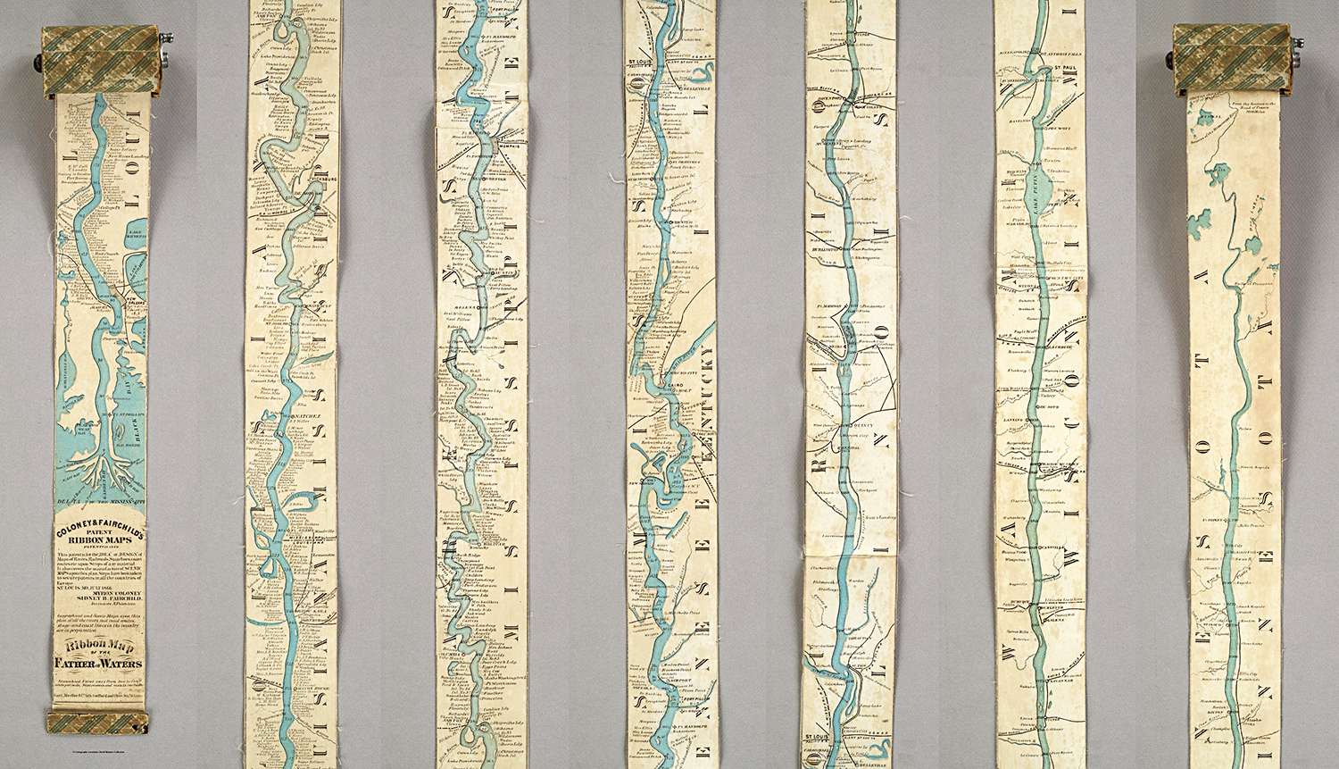

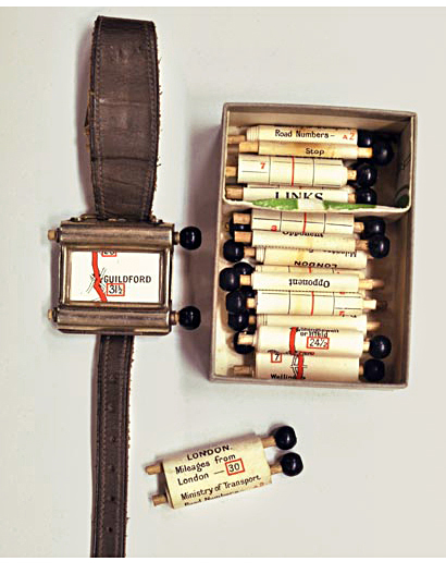
 Photograph: The British Library.
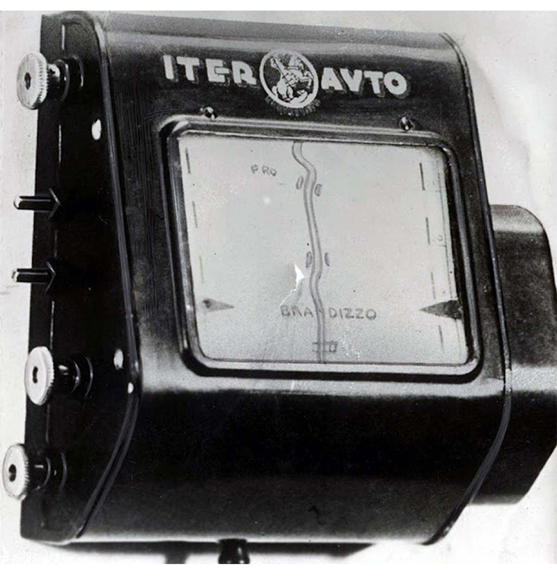
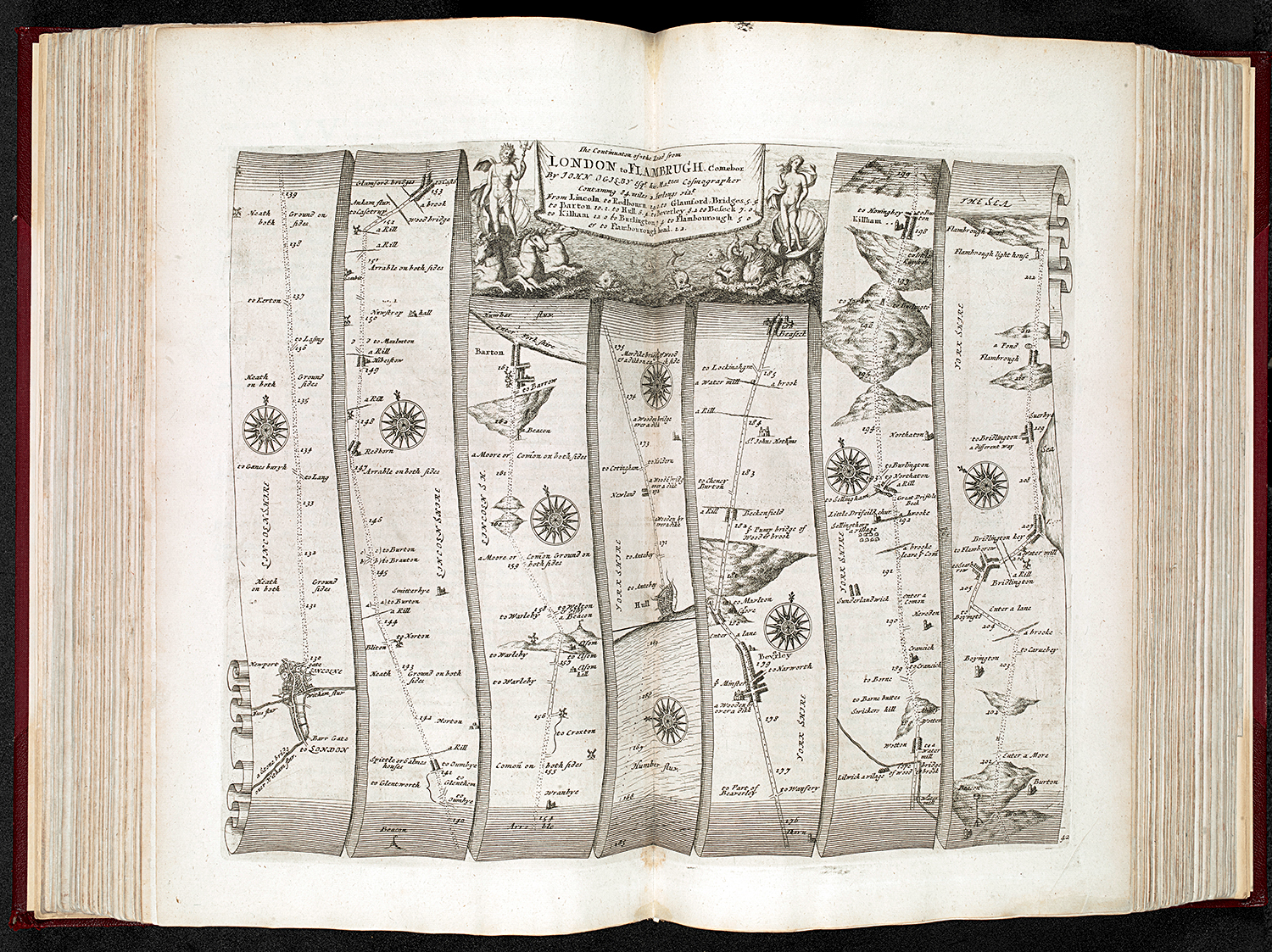