
A PRACTICAL GUIDE.
This newly-published book is written from the perspective of a designer who works nearly exclusively with scientific content. It’s aimed at a broad audience of students, scientists, science communicators, and fellow designers.
In Jen’s words: “The book reflects what I’ve learned from collaborating with scientists and artists while creating science graphics for Scientific American, National Geographic, and textbook publishers for over 25 years. It’s a practical guide for anyone interested in creating static scientific illustrated explanatory diagrams.”
There’s more information about the book, including the table of contents and a list of “More to Explore” links (for those who want to dive into specific themes in more depth) at BuildingScienceGraphics.com.
Buy it here: https://bit.ly/3kc68I8
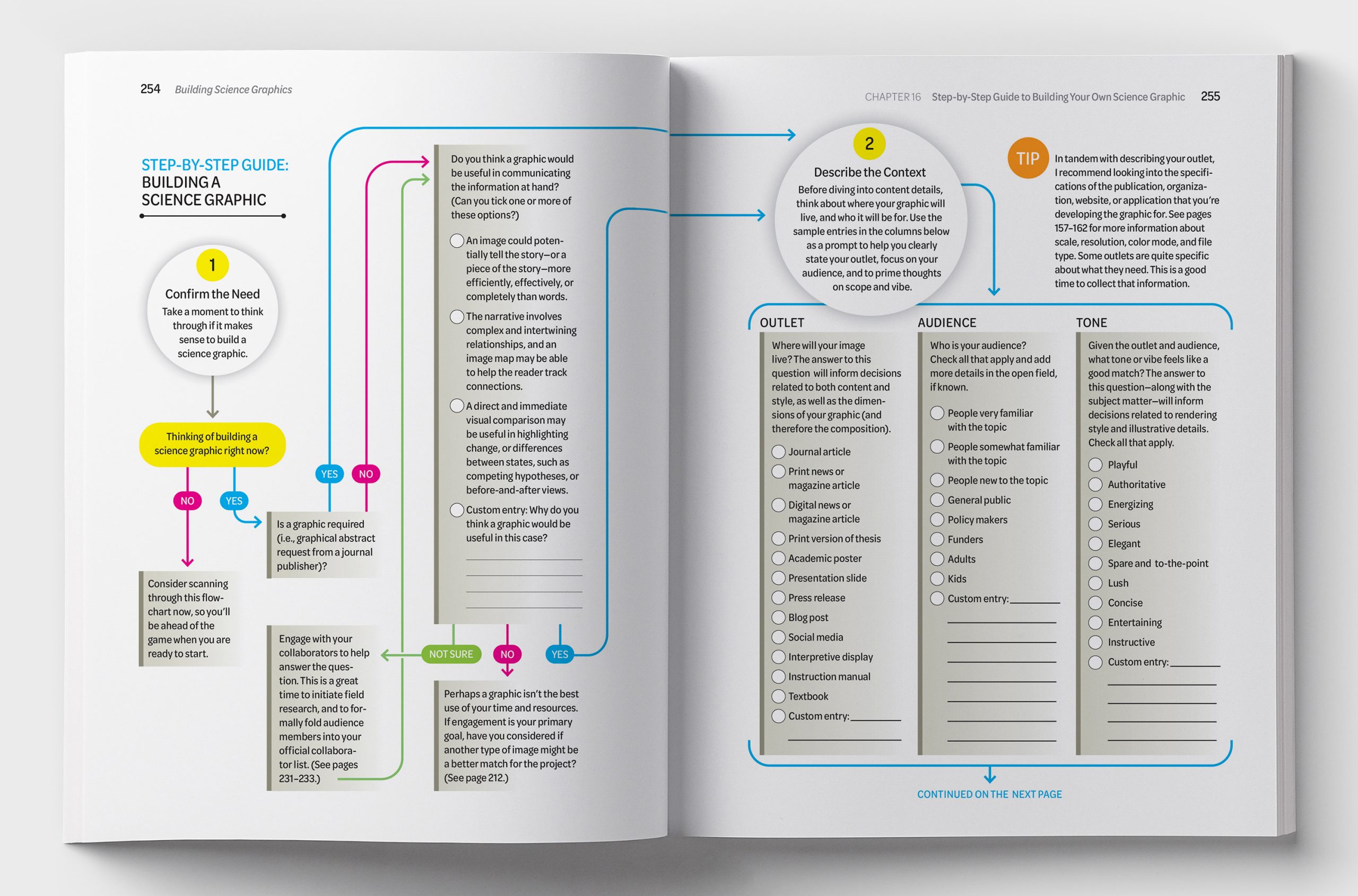
The heart of the book is composed of two step-by-step graphical worksheets, developed to walk both novice and experienced designers through the process of conceptualizing and building a science graphic. Here’s the first spread from one of them.
Click on the image for a larger version.
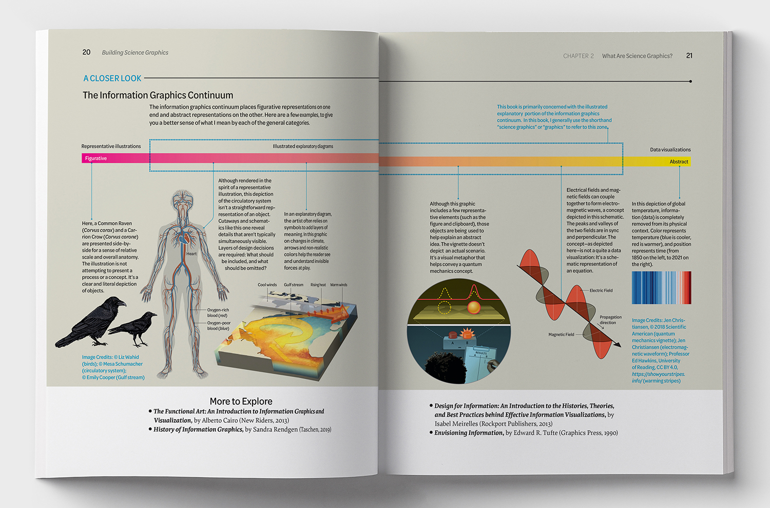
Below, more example spreads from the book.
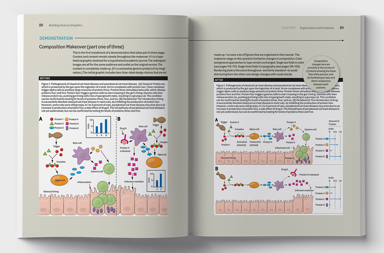
Close to home
A graphic of mine with insightful comments by Jen. Click on the image for a larger version.
The AK Peters Visualization Series editors are Alberto Cairo and Tamara Munzner.