Month: February 2017

The dawn of digital

COMPUTER INFOGRAPHICS ARRIVE ON THE SCENE.

A guest post by a digital news graphics pioneer, Karl Gude, who is now a professor in the College of Communication Arts and Sciences at Michigan State University. Karl is Director of the Media Sandbox.

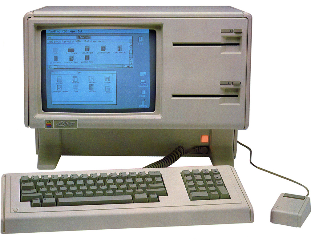
(Above: State-of-the-art in 1985, the Apple Lisa. It cost $24,000 in today’s money.)

Apple to the rescue

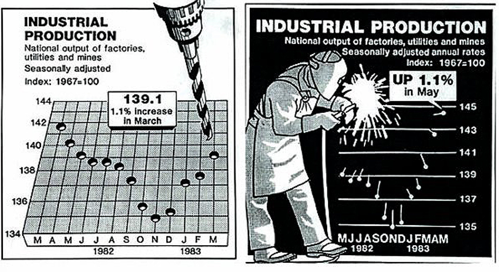
Grrrr… As a news artist working in the late 1970s and early 1980s, I hated plotting graphs by hand, like the ones below, (my boss wanted me to make charts like “Nigel Holmes in Time!”), and I made a lot of them. My fingers were black with ink and nicked by X-Acto blades. But by the mid ‘80s, there was a bright light on the horizon: Apple was making computers that could plot a graph with the click of a mouse.

United Press International in the 1980s. All news graphics were drawn by hand.

Life with Lisa

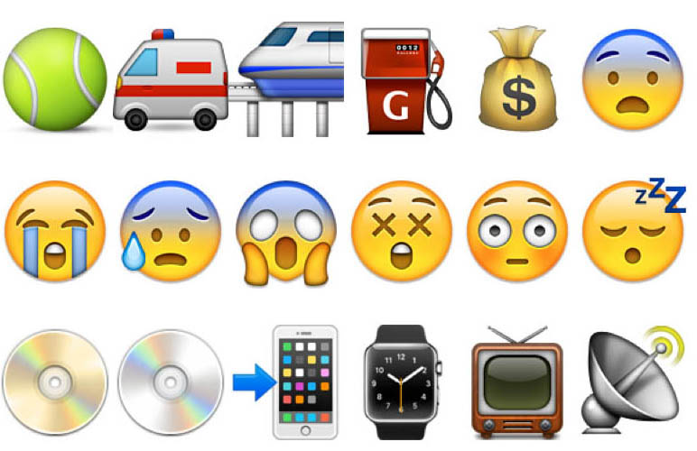
In 1985, I was working for the news agency, UPI, in Washington, D.C., which sold infographics to newspaper clients. We purchased two Apple Lisa computers which could generate simple maps and charts. Apple flew executives out to help us set them up, including Apple iconographer and designer Susan Kare (http://kare.com). Her icons for the operating system are shown below. Apple was excited that the news industry was interested in their products, and if UPI used their equipment, our 1,600 newspaper and TV clients would also have to use it to edit our graphics, if only to delete the byline!

Back to analog

I moved to the New York Daily News as their News Graphics Director in 1986. Unfortunately, it was back to the drafting table, and the old ways of doing things, but not for long. The editor was against spending money on graphics technology, but he agreed to allow me to rent one Apple Macintosh, or Mac (a bit better than the Lisa for graphics), to create infographics for a special series we were doing on transit in New York. The Mac was a crowd-pleaser, and when the editor saw what it could do he allowed me to purchase six of them. Out went the art tables, and in came the complaints. Most of the staff didn’t like this new way of making graphics and drawing, but before I could see how it all turned out, I moved to the Associated Press.

The Associated Press goes digital

Again, drawing tables! But, AP was already considering Macs, and the transition from drawing tables to computers happened quickly. I felt sad though, at the sight of about 12 battle weary, ink-stained and cut up drawing tables lining a long hallway waiting to be shipped to a warehouse. They were replaced with flat desks with Macs sitting atop 20-megabyte (!) hard drives.

One of my early Mac graphics drawn in Claris MacDraw 1.9.6, March 1988.

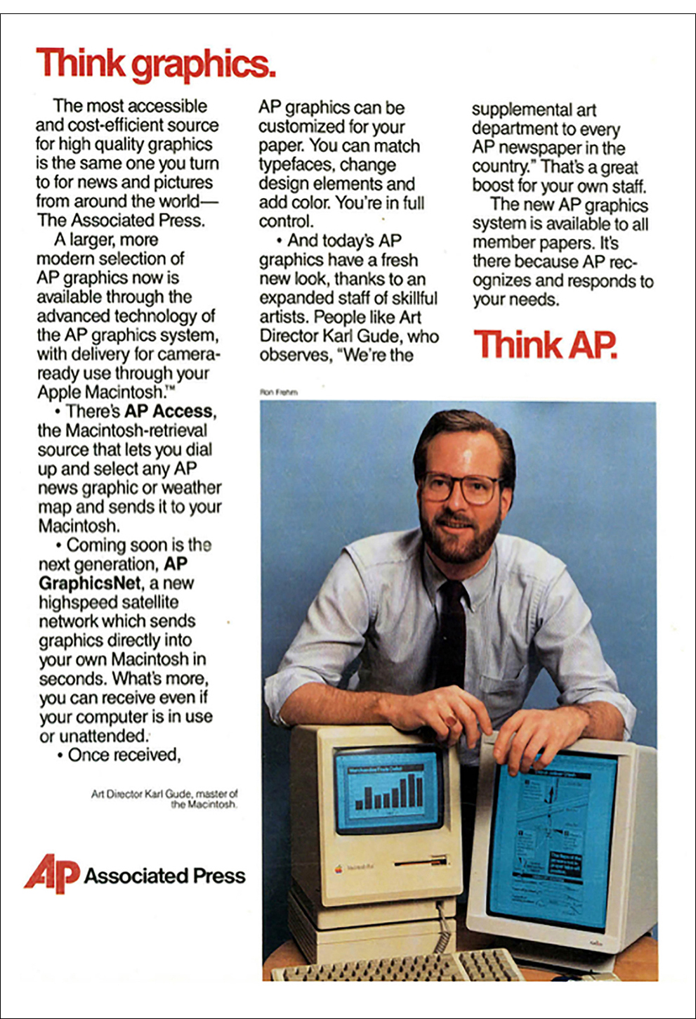
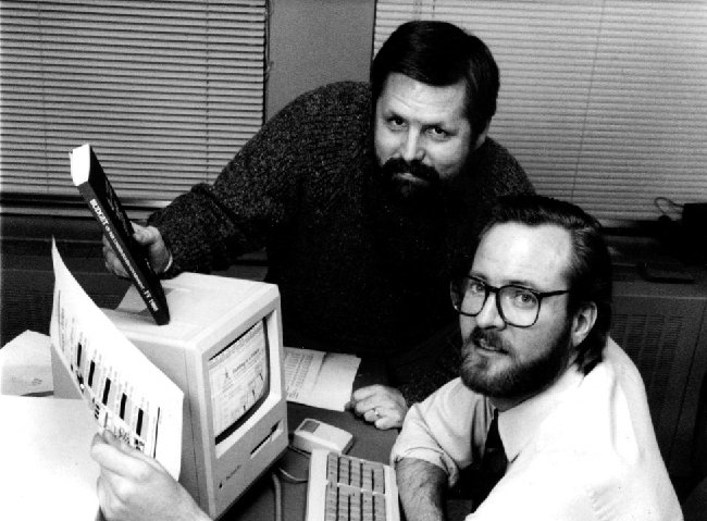
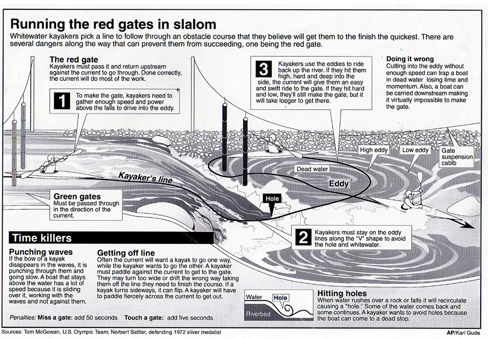
AP leads the way. (Editor’s note: Notice that Karl is “master of the Macintosh”. You can’t beat that.)

The first portable Mac


If you were to shrink every tool on a cluttered drawing table and cram them into a tiny little box, you would have the Macintosh Plus.  Because the computer was so light and portable, Apple designed a backpack so that it could be easily taken places, which was a dream for me back in 1987. As a news artist, it was hard to visit the scene of a breaking news event and cover it live in the same way a photographer could with a camera. The best I could do was to go there and make sketches (visual notes) to use as reference for a drawing that I would complete back at the office.

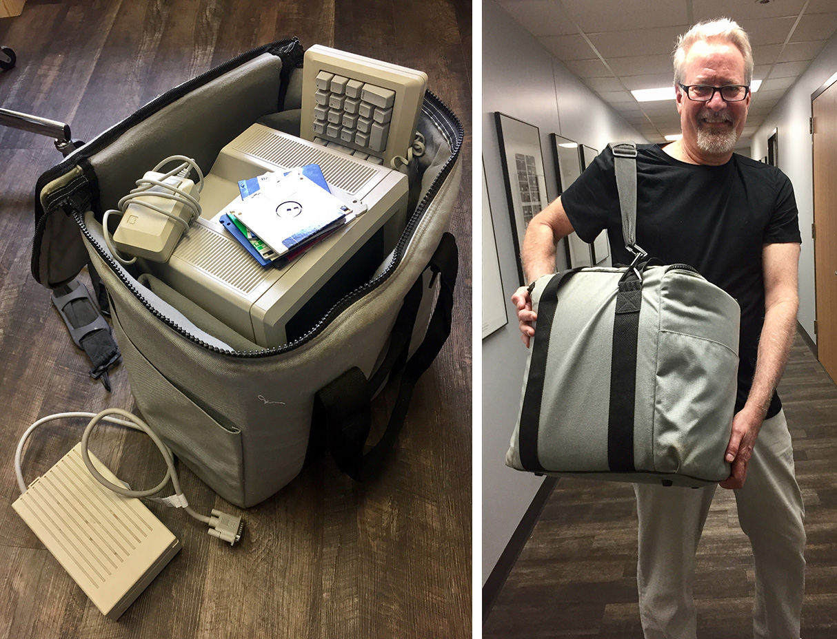
The traveling computer. Just a little larger than an iPad! Karl holding the bag a few days ago.

Before Apple’s swanky backpack existed, I used a cardboard box. There was a terrible accident where a building under construction collapsed killing a number of workmen in Bridgeport, Connecticut, which was about 35 miles from the AP offices in New York, As was the usual drill, I found myself explaining to a photographer, who was rushing to the scene, which photos I needed him to take for me as possible reference for a diagram. It was then I realized that I could go with him! No longer tied down to a drawing table, I threw my Macintosh into a cardboard box, and hopped in the car with him. The Connecticut Post was nice enough to give me a desk to work on (thanks Rick Sayers!), and my Mac was the first one they had seen in action. The diagram I made that night, explaining the process workers were using to build the doomed building (called “lift-slab construction”), was transmitted over a phone modem directly from the Post to AP in New York, who then routed it to hundreds of newspapers and TV stations around the country. Hours were saved in the making of the graphic, which made our subscribers very happy.


Drawing programs: vector or postscript?

In the early days, before scanners came along, drawing on Macs was heavy going. We used the vector-based MacDraw program, which was easy, cheap, and already in every newsroom. Because we were a news agency that supplied graphics to 2,000+ frugal news organizations, we had to stick with MacDraw much longer than we had wanted.

We would sketch out our drawings on paper, and in order to get them into the Mac to finalize them, we followed this process:

  1. Size the drawing (or photo reference) on a copy machine to about the size of the tiny Mac screen.
  2. Trace the drawing (or photo reference) with a marker pen onto clear acetate.
  3. Tape the acetate to the Mac over the screen.
  4. Trace the image with the mouse (much like drawing with a bar of soap) by clicking around the acetate drawing without moving your head (otherwise, your drawing would be distorted).

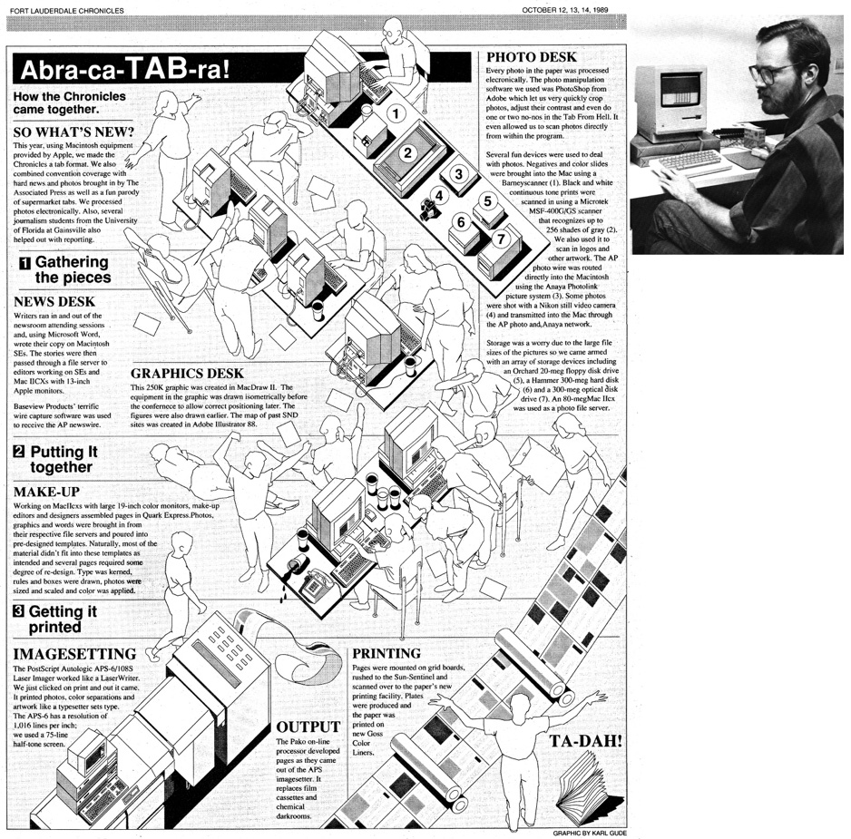
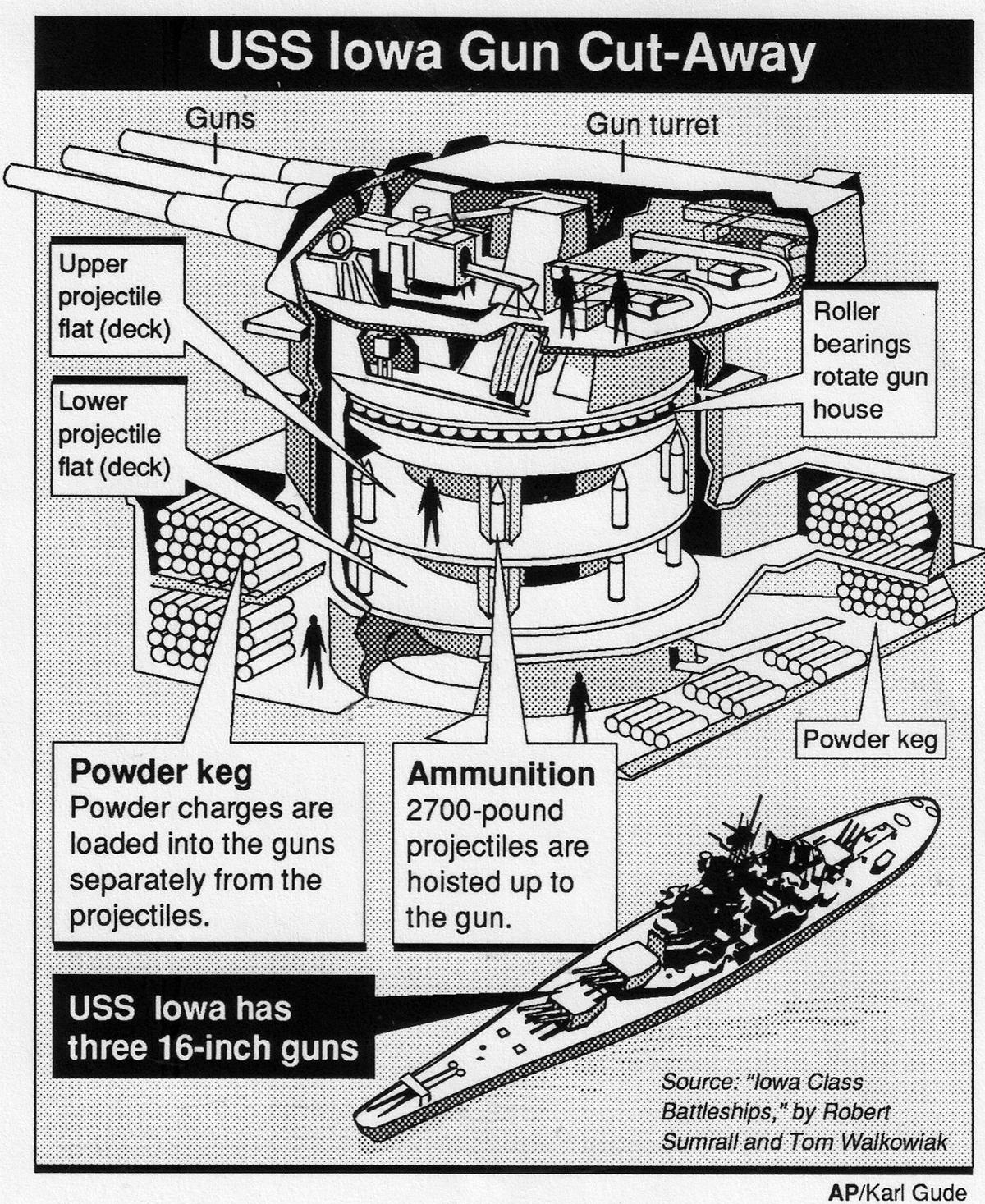
The equipment in this illustration was drawn directly in the Mac SE using MacDraw II, but the people, which my wife posed for, were drawn using the method detailed above.

Covering elections with the Mac meant sending graphics directly to papers through Mac-to-Mac- dial-up instead of over a slow, bogged down photo network. Here I am in D.C. with AP’s Brian Horton to cover the 1988 elections.

1989 MacDraw graphic, one of my last with that software.

Superior postscript drawing programs like Adobe Illustrator and Aldus Freehand had come out, but for the Associated Press to switch to one of those meant getting all of our news members to purchase and learn it, and most of the smaller papers resisted this expense of time and money. Also, postscript programs couldn’t read vector images, so entire databases of maps and images would be useless. Eventually, though, we had to make the move. We asked both Adobe and Aldus if they could build into their next version the ability to open and edit vector-based images. Adobe said, “That’s against our religion. No.” But Aldus said, “How soon do you need it?” So, we announced to the newspaper world that AP would be switching to Freehand, and that we could get if for them at a discount. I heard that the Adobe guy who made the “religion” comment was fired for lack of vision.

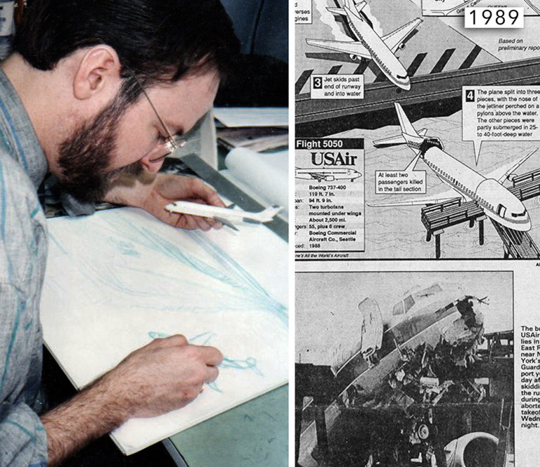
Sketching out a plane crash graphic before drawing it in the Mac. We built lots of aircraft models for reference.

Still, despite all of the awkward limitations, drawing on the Mac still was better than drawing with an ink pen, and pasting a layout with melted wax onto boards before having them photographed and printed. The Mac allowed you to edit your lines and fills, change text easily, move elements around into different layouts, and create databases of elements, like maps, that you could reuse another time. It was heaven.

An early Aldus Freehand drawing, 1989. The thick 3D boxes were a bit much. Hey, so were shoulder pads in jackets!

By the early 90s, the Mac and Postscript software, predominantly Adobe Illustrator, had stuck and both were here to stay.

Over-complex

SIMPLER MIGHT SOMETIMES BE BETTER.

I didn’t make this ocean liner comparison as a free-standing graphic. It was part of a big, and much too complicated, display about the Queen Mary 2 (shown lower down this post). I’m now thinking that this historical timeline captured the main point of the feature. (The ships are drawn to the same scale.) It was interesting to know where the QM2 was sailing on it’s maiden voyage, and the globe addresses that aspect. (It ran on another page of the feature.) These two small graphics would probably have been enough, but I was a graphics director, and I wanted to make a statement.

So… I wonder how many times I’ve made infographics that are more dense than they need to be? I collected a lot of information for the graphic below, but I didn’t have to use it. The lower section of the spread looks like it might be from a cruise brochure. And apart from the overcrowding, an elevation view doesn’t give enough of an idea about the interior spaces of the ship. That’s obviously why this type of rendering is usually a three-quarter view. (Which is a hell of a lot harder to create!)

This travel graphic is another example of too much information. I meant well, but I was carried away by the enthusiasm of wanting to show everything. I worry that presentations like this might alienate readers, to whom it could seem like too much hard work.

Emojis and beyond

USING IMAGES, NOT WORDS.

This is the third and final post in a series about the search for a pictorial language, by Nigel Holmes.

When considering a visual language, it’s worth looking at artists’ efforts to communicate without any words, and there’s an illustrious history of wordless books. The graphic novels that Frans Masereel and Lynd Ward made in the early 20th century are great examples. They are stories that are told through a series of black and white woodcuts, one to a page, without a single explanatory word or caption. As you turn the pages you follow the story, as you might if you flipped through a series of still pictures from a movie. You add your own interpretations and feelings, and your imagination fills in the story from picture to picture.

In 2013, Xu Bing published “Book from the Ground: from point to point”. Unlike Masereel’s and Wards’s books, “Book from the Ground” is comprised of thousands of existing symbols, icons, tiny pictures, emojis, trademarks, roadsigns, numbers and punctuation (including question and exclamation marks) arranged in rows like text, to be read from left to right. And you can “read” it. It’s a little difficult…but nevertheless it is a pleasure to slow down and take the time to work out the meaning. I can read about two pages at one sitting. It makes you think about what pictograms really mean; and how the meaning can change depending on the context.

Has Bing invented a new language? Not quite. The story is 24 hours in his life. You know that because there’s a little text on the back cover, the only regular words in the book. The more you read the book, the easier it is to understand how Bing is telling the story; what his “writing” style is. The tiny pictures don’t exactly make sentences, they represent a sequence of actions and thoughts.

One thing is clear in the book: all the pictures look like the things being described. And that must be the rule for a truly visual language.  If the inventors of such languages have to resort to abstract symbols and other marks to modify their pictures, then readers have to know what those marks mean. They have to learn another language, before they can see meaning in the string of pictures. Bing does use brackets enclosing a group of symbols to indicate thoughts about, or explanations of, the preceding “text.” Other forms of punctuation are used, but the images—the “words”—are all recognizable. He brushes his teeth, you see brush and toothpaste. Fedex delivers a package, you see the Fedex logo, and a box.

The forerunners of emojis were emoticons (emotional icons)—punctuation marks and other typographic characters arranged to make keystrokable pictures of faces. They first appeared in Puck Magazine, in 1881.

Modern emoticons were invented by Scott Fahlman in 1982. According to Pagan Kennedy (writing in the New York Times Magazine) Fahlman’s smiley face 🙂 was intended “to take the sting out of mocking statements” and other differences of opinion on online forums. He called his invention a joke marker. There’s a collection of 650 emoticons in David Sanderson’s Smileys.

To see the icons above, you tilt your head sideways. In 1993, Tota Enomota published “Niko! The Smiley Collection”, with 200 non-head-tilting emoticons. Compared to western keyboards there are many more characters on Japanese computers. Some of Enomota’s examples are quite subtle.

But somehow, five or six, or even just three :-), keystrokes proved to be too much for people who wanted to add a tiny picture to their email messages. Enter emojis (a literal translation from the Japanese is “picture letter”). In 1999, in Japan, Shigetaka Kurita created 176 12-pixel by 12-pixel characters. They were recently added to the Museum of Modern Art collection.

In 2010, emojis were added to the International Unicode Standard, a non-profit group of programmers who wanted to standardize the coding of fonts so that computers and phones all talked to each other in the same way. There are now roughly 1,850 emoji characters on the Unicode list. It’s a big number because many of the human faces are available in a range of different skin tones.  You can look them up on emojipedia.org.

Both Scott Fahlman and Shigetaka Kurita think “current emoji standards are ugly compared to their ancestors.” (From “Emojis, the secret behind the smile”, by Marty Allen, 2015.) I agree. Wouldn’t it be great if they were simple, flat, iconic pictograms? Why does everything have to be so fully rendered?

Funnily enough, one of the things that you can do with emojis is surprisingly similar to a principle that Otto Neurath used in Isotype, and Charles Bliss, too: joining two icons to make a third. Emoji ZWJ Sequence (Zero Width Joiner) is way of combining more than one emoji (digitally, on the keyboard) so that it displays as a single emoji.

This approach offers possibilities for a more nuanced language. A string of single emojis doesn’t constitute language at all; it’s just a way of adding fun to a message, and shortening it.

Fred Benenson has “translated” Moby Dick into emojis. “Emoji Dick” reprints all of Herman Melville’s words with the “translations” above each sentence. Benenson is a data engineer at the fund raising site Kickstarter, and he used Kickstarter to raise money to pay the 800+ Amazon Mechanical Turk workers to translate the novel’s approximately 10,000 sentences. The book is $200 for the color version ($40 for black and white), but you can download a free pdf of the whole thing (750 pages!) here: www.czyborra.com/unicode/emojidick.pdf

Unlike the Bing book, I have not cracked the code of how the emojis actually do translate the Melville’s text. Here’s the famous first line (“Call me Ishmael”).

I see a phone, and a whale…but it’s so cryptic, that I wonder if the whole thing is a joke. (An expensive joke.)

So unless it is a kind of joke, (and even if it isn’t!) Emoji Dick is not a wonderful advert for translating literature into emojis.

Here’s my point: strings of emojis, or emoticons of any type are not new pictorial languages. They are, at best, messages. Messages that the mind completes. “You get the message” or “Know what I’m saying” mean that the message is not all spelled out. Perhaps that’s enough for most people. Emojis are fun, but they are faddish—currently used by the pretty young (6-9 year-olds?), and the pretty old (60-plus, who may think they are being computer literate). Or perhaps we oldsters are just messaging with our emoji-addled young grandchildren. They certainly have more patience than I do going through all the tiny choices!

But if there is any way a universal visual language can be created, it’s probably via computing. Today, two thirds of people in the world have a smartphone. By 2019, that’ll be five billion people; this is how we communicate (sadly). If we can type, or say, “thank you” in Google Translate when writing to a friend in Germany, and get “danke” back in an instant, perhaps the newly updated and improved AI version of Translate will be able to “translate” regular written or spoken language into a new, as yet undrawn, set of (hopefully) flat and iconic pictograms.

Of course, since the point is to communicate, why not ask Google Translate to put your message into the receiver’s native language? Who needs pictures now? (And, if you have emojis on your phone now, they will pop up as stand-ins for some words).

I think designers will keep trying. We will look back to “Safo” (“mind writing”), a language developed from Chinese Hanzi by Andreas Eckhardt (1884–1974), who in turn looked at Gottfried Liebnitz’s work on universal scientific notation in the late 1600s, and “Solresol”, a language developed by Francois Sudre (1787–1862), which was based on the notes of an octave. It could be sung, spoken, or played on a musical instrument.

Language changes all the time. One day we’ll make a pictorial one that works. Everyone says we are in the age of visuals. With Otto Neurath alongside us, let’s get going, (and let’s have fun doing it).

Worth a look:
“Book from the Ground: from point to point”, by Xu Bing. 2013.
“Niko! The Smiley Collection”, by Tota Enomoto. 1993
“Emojis: The Secret Behind the Smile”, by Marty Allen2015

Thank you for reading! (Art by the great Gerd Arntz.)

CMYK

ASSIGNING COLOR TO “MECHANICAL” ARTWORK.

This follows on from my post last week about mechanical art: https://www.johngrimwade.com/blog/2017/02/09/mechanical/

It obviously wasn’t just a matter of making overlays with pens and black ink, or cutting shapes in Rubylith film. You had to pick the CMYK colors, and try and visualize the final result. I used two process color books that displayed a huge range of possible color combinations.

One book has black cards with cutouts to isolate colors, and a transparent sheet of black tints to estimate surprints.

Of course, you could refer to previous proofs and build up a vocabulary of color values that you knew would work. But it was not an exact science, and there were sometimes interesting results. Either I had marked up the overlays incorrectly, or there was a mistake at the pre-press company. (How they could ever get it right amazed me.) Sometimes I had selected a color, that when put next to another color, looked downright awful.

But mostly it worked. In the case of this Parthenon artwork (from 1988), I applied several layers to the first “Chromalin” proof to correct my miscalculations. I’ve shown the printed result before in a post about the pre-computer era: https://www.johngrimwade.com/blog/2016/09/26/when-infographic-dinosaurs-roamed-the-earth/

Time has taken it’s toll on this mechanical. The layers have shrunk or expanded, which is why they don’t register correctly, and the blue-inked instructions have spread out, but it still gives an good idea of the process of working with overlays.

This artwork is heading to Munich! It‘s part of an exhibition of my work. From March 9 to 11, at the EDCH and INCH conferences.
I will also be giving one of the keynote presentations at INCH, and running an information graphics workshop.

Design conference: http://www.edch-conference.com

Infographics conferencehttp://www.inch-conference.com

Infographic workshop: http://www.inch-conference.com/en/workshops

The Isotype revolution

OTTO NEURATH AND THE MODERN PICTOGRAM.

This is the second post in a series about the search for a pictorial language, by Nigel Holmes.

Excuse me where’s the restroom? Moments later, I see the familiar icon of a man and a woman. Ah, relief. Most people don’t know that the grandfather of these welcoming little people is Gerd Arntz. (They probably don’t care much either, when nature calls.) Gerd Arntz’s boss was Otto Neurath.

Mention Neurath to anyone who knows the name, and the kind of illustration that will come to mind was probably created by his brilliant collaborator (and toilet-icon grandfather) Arntz—an artist who made mostly black and white wood- and lino-cuts, and whose work still looks modern though he started working 90 years ago. (He died in 1988.)

But it’s Otto Neurath (1882–1945) who was the force behind the graphic information movement called ISOTYPE (International System of TYpographic Picture Education). It’s still a huge influence on information graphics and data visualization. Below is the well-known logo.

Neurath was a social scientist, not a graphic designer. True to the idea of this blog, he made “Infographics for the People”—the people of Vienna, in his case. In 1925, he founded the Gesellschaft und Wirtschaftsmuseum (Social and Economics Museum), and his exhibitions about social conditions in Vienna consisted of large hand-made charts and diagrams, and models. He understood that it was tiring for museum visitors to stand around studying dense abstract graphics about housing or industrial production. So he developed a way of announcing what his charts were about by adding pictorial elements, while at the same time presenting the statistics in them. Neurath’s effort to make his charts “statistically accountable” was prescient, and should be remembered today by anyone (including me) who includes recognizable pictorial elements in their information graphics. Neurath didn’t want anyone to think he was just making pretty pictures, although he was deliberately using pictures to attract the public’s interest.

In 1925, Marie Reidemeister joined Isotype as the research link between Neurath’s broad-brush ideas and the artists who actually made the end products, most notably Gerd Arntz, who became part of the team in 1928. Marie was the team’s “transformer”—the person who researched and edited the data to best express the stories that Neurath wanted to show his audience.

The Italian archeologist Emmanuel Anati (b.1930) has proposed that early humans learned to identify animal and human tracks in snow. He argued that they learned to “read” before they could write. Neurath used a similar approach when he said that the best way to draw icons of things was to use silhouettes, or profile—side views—of the things being depicted. In the beginning, he even suggested making images by cutting them out of black paper. This forced the artists to keep their images simple. And silhouettes were like footprints, or shadows—“reflections” of reality—documentary evidence, left by the real thing.

Apart from encouraging simplicity when drawing or cutting icons, there were graphic guidelines for the statistical arrangement of the museum’s charts. Today it’s often the surface look of Arntz’s work that’s copied (relentlessly!), while the original principles behind the work is forgotten. (Personally, I think Arntz’s beautiful and humanistic work is a major reason for Isotype remaining influential today, and I completely respect Neurath’s rules for the pictorial arrangement of statistics.)

The guidelines are detailed in Neurath’s “International Picture Language,” published in 1936. The book is written in Basic English. This is a list of 850 words (an average dictionary has about 25,000) and rules for using them, compiled by C.K. Ogden, published in 1930. Basic was intended to simplify English and teach the language to non-speakers. Both Neurath and Ogden were on the same track: ease of communication across all languages.

The main Isotype guidelines

  • Instead of using the length of abstract bars to denote quantities, Neurath used small pictorial icons of the commodities (or people) being charted. All icons in a chart, whatever they were depicting, were drawn to be the same height and width (and visual weight), so that when lined up in rows, one row of icons does not visually outweigh the others. Neurath’s desire to make his charts “statisically accountable” meant that you can not only see the subject of the charts (by seeing the pictorial icons), but you could count the icons and know the quantity indicated. All the icons had to be visually balanced so that your eye didn’t “favor” one row over the others.

  • Perhaps the most important guideline is that a greater quantity of something (traditionally shown by a longer bar) should be represented by a greater number of icons, not by enlarging them.

  • For very large numbers, one icon could stand for many. Thus, if the legend on a chart said “one sign stands for 1 million,” then two icons represented 2 million, and so on. (Neurath, limited by Basic English, had to use the word “sign” for “icon.”)

  • Where possible, use a horizontal arrangement of icons rather than a vertical one.
  • Circles of different sizes are not good ways to show different quantities.

  • Many line, or fever, charts contain information that is useless, or misleading: the slopes between the plot points are just joining up the points, but contain no information. Bar charts are a truer representation of the data.
  • Other guidelines were about the use of color. Neurath advised a severely restricted use. (During his working life, he often had to do this for many projects, because only black and red were available.) It’s still good advice today, at least at the start of a project, even if there’s no limit to the colors ultimately available. For Neurath, color was strictly used for information, not decoration.

Robin Kinross, author (together with Marie Neurath, who died in 1986) of “The transformer: principles of making Isotope charts” (2009), notes that Isotype guidelines really were guidelines more than rules, and that the team approached each job with them in mind, and that “the principles were continually affected by the challenge of new tasks.” Kinross adds that the overall point of Otto Neurath’s Isotype was “to make something intelligible and interesting.” That’s a principle that should drive all information graphics and data visualizations.

Worth reading:

“International Picture Language,” by Otto Neurath. 1936

“Modern Man in the Making. 1939

“From Heiroglyphics to Isotype, a visual autobiography,” 2010 (Left unpublished at Neurath’s death in 1945.)

“The transformer: principles of making Isotype charts,” by Marie Neurath and Robin Kinross. 2009

“Gerd Arntz, graphic designer,” by Ed Annink and Max Bruisma. 2010


Next Monday, the final part of this series: Emojis and beyond.

Mechanical

FROM OVERLAYS TO COLOR.

I’ve been looking at this somewhat battered (and not very attractive) Milan artwork of 1988 vintage. It’s going to be in my exhibition next month. (More about that event below.) This is what was known as a “mechanical.” An assembled piece of artwork that would be photographed and converted to a color separation. On top of the line art base, there are twelve overlays, plus a color pencil guide for the pre-press technician. Some layers are inked, some are cut from Rubylith film, with multiple knock outs and surprints. How this all came together to make four printing plates is one of the mysteries of the universe.

When I moved to the U.S in 1987, I was amazed that magazines would spend the money to go through this elaborate process. I mentioned mechanicals in a previous post: https://www.johngrimwade.com/blog/2016/09/26/when-infographic…roamed-the-earth/

Below is a composite scan of the mechanical layers, and the CMYK result after a lot of pre-press work. And I mean a lot.

Some of the layers, and the color guide.

It all worked somehow. From thirteen layers to the printed page. The presentation below might fit into the “gratuitous animation” category. If it does, apologies for that. I was just trying something.

See it in Munich A lot of my pre-computer artwork will be on show in Munich from March 9 to 11, at the EDCH and INCH conferences. I will also be giving one of the keynote presentations, and running a workshop.

Design conference: http://www.edch-conference.com

Infographics conferencehttp://www.inch-conference.com

Infographic workshop: http://www.inch-conference.com/en/workshops

Picture language (Part 1)

COMMUNICATING WITH SYMBOLS.

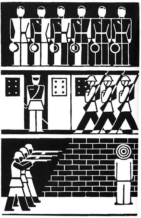
This is a guest post (in three parts) by a master of pictograms, the great Nigel Holmes. Parts 2 and 3 will appear on the next two Mondays.

Linguists, designers, social scientists, teachers, and a 12th-century nun, among hundreds (yes, hundreds!) of others, have invented what they hoped would be internationally-understood languages. None have lasted. Esperanto (by Ludwik Zamenhof, 1887) came closest; Klingon (by Marc Okrand, 1984) survives as a pop curiosity for devoted Star Trek followers.

Very few of the invented languages were pictorial, and those that were have not fared any better than their purely alphabetic cousins.

These posts are not about a history of writing that starts with 30,000 year-old cave paintings then runs through Sumerian sign-writing, Egyptian hieroglyphs, Mayan calendar icons and so on, but are about how we might return to using pictographs, pictograms, pictorial symbols, icons —to mention a few of the many names for these tiny pictures—to communicate with people from countries who don’t know what you are saying when you speak or write in your native Dutch or Swahili or English (or Esperanto).

For a picture language to be universal, thousands of pictures are needed. An argument against inventing such a language (a two-way communication) is that while it might be fine for someone equipped with those thousands of pictures to “write” in that language, the average person cannot “write” it. It’s a one-way, read-only communication.

There are tons of pictures to be drawn (or somehow produced) by the “writer” of a visual language, but can we be sure that those pictures mean the same thing all over the world? A house is easy to draw. Or the sun. Or a woman with her child.

How do you picture hope, or sin, or longing, or fertility treatments, or financial backing, so that anyone, anywhere can see the precise meaning?

I’ve drawn lots of pictorial symbols, and I relish the quirks of regular spoken and written language. Against what look like difficult odds, I have often thought of trying to create my own version of a way to communicate visually. My inspirations are three picture languages that have come closest to any success in the past: Charles Bliss’s Semantography (1949; Bliss later changed the name to Blissymbolics); Yukio Ota’s LoCoS (Lovers’ Communication System, 1964); and Otto Neurath’s Isotype (developed in the 1920s). Actually, Neurath never claimed that he was inventing a total language. When he spoke about Isotype, the graphic system that he created with Marie Reidemeister (later she was his wife), and Gerd Arntz, his leading graphic designer, Neurath called it a “helping language” rather than a complete substitute for the written word. Neurath and Isotype will be the subject of the second post.

Some of the Blissymbolics and LoCoS images are understandable pictures (house, fish, car, man, woman) but many others are a vocabulary of abstract marks that the inventors have assigned meaning to, such as a wavy line (horizontal = water; vertical = smoke), that can be combined with pictorial symbols to make “words” (house + horizontal wavy lines = flooded house; although it could also be houseboat).

But what if a pictogram of a wavy line is positioned horizontally next to a factory chimney, indicating smoke? Now a horizontal wavy line means smoke, not water. Another inventor might use a teardrop shape to mean “water.” Besides, in certain contexts, Bliss used a vertical wavy line to mean fire. Weather maps today use three wavy horizontal lines to mean fog.

When it comes to completely abstract marks—those which don’t look like anything we know—there’s a bigger river of meaning to cross. We have to learn what the inventor intends these marks to mean, in the context they are used. Many of them act like accents common to written languages. They also address the question of grammar in language. (For instance, a mark might let readers know whether a pictorial icon is a noun or a verb.) But the use of such modifying marks means that pictorial languages that include them aren’t truly visual. If you can’t read a text until you have learned how to read the marks, it’s just another language to learn, not one you can “read” by looking at the pictures. And that’s the point of an international picture language. It’s easy to read. By anyone.

In fact, are there any marks that are truly universal? You’d have thought that some, such as up- and down-arrows are. They mean up and down, right? But do we all agree on what that means? For Bliss, a picture of a heart with an up-arrow meant happy. A heart with a down-arrow meant sad. So he was using “up” and “down” as figures of speech. But in American Indian picture-writing the arrow looked like an archer’s arrow with feathers at one end and a sharp point at the other, and it meant “protection.” We can’t even assume that a simple thing like an arrow means the same thing to everyone.

So before finishing the design of any pictogram, designers should ask themselves and others—non-designers, if possible—this question: what else could this pictogram mean that I haven’t thought of? And if the image is part of a proposed universal language, designers must ask that question all over the world before claiming it has universal meaning.

In 1961, IBM introduced The Selectric typewriter with its revolutionary, interchangeable “golf ball” printing element, that replaced a normal typewriter’s basket of spidery arms with characters on the end of them that sprang up to hit the page. If you typed too quickly, the arms got tangled up. Initially there were 64 characters on the golf ball; later, the ball had 96 characters. Before the age of the computer, Bliss saw the possibility of a typewriter golf ball with his symbols on it.

Now his language could be typed —“written”— by anyone. Typewriter companies were already making machines with letters and numbers and also with a range of symbols for scientific communication. Mathematical, chemical, biological, astronomical and other symbols were available. Bliss’s golf balls were never made, but his idea that anyone could simply type his pictograms on paper was way ahead of its time. Of course, to come up with a set of pictograms that would fit on the ball was difficult. Bliss had to simplify everything pictorially, and the result looked somewhat like written words—a string of marks—except that they weren’t actual letters of the alphabet. He wrote long tracts about how to combine his pictogrammic marks to extend the range of possible “words.”

The icons in Yukio Ota’s elegant visual language, LoCoS, are designed in a way that could be written, with practice. But like Blissymbolics, LoCos combines simplified pictures with abstract marks that have to be learned.

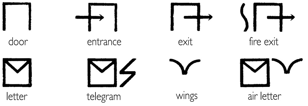
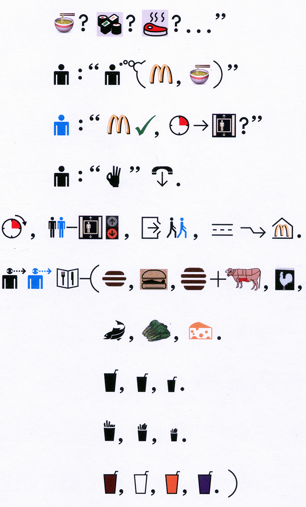
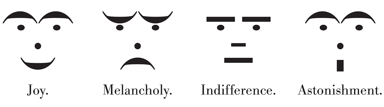
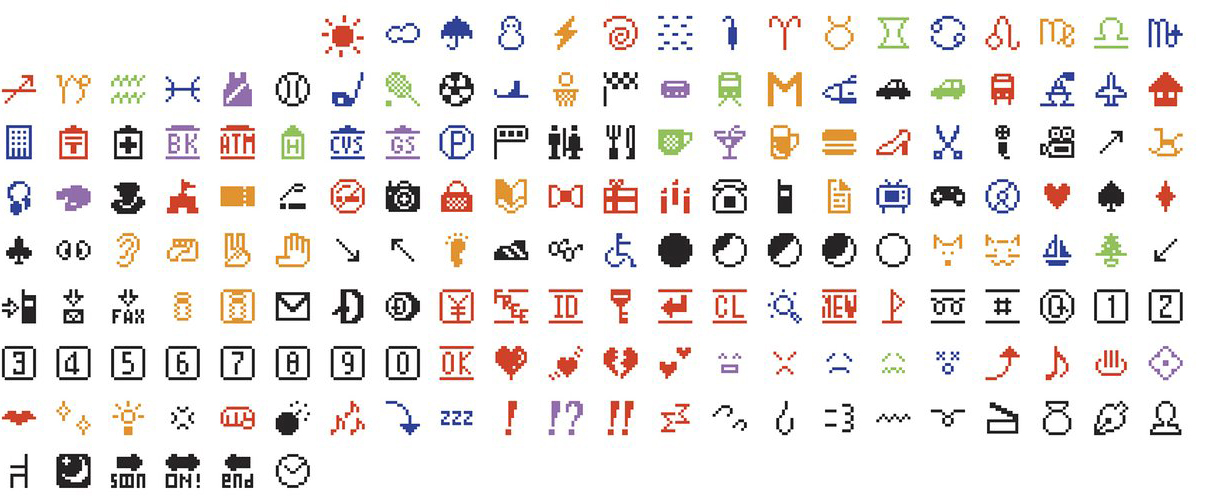
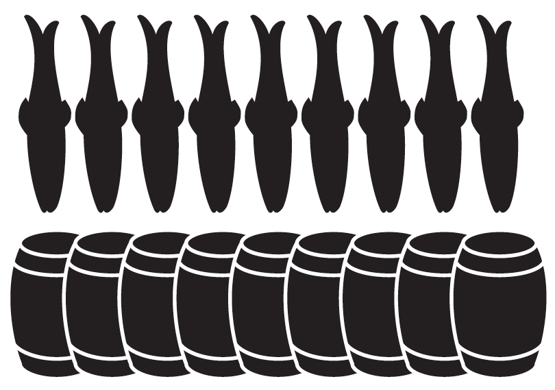
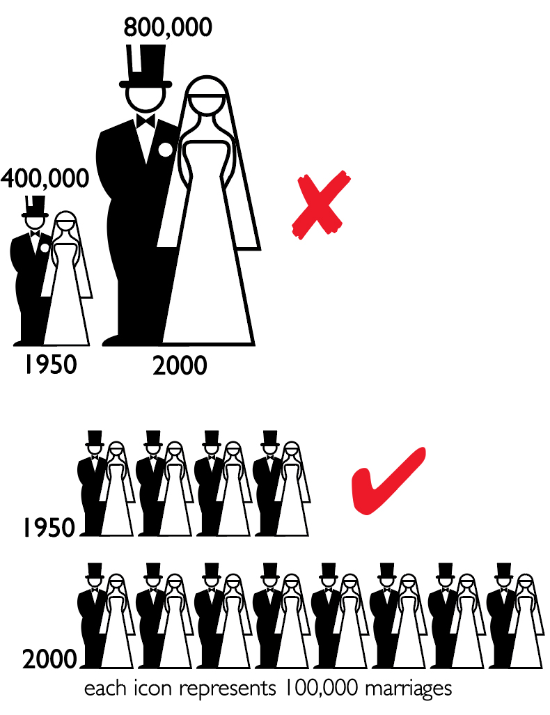
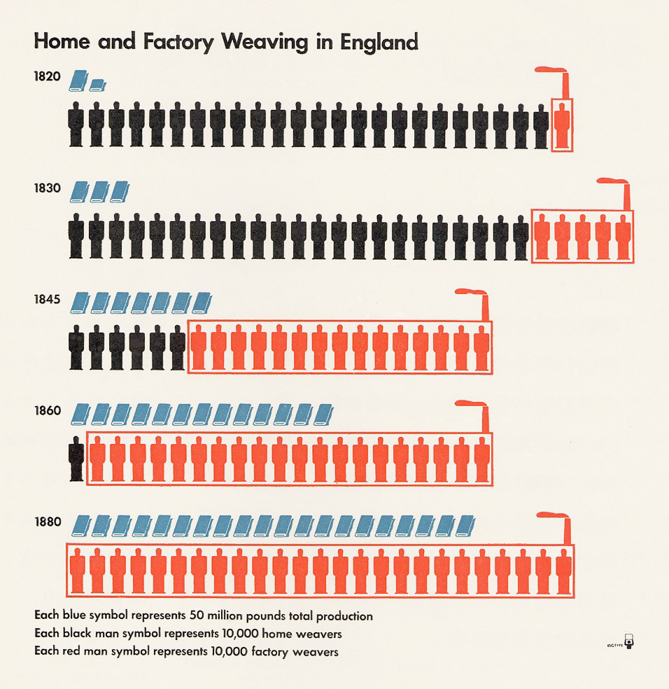
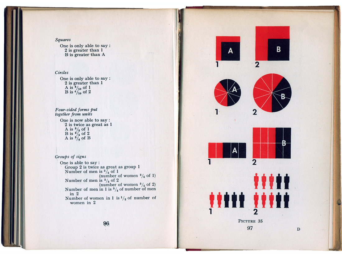
Any picture language excludes the blind—you can’t speak it or hear it—but perhaps we could consider a kind of braille version. Deaf people do have their own visual sign system, and there’s plenty of signage in airports, hospitals, zoos, at the Olympics, on the road—but that’s wayfinding, not a language. I hope we don’t give up on trying to design a whole universal pictorial language.

Ikea, the Swedish furniture store, hasn’t given up. They’ve attempted to make the instructions for their build-it-yourself items internationally understandable, eliminating multiple translations. However, it is good to know that for a modest sum, they will deliver the bits and pieces to your home and assemble them for you, thus preserving your sanity and fingers, and limiting the screaming of obscenities at the visual instructions. One day I may have the guts to show you my language. Then you can scream at me.

Worth reading: “In the Land of Invented Languages,” by Arika Okrent, 2009.

Next Monday: The Isotope revolution.


Animated

INFOGRAPHIC GIFS.

Although gratuitous motion in infographics has come in for a lot of criticism, it’s still true that animation can be very effective in a visual explanation. Here are a few examples that succeed in terms of grabbing our attention, and explaining something.

Engage our audience. Fun, humor, a little showbiz. I’m fine with all that, as long as we are clearly communicating some information.

Above: From egg to baby, by Eleanor Lutz. (There are only nine frames in this file.) This was in my very first post, about the history of infographics, as an example of the current era. (https://www.johngrimwade.com/blog/2016/08/22/this-blog-started-35000-years-ago/)

See more of Eleanor’s work here: http://tabletopwhale.com

Below: How fast does a spacecraft travel? Clay Bavor puts that incredible speed into a context that works for us all.

Engine combustion by Jacob O’Neill. See the whole graphic here: http://animagraffs.com/how-a-car-engine-works/

Who do Mexicans trust? By Pictoline: http://pictoline.com