
OTTO NEURATH AND THE MODERN PICTOGRAM.
![]()
This is the second post in a series about the search for a pictorial language, by Nigel Holmes.
Excuse me where’s the restroom? Moments later, I see the familiar icon of a man and a woman. Ah, relief. Most people don’t know that the grandfather of these welcoming little people is Gerd Arntz. (They probably don’t care much either, when nature calls.) Gerd Arntz’s boss was Otto Neurath.
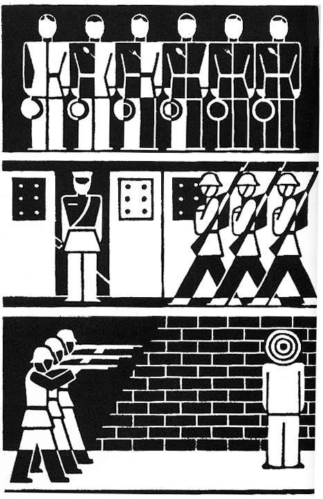
Mention Neurath to anyone who knows the name, and the kind of illustration that will come to mind was probably created by his brilliant collaborator (and toilet-icon grandfather) Arntz—an artist who made mostly black and white wood- and lino-cuts, and whose work still looks modern though he started working 90 years ago. (He died in 1988.)
But it’s Otto Neurath (1882–1945) who was the force behind the graphic information movement called ISOTYPE (International System of TYpographic Picture Education). It’s still a huge influence on information graphics and data visualization. Below is the well-known logo.
![]()
Neurath was a social scientist, not a graphic designer. True to the idea of this blog, he made “Infographics for the People”—the people of Vienna, in his case. In 1925, he founded the Gesellschaft und Wirtschaftsmuseum (Social and Economics Museum), and his exhibitions about social conditions in Vienna consisted of large hand-made charts and diagrams, and models. He understood that it was tiring for museum visitors to stand around studying dense abstract graphics about housing or industrial production. So he developed a way of announcing what his charts were about by adding pictorial elements, while at the same time presenting the statistics in them. Neurath’s effort to make his charts “statistically accountable” was prescient, and should be remembered today by anyone (including me) who includes recognizable pictorial elements in their information graphics. Neurath didn’t want anyone to think he was just making pretty pictures, although he was deliberately using pictures to attract the public’s interest.
In 1925, Marie Reidemeister joined Isotype as the research link between Neurath’s broad-brush ideas and the artists who actually made the end products, most notably Gerd Arntz, who became part of the team in 1928. Marie was the team’s “transformer”—the person who researched and edited the data to best express the stories that Neurath wanted to show his audience.
The Italian archeologist Emmanuel Anati (b.1930) has proposed that early humans learned to identify animal and human tracks in snow. He argued that they learned to “read” before they could write. Neurath used a similar approach when he said that the best way to draw icons of things was to use silhouettes, or profile—side views—of the things being depicted. In the beginning, he even suggested making images by cutting them out of black paper. This forced the artists to keep their images simple. And silhouettes were like footprints, or shadows—“reflections” of reality—documentary evidence, left by the real thing.
Apart from encouraging simplicity when drawing or cutting icons, there were graphic guidelines for the statistical arrangement of the museum’s charts. Today it’s often the surface look of Arntz’s work that’s copied (relentlessly!), while the original principles behind the work is forgotten. (Personally, I think Arntz’s beautiful and humanistic work is a major reason for Isotype remaining influential today, and I completely respect Neurath’s rules for the pictorial arrangement of statistics.)
The guidelines are detailed in Neurath’s “International Picture Language,” published in 1936. The book is written in Basic English. This is a list of 850 words (an average dictionary has about 25,000) and rules for using them, compiled by C.K. Ogden, published in 1930. Basic was intended to simplify English and teach the language to non-speakers. Both Neurath and Ogden were on the same track: ease of communication across all languages.
The main Isotype guidelines
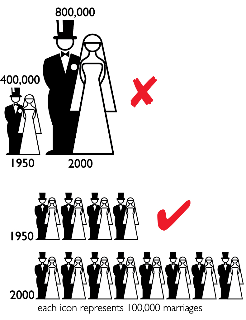
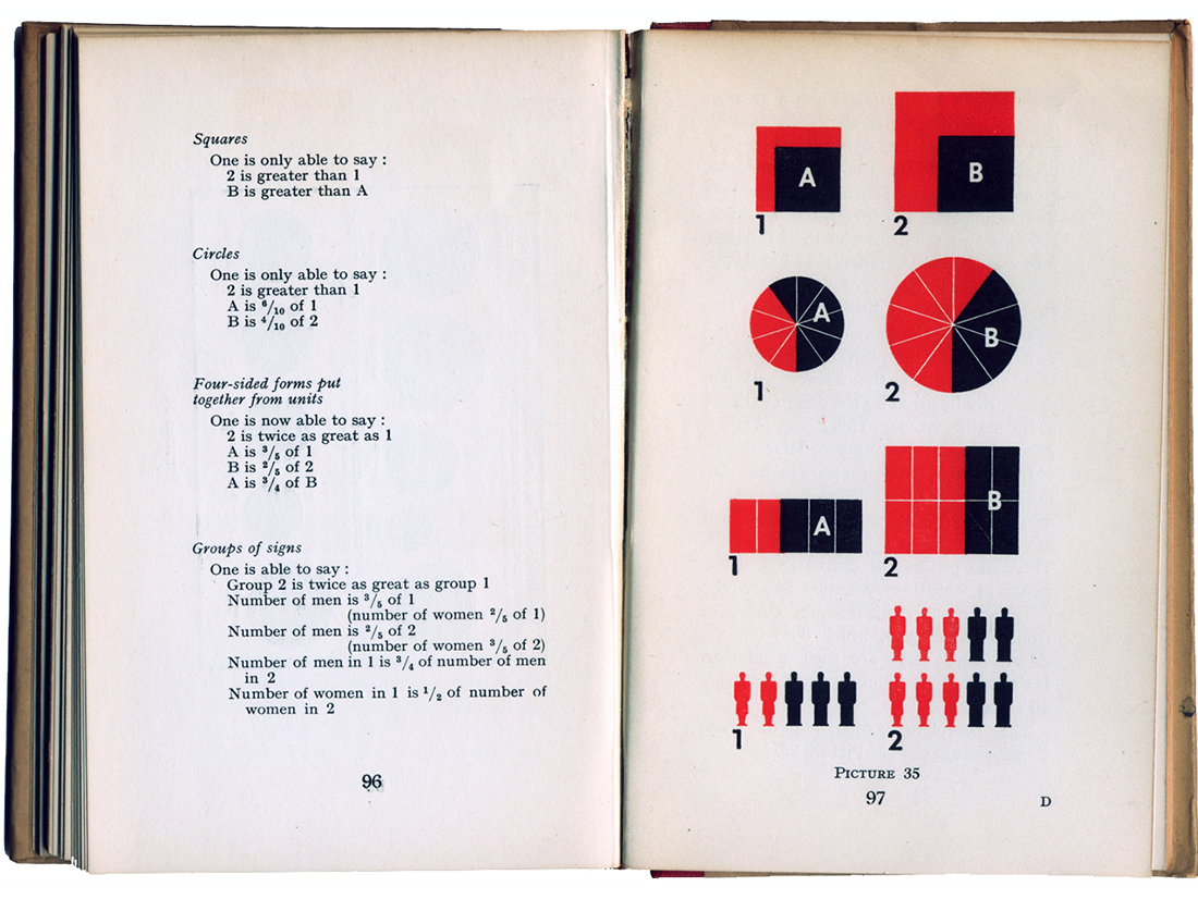
- Instead of using the length of abstract bars to denote quantities, Neurath used small pictorial icons of the commodities (or people) being charted. All icons in a chart, whatever they were depicting, were drawn to be the same height and width (and visual weight), so that when lined up in rows, one row of icons does not visually outweigh the others. Neurath’s desire to make his charts “statisically accountable” meant that you can not only see the subject of the charts (by seeing the pictorial icons), but you could count the icons and know the quantity indicated. All the icons had to be visually balanced so that your eye didn’t “favor” one row over the others.
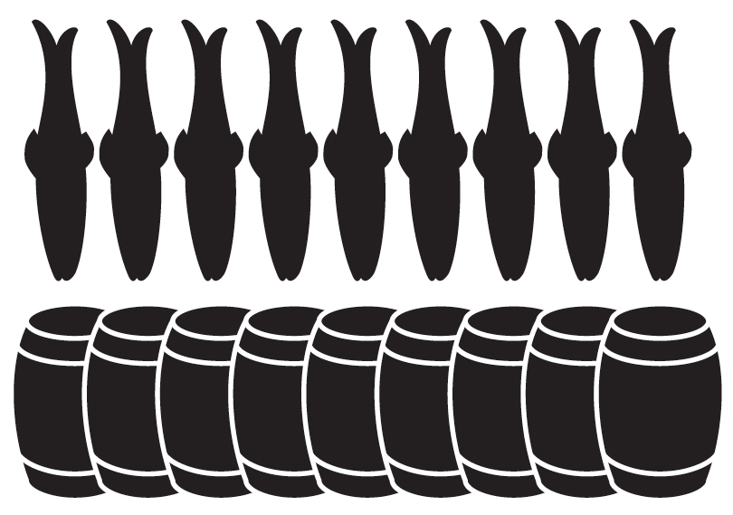
- Perhaps the most important guideline is that a greater quantity of something (traditionally shown by a longer bar) should be represented by a greater number of icons, not by enlarging them.
- For very large numbers, one icon could stand for many. Thus, if the legend on a chart said “one sign stands for 1 million,” then two icons represented 2 million, and so on. (Neurath, limited by Basic English, had to use the word “sign” for “icon.”)
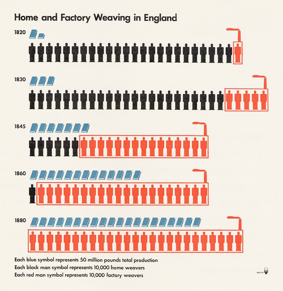
- Where possible, use a horizontal arrangement of icons rather than a vertical one.
- Circles of different sizes are not good ways to show different quantities.
- Many line, or fever, charts contain information that is useless, or misleading: the slopes between the plot points are just joining up the points, but contain no information. Bar charts are a truer representation of the data.
- Other guidelines were about the use of color. Neurath advised a severely restricted use. (During his working life, he often had to do this for many projects, because only black and red were available.) It’s still good advice today, at least at the start of a project, even if there’s no limit to the colors ultimately available. For Neurath, color was strictly used for information, not decoration.
Robin Kinross, author (together with Marie Neurath, who died in 1986) of “The transformer: principles of making Isotope charts” (2009), notes that Isotype guidelines really were guidelines more than rules, and that the team approached each job with them in mind, and that “the principles were continually affected by the challenge of new tasks.” Kinross adds that the overall point of Otto Neurath’s Isotype was “to make something intelligible and interesting.” That’s a principle that should drive all information graphics and data visualizations.
Worth reading:
“International Picture Language,” by Otto Neurath. 1936
“Modern Man in the Making.” 1939
“From Heiroglyphics to Isotype, a visual autobiography,” 2010 (Left unpublished at Neurath’s death in 1945.)
“The transformer: principles of making Isotype charts,” by Marie Neurath and Robin Kinross. 2009
“Gerd Arntz, graphic designer,” by Ed Annink and Max Bruisma. 2010
Next Monday, the final part of this series: Emojis and beyond.
4 comments
Comments are closed.