Supersign

MECHANICAL MEETS DIGITAL.

I wish I was getting one of these in my extremely large Christmas stocking. These classic mechanical split-flap information boards make a distinctive (and pleasant) clicking sound as the flaps turn over. Retro signage that is reborn in the digital age. As well as letters, punctuation and numerals, the flaps can display seven colors. Control the display from anywhere with the Vestaboard app, or connect with many other apps like Twitter and Slack. It also works with Alexa and Google Home.

The price is $2,250 in the U.S. Order one now for 2020 delivery (all units for 2019 are already sold).
https://www.vestaboard.com

Paper buildings

ARCHITECTURE RECORDED.

Drew Leshko recreates buildings from his Philadelphia neighborhood using paper and wood, working at a scale of 1:12. “Relics” is an appreciation of mundane and neglected buildings as opposed to the glamorous structures we usually see recorded with this level of detail. As gentrification comes to the area, Drew is making this record of structures that will be redeveloped or demolished. http://www.drewleshko.com

For “Broken Houses,” Ofra Lapid cut out printed images of abandoned buildings, fixed the pieces in place with wooden supports, and then rephotographed them against a neutral background. It creates a different, stark reality. The original images (from North Dakota) were found on Flickr. http://www.ofralapid.com/#/broken-houses/

Art Deco masterpiece
At the other end of the glamour scale sits the Chrysler Building. Build your own version from a postcard. Get it here: https://bit.ly/2TJGSr2

Many other New York landmarks are available: http://www.buildyourownnewyork.com/

Economic visuals

USING INFOGRAPHICS TO EXPLAIN GLOBAL BUSINESS.

This new book by Thomas Ramge and Jan Schwochow visualizes the key components that make up our complicated international economy. It’s published by The Experiment. Buy it here: https://bit.ly/2Lf6o6o

Here are three of the 99 graphics in the book. Below, worldwide poverty levels. (Click on the images to see larger versions.)

Product pipeline: The complex process of manufacturing cars.

Multi-national production, and a banana.

Some more pages can be seen on Google Books: https://bit.ly/2KSxNrQ

Thomas Ramge writes for the Economist. Jan Schwochow’s company, Infographics Group, produces the all-information-graphic magazine, In Graphics. Two previous posts about it: 

https://wp.me/p7LiLW-1mX
https://wp.me/p7LiLW-1n1

Infographics Group: https://infographics.group

Arrowmania

MORE EVERYDAY POINTERS.

Photograph © sergey novikov/123rf

Twin Arrows (below)
These 25-foot-long examples (7.6 meters) can be seen at the site of the Twin Arrows Trading Post on Route 66 in Arizona. The business closed in 1995 after Interstate 40 took away most of the passing traffic. In 2009, the arrows were renovated.

Photograph © giuseppemasci/123rf

Street direction
Frédérik Ruys, a longtime friend of mine, lives on this street in Utrecht (in the Netherlands). The traffic circle contains a large north arrow. Frédérik’s house is easy to identify, and clearly belongs to an infographics person, as it has a big pictogram of a bike on the roof.

By the way, the bike symbol contains the first initial of everyone who lives in the house (Frédérik’s family). An earlier post about an example of his visualization work is here: https://wp.me/p7LiLW-Ru

Home furnishings
Keep your books in position with an arrow going right through them. https://bit.ly/2KpV5W1

I came across this cushion in a store in Columbus (on one of my very rare expeditions away from my desk).

I need this arrow cube. It was designed by Kevin Dresser. https://bit.ly/2DVXIhP

So many variations
Julie Elman (a professor here in VisCom at Ohio University) used a lot of different arrow examples on this cover for Design Journal, the magazine of the Society for News Design.

Venetian arrows
Talking of VisCom, we’ve just been on a trip to Venice. The retro signage kept us heading in the right direction. Sometimes.

Photograph © federicofoto/123rf

Orientation
Multi-directional signs to distant locations are common at tourist places. Why? Not entirely sure what the answer is to that. Anyway, this one is in the Riviera Maya, Mexico.

Photograph © czekma13/123rf

An earlier post about arrows: https://wp.me/s7LiLW-arrows

Data mapping

JOSHUA STEVENS VISUALIZES THE WORLD’S CLIMATE AND ENVIRONMENTAL DATA.

Joshua creates compelling and important visuals for NASA’s Earth Observatory, where he’s the lead for data visualization and cartographic quality. Satellites provide the data that drives an impressive range of informative visualizations. They often illuminate key issues that our precious planet faces. See many more examples at: http://www.joshuastevens.net/

Cloud cover (above)
A subject that used to be dear to my heart: the likelihood of clear skies over the U.K. and Ireland. (I’m from England.)
https://go.nasa.gov/2CynLKv

Landslides
Satellite data every thirty minutes gives new insights into long-term patterns. https://go.nasa.gov/2yYaibh

Hurricane effect
Wind speeds as Florence churned across the Atlantic. See the full animation here: https://go.nasa.gov/2T1MAUS4g

Early spring
Climate change is bringing an earlier end to winter. https://go.nasa.gov/2PegKFj

Aerosol earth
Our fragile atmosphere faces many challenges. https://go.nasa.gov/2MsyDQl

Cyclone menace
The path of Tropical Cyclone Gita, which hit Tonga with winds of up to 145 miles per hour (233 km).
https://go.nasa.gov/2JbEVPp

Shrinking glaciers
A dramatic decrease in the size of tropical glaciers. https://go.nasa.gov/2yWp6Yh

Joshua helps to run the subreddit, dataisbeautiful: https://www.reddit.com/r/dataisbeautiful

Master of letters

CREATIVE TYPOGRAPHY BY JOSEPH ALESSIO.

Hand-crafted lettering that gets a very high score on my (very unofficial) design-engagement scale.
See more at http://josephalessio.com  and on Instagram: https://www.instagram.com/alessio_joseph/

Above, a promotion for a design event, the Circles Conference.
Below, come on everyone, we can do it!

An experimental tools and hardware alphabet that shows lessons learned as a freelancer.

The process.

The same set of materials is used to create the various characters.

A physical interpretation of a short composition by Claude Debussy,“La fille aux cheveux de lin,” and a quote, attributed (perhaps) to Plato.

For a “Small Business Saturday” campaign.

Painter’s tape on a freshly painted wall.

We all love tax day.

Personal data viz

ANALOG WAYS TO SHOW THE PATTERNS IN EVERYDAY DATA.

Giorgia Lupi and Stefanie Posavec’s latest collaboration is Observe, Collect, Draw!: A Visual Journal. The book shows how anyone can have fun collecting personal data, and then use a simple non-software approach to display it. This is a natural development from the ”Dear Data” project described further on in this post.
Read more here: http://giorgialupi.com/observe-collect-draw/
Buy the book: https://amzn.to/2Op4C4S

Dear Data was a year-long analog exchange of ideas. Stefanie (London) and Giorgia (Brooklyn) mailed each other weekly data viz postcards. On the front was a hand-drawn visualization of an aspect of personal data. On the back was an explanation, and a key to understand the data. The project later became a book. Below, the covers from the U.S. and the U.K.

A few of the 104 postcards that crossed the Atlantic. Below, Week 26.

The cards from Week 50.

Read more here: http://www.dear-data.com/theproject/
Buy the book: https://amzn.to/2ynXmMx

Beautiful pencils

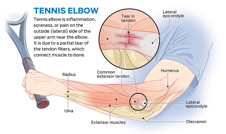
GO ANALOG, GO GRAPHITE.

I can never get enough good pencils. These ten examples, and lots of additional must-haves, are available at CW Pencils: https://cwpencils.com
Next time you’re in Manhattan, visit the store at 15 Orchard Street, NY 10002

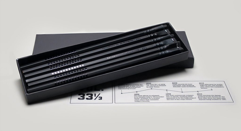
Palomino Blackwing Volume 33 1/3 (shown above)
A fabulous pencil inspired by vinyl records.

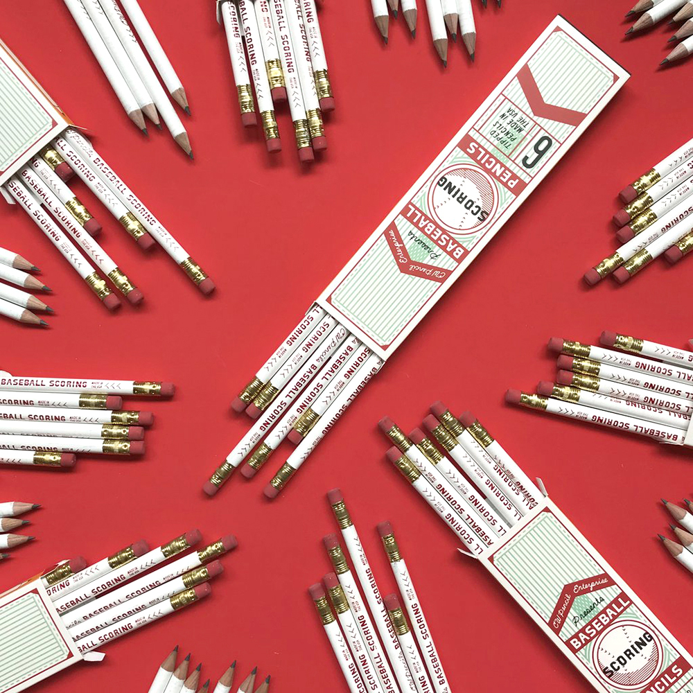
CW Pencils Baseball Scoring
Made by the General Pencil Company. This season is almost over, but keep score next year with these.

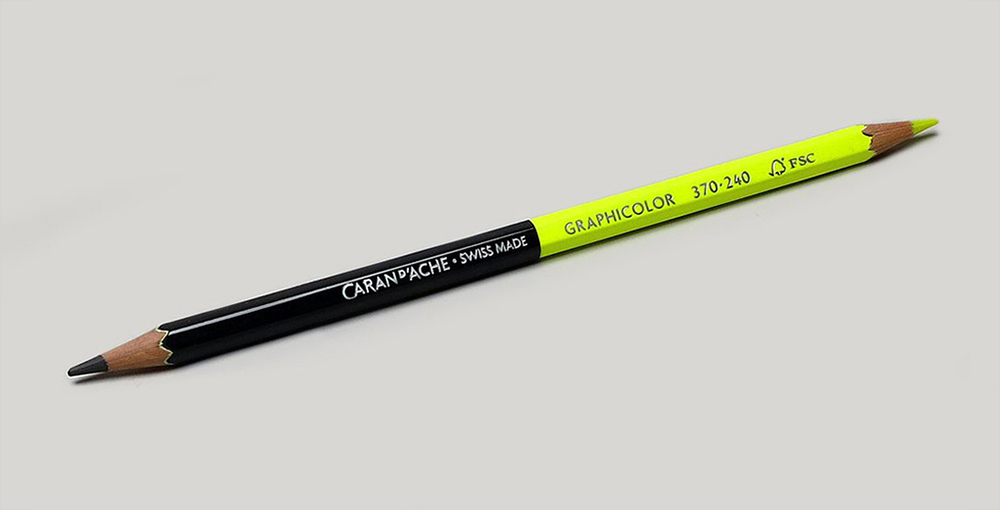
Graphicolor Highlighter/Graphite
Double-ended for notating or studying.

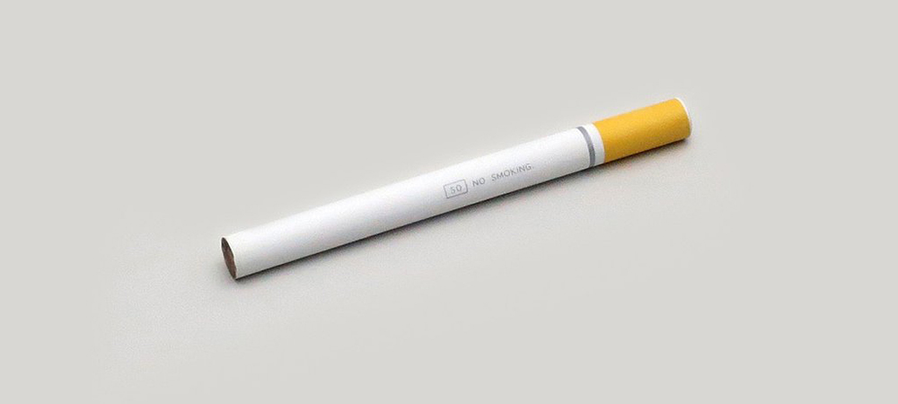
Eye Ball “No-smoking”
A 3 1/2 inch mini-pencil.

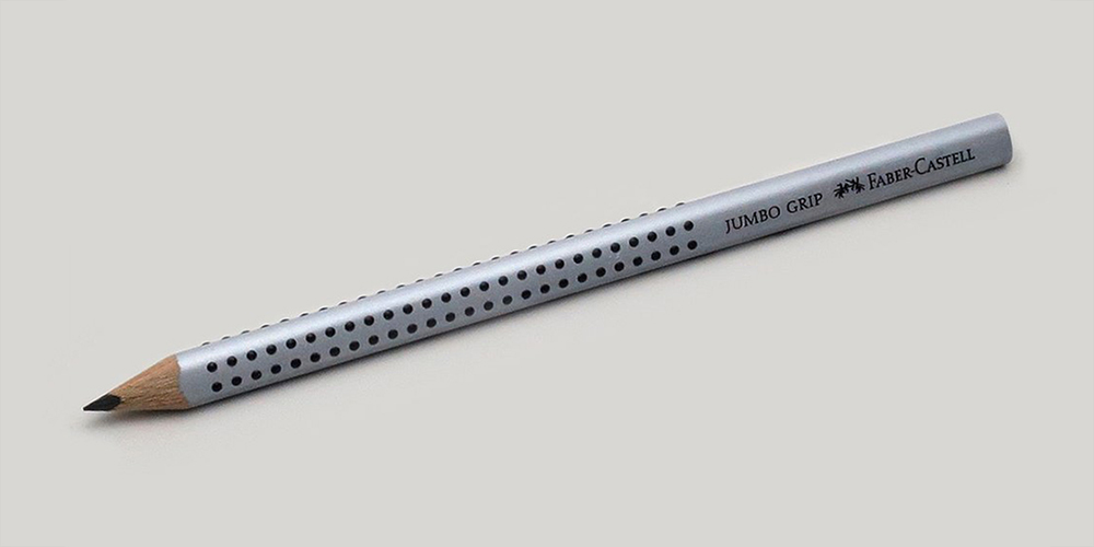
Faber-Castell Grip 2001
Soft-grip dots on a triangular barrel.
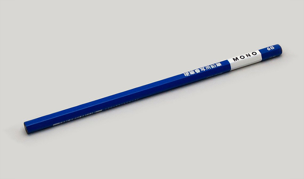
Tombow Mono KM-KKS
This pencil (from Japan) has a thicker graphite core that’s especially good for calligraphy.

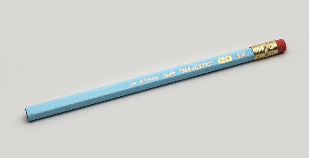
Hester & Cook Majestic Jumbo #2
Love the retro color.

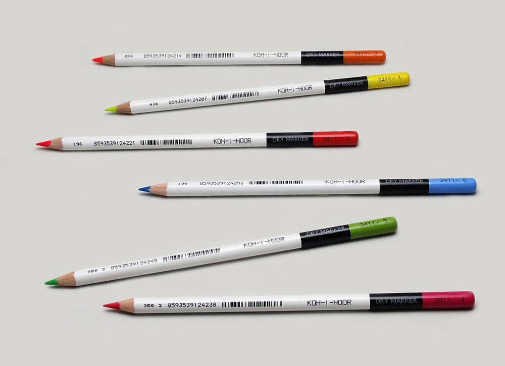
Koh-I-Noor Dry Marker Highlighter
Another pencil for notation, editing etc.

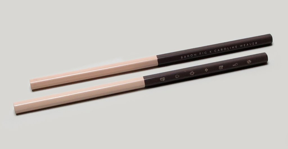
Archer Limited Edition Elements
A collaboration between Baron Fig and Caroline Weaver, who is the owner of CW Pencils. On the barrel are icons of the six elements used to make the pencil.
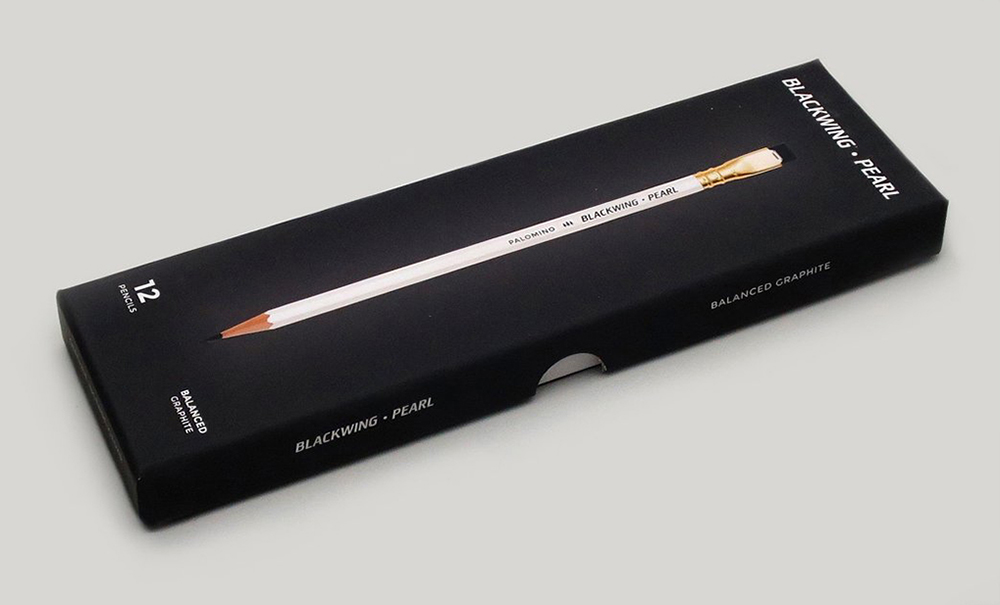
Blackwing Pearl
A little softer than the legendary 602, which was featured in a previous post, “The ultimate pencil:” https://wp.me/p7LiLW-4a

A post about the CW Pencils store,“Pencil Power:” https://wp.me/p7LiLW-pe
The store has moved since this post (see new address above).
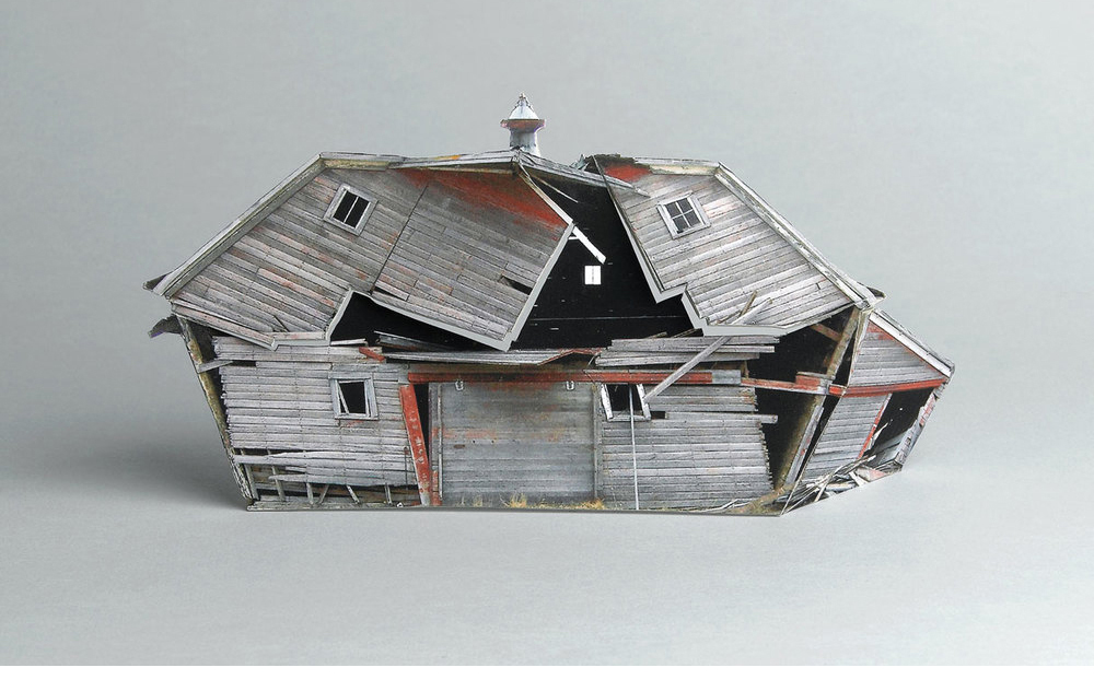
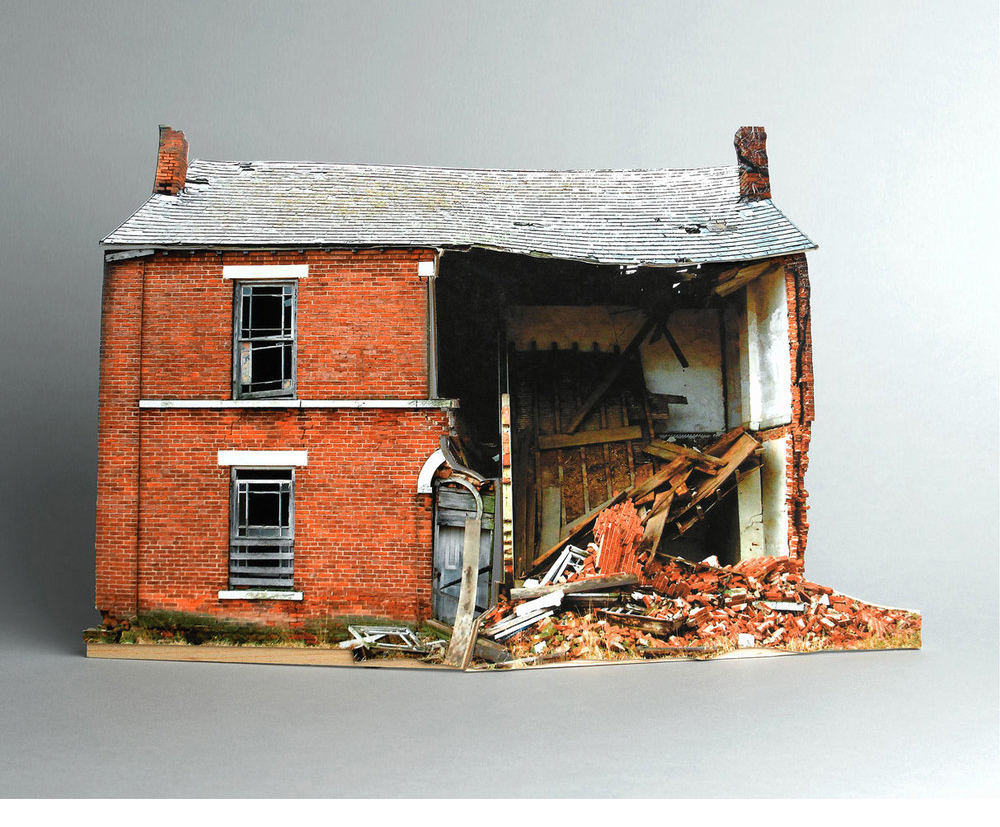
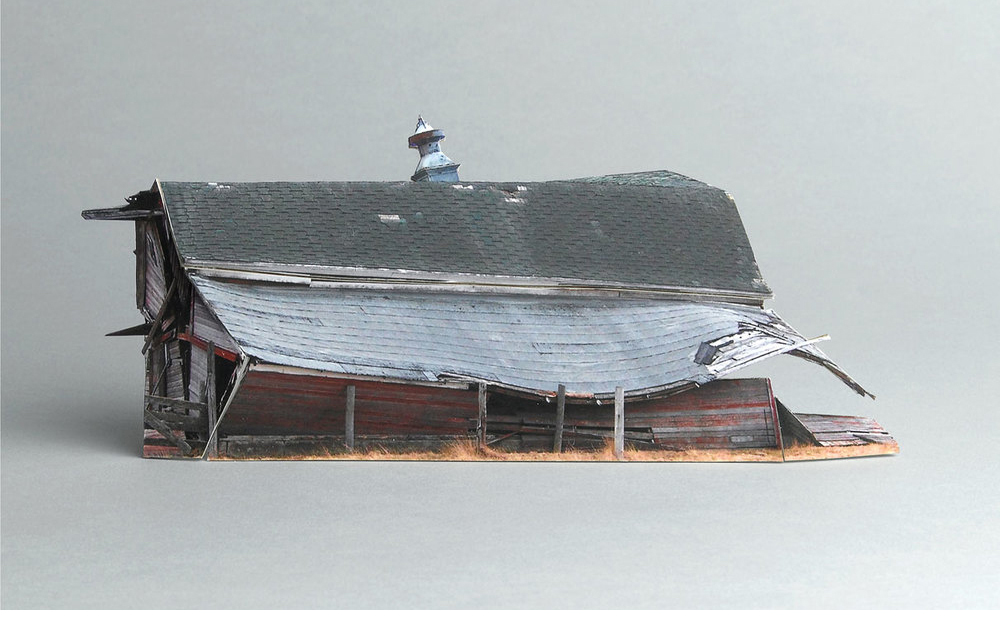
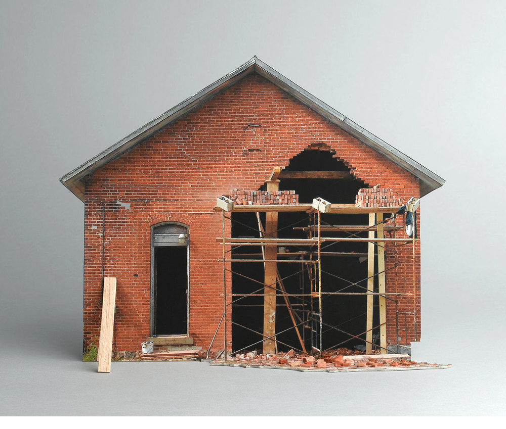
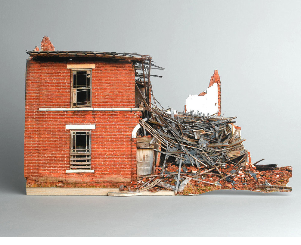
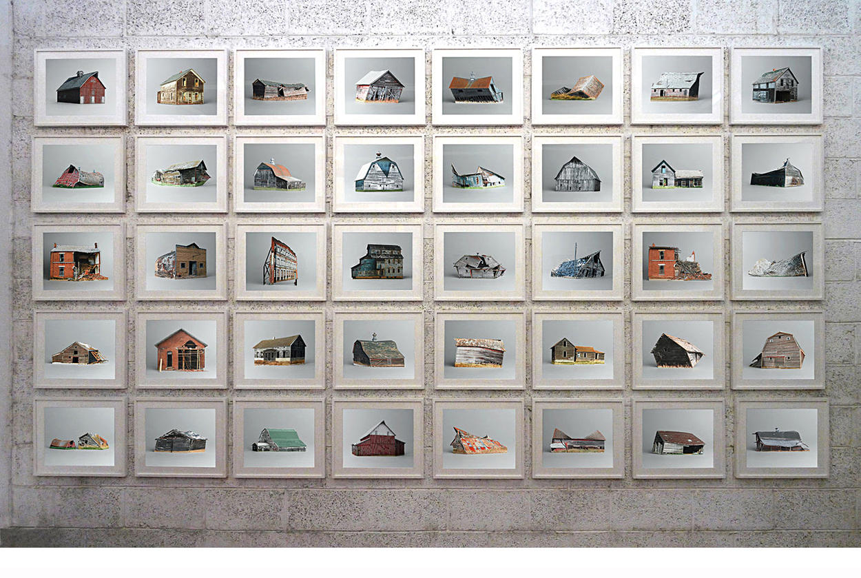
The infographic family

VISUAL EXPLANATIONS FROM 5W INFOGRAPHICS.

The Velasco brothers (Juan, Samuel, Pedro and Martín) combine their talents to make clear and engaging infographics and data visualizations. Here’s some examples of their work. See more at: http://www.5wgraphics.com 
Their blog: https://5wvelascoblog.com 

Above, American Museum of Natural History. Below, Science & Vie magazine.

Nuclear Energy Encyclopedia. (The Emirates Nuclear Power Corporation.)

Reader’s Digest magazine.

Nature magazine. Click on the image for a larger version.

From a Scientific American book: The Zoomable Universe. https://bit.ly/2EfkySK

The New York Times.

Sukle Advertising & Design, for Esteem Hearing.

AARP The Magazine.

This space exploration timeline for National Geographic appeared in an earlier post about timelines: https://wp.me/s7LiLW-timeline
Click on the image for a larger version.
(By Sean McNaughton, Samuel Velasco (5W Infographics), Matthew Twombly, Jane Vessels and Amanda Hobbs.)

Malaria Vaccine Initiative.

UNICEF.

Juan and Samuel produced this superb book of cutaways for Gestalten: https://wp.me/p7LiLW-qF

Learning experience
Juan has led three excellent workshops for Ohio University students. I highly recommend the 5W professional workshops: http://www.5w-consulting.com

Marble and bronze

FICTIONAL IDEAS MADE REAL.

Imagine a museum where comic-book legends are commemorated amongst important historical figures. It adds a blast of reality to the whole superhero idea. Leo Caillard created these digital marble and bronze busts, and photoshopped them into the Louvre’s galleries.
https://www.leocaillard.com

Below, a monument to the famous Staten Island Ferry Disaster of 1963, when a giant octopus dragged a commuter boat under. Of course, this event never happened. Made by Joe Reginella, the monument was placed at an appropriate spot, Battery Park in Manhattan, where you can see the ferries coming and going. Many tourists were understandably confused by this pop-up memorial.

Clearly, it must be inspired by Jules Verne’s 1870 novel, “20 Thousand Leagues under the Seas,” or perhaps by the 1954 movie (which dropped the “s” at the end). In this classic poster, a massive giant squid attacks Captain Nemo’s submarine.

Fake museum website: http://www.sioctopusdisaster.com/memorial.html
The disaster occurred on the same day as the assassination of President Kennedy, which is why it was lost in the news. The real Cornelius G. Kolff ferry was retired in 1987, used as a prison ship until 1997, and scrapped in 2004.

A typical Staten Island Ferry.


Photograph by Rachel So.

Editor’s note: Some people wonder why I sometimes have design and art-themed posts (like this) on an infographics blog. Well, it’s because I believe that we have to be aware of all things visual in order to create our best infographics and data visualizations. These general influences make our work better.