Month: November 2017

Aerial visions

BERNHARD LANG REVEALS THE PATTERNS WE MAKE.

With their straight-down viewpoints that create almost two-dimensional scenes, Bernhard’s photographs reveal surprising insights about our effect on the planet. Above, Adria, an Italian beach resort. Below, fish farms in Greece.

Suburban houses in North Rhine-Westphalia, Germany.

The “Mar de Plástico,” a massive greenhouse complex in southeastern Spain.

Rowers near Munich, Germany.

Industrial storage in North Rhine-Westphalia.

Miami, Florida.

A marble quarry in Carrara, Italy.

Tulip fields in the Netherlands.

See many more images on Bernhard’s website: http://www.bernhardlang.de

Instagram: https://www.instagram.com/blangphoto/

Facebook: https://www.facebook.com/Photography-Bernhard-Lang-251075035099935/

All photographs © Bernhard Lang.

Symbol art

CREATIVE PICTOGRAMS.

In my office, I have a beautiful soccer ball, designed by Ryan McGinness. And no one is kicking this “Bucky Ball” down the VisCom corridor.
I will never even take it out of the box. Ryan uses pictograms creatively in his artworks and installations: http://www.ryanmcginness.com

Sign Trees (2015), a set of reflective signs shown at the Silas Marder Gallery in Bridgehampton, New York.

Wayfinding (2017), an art installation at a Detroit skate park.

Hand-crafted symbols have a lot of appeal, as you can see in the examples below.

Balloons Masayoshi Matsumoto’s animals. https://www.instagram.com/isopresso_balloon/


Flowers
Insects by Raku Inoue. https://www.instagram.com/reikan_creations/


Axes
These hatchets are hand-painted by Peter Buchanan-Smith. http://www.bestmadeco.com

Breakfasts Instagram users submitted their favorites, and Reina Saur made 100 of them out of paper. One each day, until the project was completed. A selection of them are shown below.

http://www.reinasaur.com

DNA

PRINTING THE GENOME, AND THE DOUBLE HELIX STORAGE SOLUTION.

The Wellcome genome bookcase 118 books, each a thousand pages long, contain the 3.4 billion letters of DNA code that make up the human genome, displayed in a type size of 4.5 pts. The bookcase is part of the Welcome Collection in London.


Photograph by Russ London.

The books are numbered for the 22 pairs of chromosomes, plus X and Y. Below, the male karotype.


National Human Genome Research Institute.

Ultimate storage Our DNA carries all this information with an incredible degree of compactness. As a result, researchers are developing techniques to use DNA to store data. A single gram could potentially hold 215 million gigabytes. The artificially created strands can be read by sequencing machines. Another big plus is that DNA has the potential to last for hundreds of thousands of years, if stored correctly.

Below, the first published illustration of the double helix (in “Nature,” 1953), illustrated by Odile Crick. She was married to Francis Crick, who discovered the structure of the DNA molecule with James Watson.

A more developed version from “Nature” in 1968.

A replica of Crick and Watson’s original DNA model.


MRC Laboratory of Molecular Biology.

Crick’s original drawing.

Data storage footnote Back in the early 1980s, 10 megabyte storage was really something (and really expensive).
That’s about $10,000 in today’s dollars.

This computer from the late 1970s cost $24,000 (adjusted for inflation).

Color wheels

TRADITIONAL THEORY FOR ARTISTS AND DESIGNERS.

Above,“Farbkreis” from “The Art of Color” (1961), by Johannes Itten, a Swiss painter and theorist who taught at the Bauhaus. This 12-hue circle is made up of three primary, three secondary and six tertiary colors.

“The Color Star” (1986) has eight disks with cut-outs that can be rotated over Itten’s star to compare colors.

Now we have so many excellent digital color aids, like Adobe Color: https://color.adobe.com/create/color-wheel/

But… I still remember art theory classes way back in art college. They were not that easy (we used to moan about them), but in retrospect, it was important knowledge. The basic concepts: primary, secondary, and tertiary colors (primary and secondary mixed). Hue, saturation, temperature, and so on. I know I sound like a dinosaur (and I do certainly fit that description), but I wish my students had a color theory class. These are valuable lessons to learn.

Color Wheel 101: Complimentary colors are opposite each other. Analagous colors are next to each other. White, which represents all color, is in the center.

Some historical examples:

From “The Natural System of Colors” by Moses Harris, 1776.

From “Theory of Colors” by Johann Wolfgang von Geothe,1810.

From “The Principles of Harmony and Contrast of Colors” by Michel Chevreul, 1839. A 72-part circle.

“Color Panel” by Wilhelm von Bezold from “The Theory of Colors in Arts and Crafts,” 1874.

There are many online color wheels like this one, in RGB: goo.gl/xeK49A

And analog ones are available, like this: goo.gl/CQjvDd

A previous post about the color books used to choose CMYK colors in the pre-computer era: https://wp.me/s7LiLW-cmyk

Jack Medway

A CHANGE OF INFOGRAPHIC IDENTITY.

Above, Professor Jack Medway, a leading authority on data visualization and infographics. Below, his famous blog.

For IC14, the Dutch infographics conference, the organizers decided (correctly) that as I had presented at the six previous conferences, it was time for someone new. Then Frédérik Ruys had the idea that I could still be part of the program if I appeared as someone else. A change of identity began there. Frédérik created a blog so that I could rant on about infographics for a few weeks before the conference. As an opinionated professor from the (fictitious) University for the Graphic Arts in London. The blog title was my chance to make an over-the-top statement, which later became the more focused “Infographics for the People.”
It’s still online: http://www.jackmedway.co.uk

There was even a Facebook page for Jack.

Below, the conference program, with two very big data viz names in front of me.

I promoted a fake yet-to-be-published book: “Information and Art” on the blog…

…and referred to my real self in one of the posts.

On the day of the conference, I appeared on stage after being given a new look (and a lot more hair) by a professional makeup artist. A video of the transformation (in reverse) is here: goo.gl/d27R8Q

Some people were fooled, some were skeptical, but it was a lot of fun. I even criticized my real self during the presentation. “I’m sick of hearing Grimwade’s opinions on infographics. What makes him such a big authority?” (To be honest, that has a ring of truth about it, so let’s move quickly on.)

Why Jack Medway? Jack is a form of John, and I lived for a number of years in the Medway Towns, which are a group of towns on the River Medway in Kent, a county in south-eastern England.

UGA is a reference to UCA, the University for the Creative Arts, which is the modern name for the place where I studied Graphic Design. I used Walthamstow Town Hall as a stand-in for the UGA campus. (Photograph by Russ London)

Pop-up

MASTERFUL PAPER ENGINEERING BY PETER DAHMEN.


Above, a promotional piece for Lexon, a creative printing company. (Graphic design by Bigwave Media. Image courtesy of Highcon.)

Peter starts working with rough prototypes as he develops these precise folding designs. “Don’t give up if you fail. I fail a lot of times.”
And it’s all about the reveal of the design: “I’m most interested in the movement. Make the movement the beautiful thing. I call it the magical moment.”

Below, six personal projects.

Flower & Crystal. The client was Highcon for the trade show Print China 2015.

A color version for the trade show DRUPA 2016 in Düsseldorf.

Also for Highcon.


For Volksbank Vorarlberg.

“For Iggesund Paperboard, I created a greeting card, which is also a foldable decoration. It can be used to create thousands of different snowflake images. In total, 44,716 different snowflakes. (If you are interested in the mathematics behind this project, you can download a PDF file with the exact calculations here: https://peterdahmen.de/wp-content/uploads/2016/12/snowflake-calculations.pdf.)”

Peter’s website has many examples, and tutorials if you want to try making something yourself: https://peterdahmen.de/en/

A video interview: https://vimeo.com/98760774

Wall charts

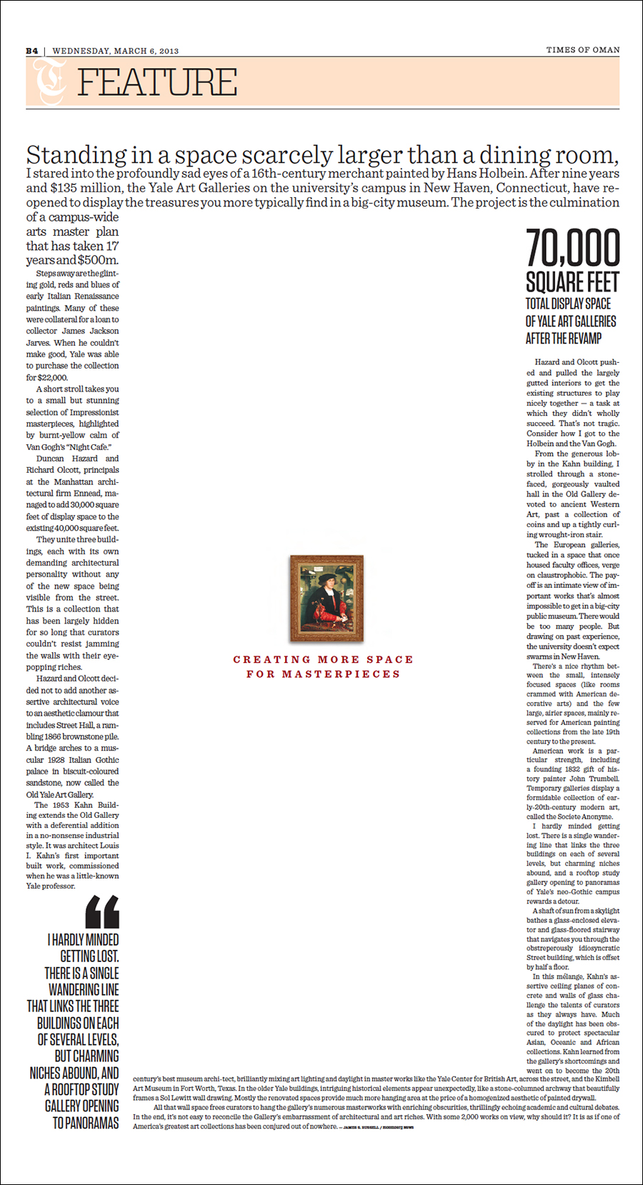
IMPRESSIVE EXAMPLES FROM THE LAST CENTURY.

It’s time for another visit to Michael Stoll’s superb collection of historical graphics. Before the computer, these big infographics were essential teaching aids. Of course, their (mostly inferior) descendants are common in classrooms today. I asked Michael for his general thoughts about this genre and some comments about these examples.

“Wall charts are a dying species in an era where everything is digitized and online. This is a shame, because having something physically present in a classroom and encouraging a conversation about it, makes more of an impression than a screen, especially as these charts are so large.

I remember being sent by a teacher to the wall chart room at our school to get a particular example. I spent more time just looking at the other charts (there were a huge number of them) instead of concentrating on the task. As a teacher myself, I often wonder how other teachers used these charts to explain things to their pupils. A wall chart can be seen as a didactic element. It emphasizes visualization over explanation. Wall charts were also used as promotional material by companies, that wanted to enable deeper understanding of their products, or provide background information.”

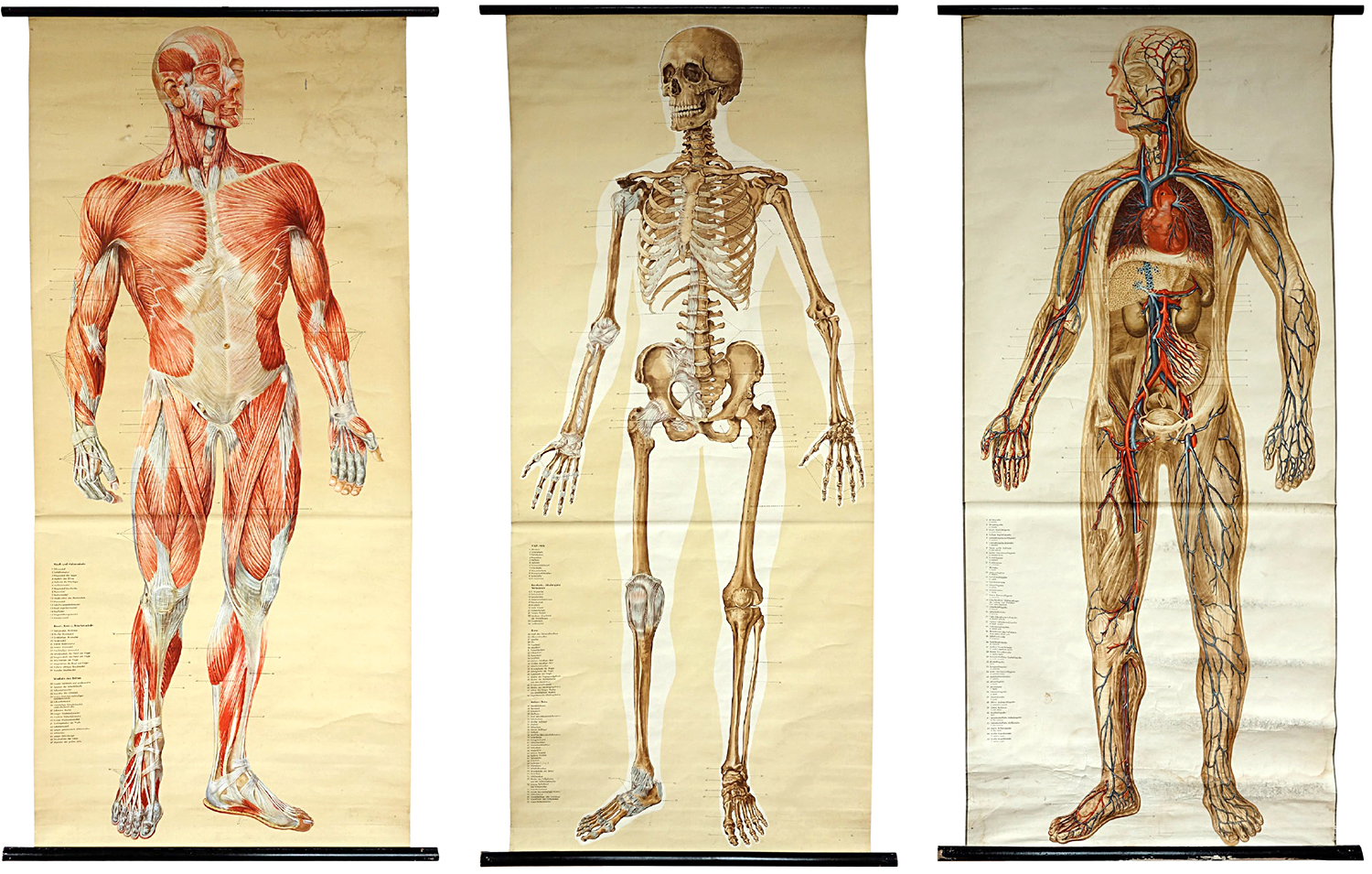
Anatomy (Shown above) Naturalien und Lehrmittel, Anatomie, Biologie Tanck & Wegelin, Hamburg Altona. c.1950
“These are considered to be the most accurate anatomical charts. While each one will work on its own, I love the effect of the series. The reader can jump between them and make comparisons or draw conclusions.”

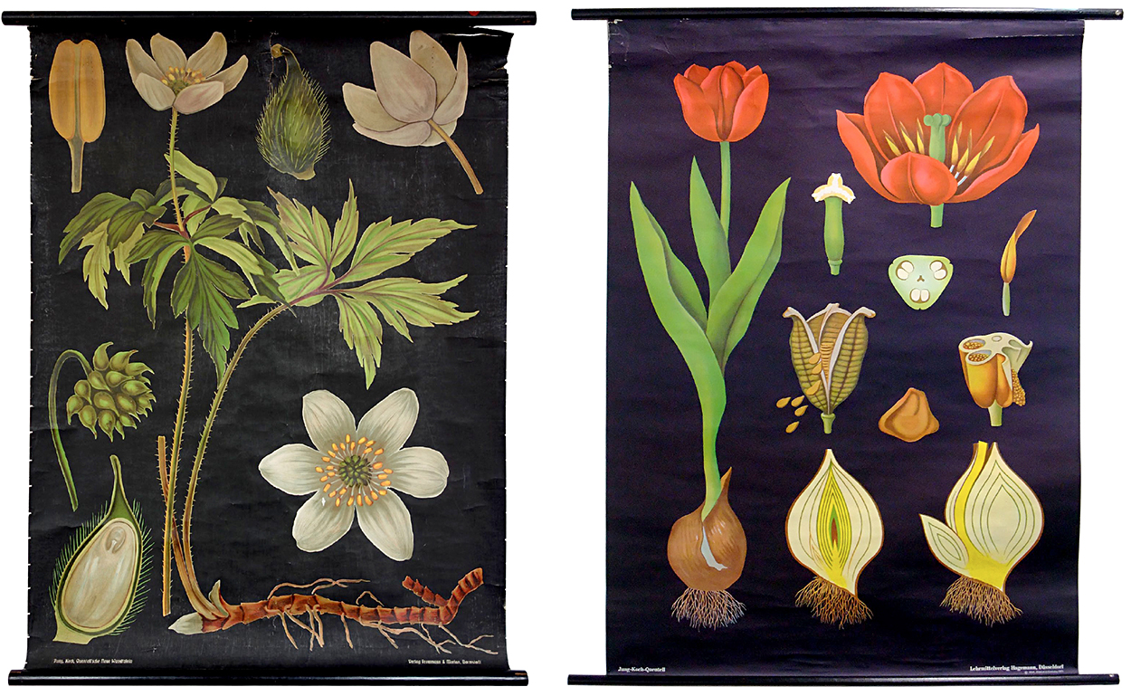
Botany (Shown below) Jung, Koch, Quentell—Lehrmittelverlag Hagemann, Düsseldorf. c.1963
“Two rather old examples from the world-famous publisher. While the newer ones are offset printed, the older ones were produced using lithographic printing, which provides a lot of detail. The arrangement is fascinating, in that the chart still works although the parts of the plants are not to scale. This is called adaptive scaling. And the items stand out clearly against the black background.

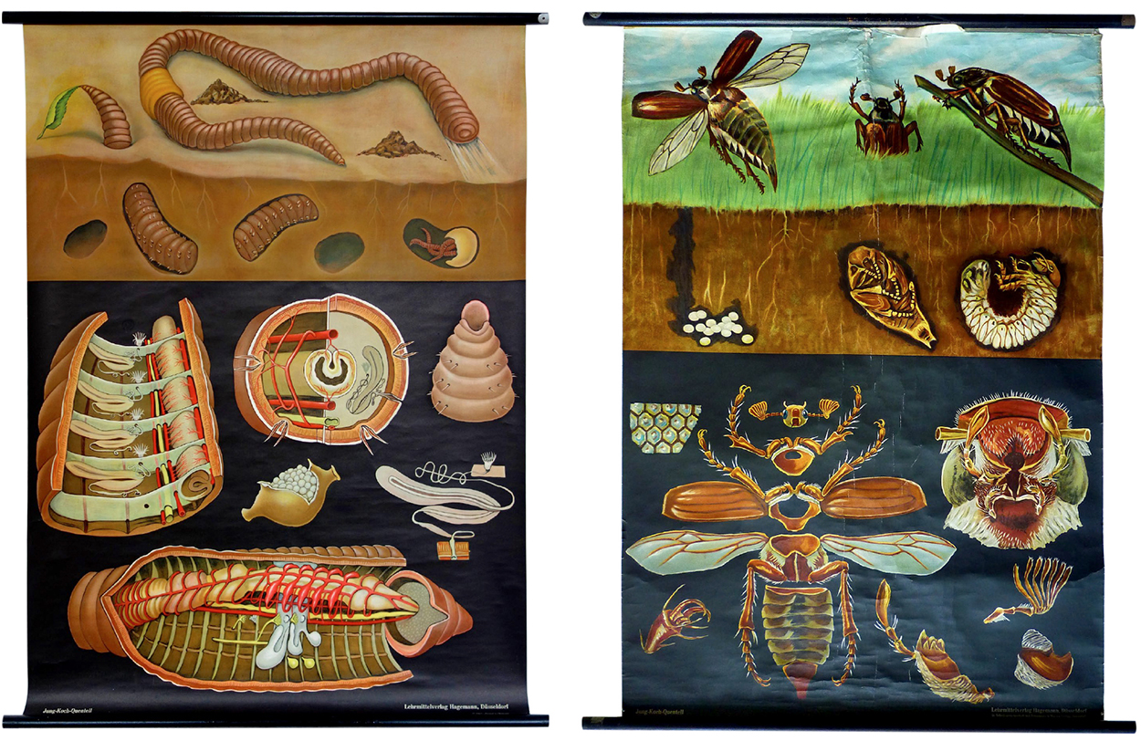
Insects Jung, Koch, Quentell. c.1963
“The layout is set up in three logical stages: what we normally see (which references what the reader recognizes), what is going on hidden from the human eye (which connects this information to what we normally see), and a very detailed deconstruction of the animal (which has the highest density of information).”

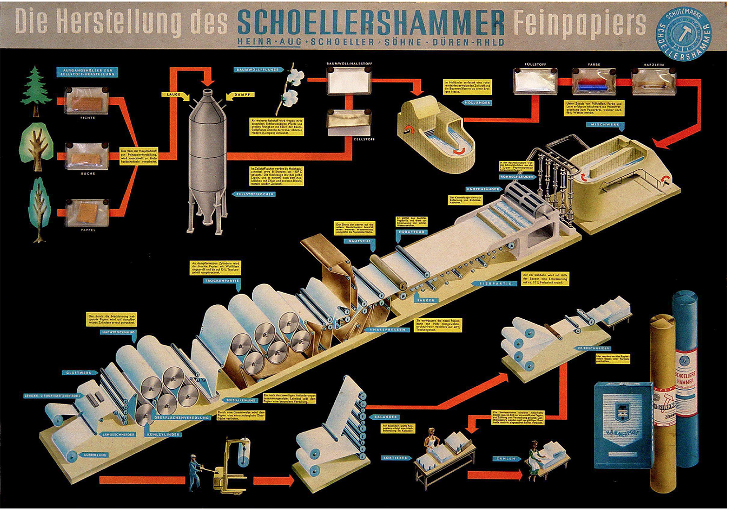
Paper production “Mounted onto stiff cardboard, this chart takes one further step: there are samples of real wood, chemicals and colors sealed in small plastic bags which are attached to the poster.”
(Editor’s note: I’ve used the red line a lot in my graphics: http://wp.me/p7LiLW-IP)

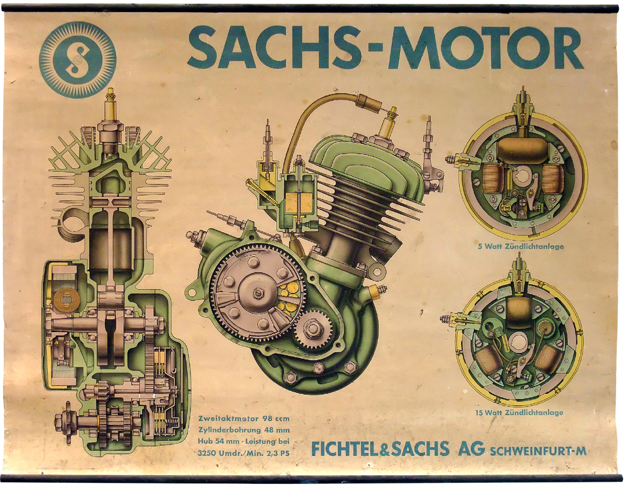
Engine Beautifully rendered, lithographic printing. Larger than actual size. This scaling allows more detail.

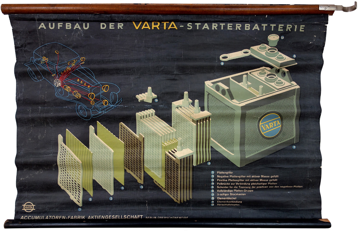
Battery “Also printed using the lithographic process. The car diagram shows the relevance of a battery like this. This chart is a visual depiction of how important electricity was for cars back then.”

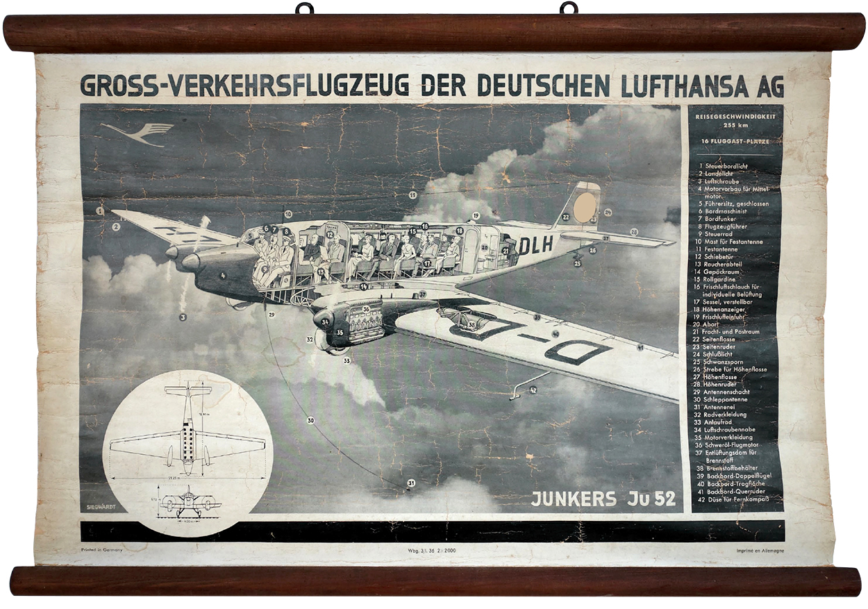
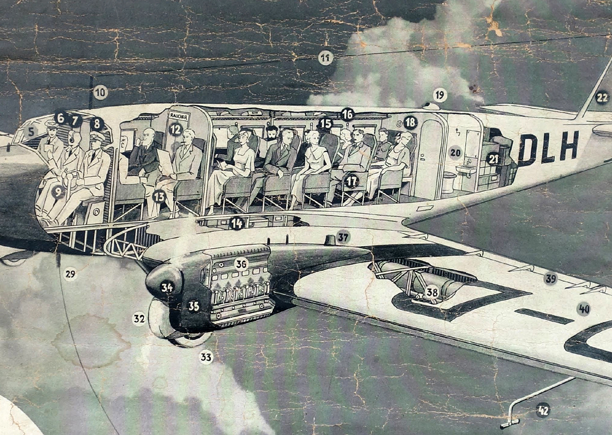
Aircraft “The chassis of this plane was made entirely from aluminum. I followed this example on eBay, and the price skyrocketed. I eventually bought it, but wondered about the high price. So I contacted the manufacturer, and found out that these charts were delivered with the aircraft. And there were only two models with these engines delivered.”

Detail.

The much more common Ju52/m3.
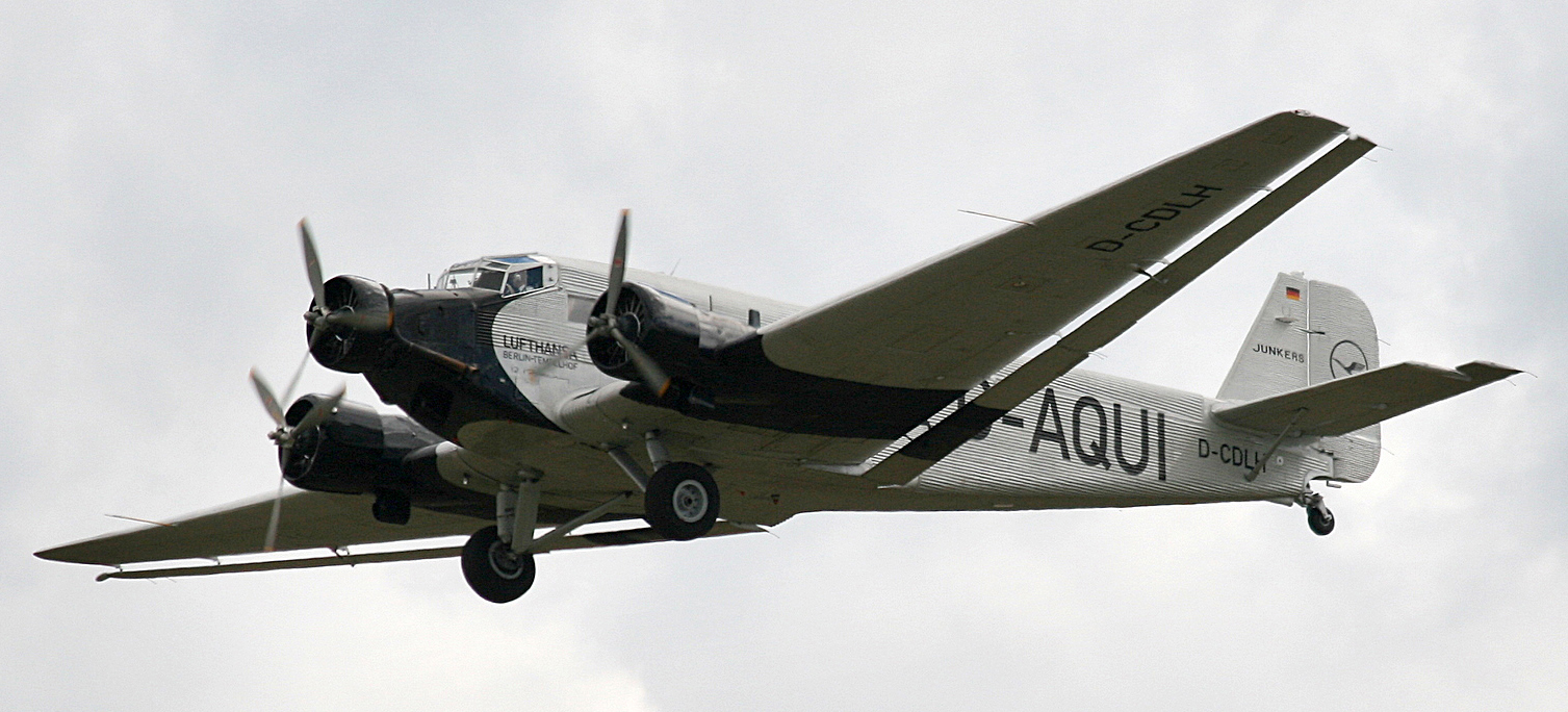

Photograph by Rror.

Previous posts from Michael’s collection:
Eye model: http://wp.me/p7LiLW-1yx
Flap books: http://wp.me/p7LiLW-IV
Flight thru Instruments: http://wp.me/p7LiLW-Rr
Herbert Bayer’s Geo-Graphic Atlas: http://wp.me/p7LiLW-xO
The Atlas to Alexander von Humboldt’s “Kosmos”: http://wp.me/p7LiLW-jO

Michael Stoll teaches media theory and infographics at the Augsburg University of Applied Sciences, where he is head of the information design study track in the Department of Design.

Visual Conceit

CREATIVE VISUAL SOLUTIONS BY ADONIS DURADO.

We’re very fortunate that our Knight Fellow for this academic year is Adonis Durado, whose design and infographics work at the Times of Oman, and several other publications, is widely admired. He currently has a terrific exhibition in our gallery called “Visual Conceit.” Here’s some examples from the show, along with his comments. The selection here has an infographic bias that does not reflect the balance of the show, and of course that’s because it’s on this particular blog.

Adonis is talking about his work on Wednesday in our auditorium (poster shown above). This is a terrific opportunity for our students to learn from a world-class designer.

SOME OF HIS INFOGRAPHICS…

Mega-debt “My conceit here is to use the bars in the chart as body text columns, giving the page an organic or architectonic quality. It’s possible to read the article and the graphic at the same time. This is arguably the biggest bar chart ever published in a newspaper.”

Boxing matchup “This preview presents, at actual scale, the height difference between the two boxers, which is shown as a white strip that runs across the spread. Height difference matters because a taller boxer has longer limbs, giving him a reach advantage.”

Olympic records “An infographic about the record-breaking history of the Olympic long jump and high jump. To add fun and interactivity, I invited readers to cut up the page and transform it into a measuring tape, then see for themselves if they can jump like a pro.” (Click on the image to see a detail.)

World Cup insights “A series of infographics that were published in the back of our World Cup supplement. In this section, called “Parting Shot,” we tried visualizing content that is considered non-serious or off-beat.”

The Oscars “A series of infographics published daily leading up to the Academy Awards ceremony. I employed a variety of conceits for each category page. For example, in “The Best Picture,” I asked myself: Would it be possible to make the graph’s color legend the most dominant element of a page? The legend is a discreet element in all graphics, but not in this case.”

Soccer discipline “Another World Cup graphic. I began the design by considering if it’s possible to visualize a dataset that can occupy the entire issue of the magazine. These are all the red card and yellow cards issued during the tournament.”

The first spread (rotated).

… AND SOME OF HIS PAGE DESIGNS

Danish banking “This page started with the conceit of “type attack,” where the headline serves as the dominant element of a page (or the text becomes art in itself). I ended up deconstructing the body text as well, and came up with a treatment that mimics the concept of intertextuality. Notice that the lead paragraph contains keywords that link to pieces of related information.”

Gallery space “My solution to a challenge that I set myself: Is it possible to design a page where the white space is an illustration in itself, and is an element that will help visualize a story?”

India by train “Perhaps here I was just too tired of the regular Q&A format. This playful treatment defies convention, and I even let the headline and the intro merge into each other.”

The poster for the gallery show.


The Accessible Icon Project

A PICTOGRAM’S ROLE IN SOCIAL CHANGE.

Sara Hendren and Brian Glenney started altering the icon that marks wheelchair-accessible parking spots in 2009. They put stickers on signs around Boston to make the standard symbol look more active. The International Symbol of Access was designed in the 1968 by Susanne Koefoed, in a competition organized by the United Nations. It’s promoted by the International Organization for Standardization (ISO).

The Accessible Icon Project grew from these initial attempts to promote change. A team of interested people worked with a designer, Tim Ferguson Sauder, to finalize a new icon. The cutouts in the wheel make it easy to stencil and emphasize movement. The other improvements speak for themselves. When the design was finalized, it was put into the public domain.

Events around Boston, in cooperation with Triangle Inc’s community service organization, gave the new icon more visibility. And now it’s really taking off.

It’s on my phone.

MoMA has added it to their permanent collection.There’s a modified version on wheelchair-accessible New York taxis.

This pictogram is one part of a movement to encourage a more positive perception of people with disabilities.
Truly, it represents “Infographics for the People.”