Month: April 2017

Less but better

DESIGN BY DIETER RAMS.

For forty years, the iconic German designer applied his careful, minimalist aesthetic to the Braun product line. His work has been a considerable (and recognized) influence on Jonathan Ive, who is the Chief Design Officer of Apple, and the connection is easy to see.

The SK4 is known as “Snow White’s coffin”, a reference to its transparent plexiglass lid. The nickname was coined by Braun’s competitors. This radio/record player, called a “Phonosuper” by Braun, was designed in 1956.

Rough concept drawings (below) by Rams.

By the way, I’m wearing this watch while writing this post.

Dieter Ram’s ten design principles.

Good design:
1. is innovative.
2. makes a product useful.
3. is aesthetic.
4. makes a product understandable.
5. is unobtrusive.
6. is honest.
7. is long-lasting.
8. is thorough down to the last detail.
9. is environmentally friendly.
10. involves as little design as possible.

A good Dieter Rams resource: https://dieterrams.tumblr.com

Tools of the trade (3)

EVEN MORE ARTIFACTS FROM INFOGRAPHIC PRE-HISTORY.


Colored pencils A blast of color when you open the lid. I’m still using a set of these, and often replacing the blue ones. Not sure what the significance of that is, but my therapist is helping me sort that out.

Flexible curve Good in theory, but difficult to hold to an exact line. Fun to bend around though.

Paintbrushes It’s always worth paying for good brushes. I once bought a cheap set, and they left a trail of hairs wherever I used them. It was a false economy.

Registration marks In the mechanical artwork years, I used a shocking amount of these. They were adhesive-backed, and came in rolls. Three were needed on every single overlay.

Transfer paper For putting a pencil drawing onto line board to be inked in. Works surprisingly well.

Spray glue The air in the studio was sometimes quite intoxicating, a heady mixture of Spray Mount and Magic Marker fumes. Perhaps I hallucinated my way through all those pre-computer graphics. I seem to remember that I smiled a lot during those years. That is certainly not the case now.

Magic Markers Happy days. See above.

Solvent dispenser Filled with Bestine solvent (see previous tools post). We were squirting solvent left, right and center.

Grant Projector Every studio in the U.K. had one of these substantial items. For enlarging and reducing images optically, as there were no copiers with exact sizing capability in those days. I spent a lot of time with my head stuck inside the top part, and it could get quite warm.

Drafting table Fitted with a parallel motion. Bottle of ink + angled desktop = problems.

Adjustable set square For precise angles. I liked adjusting it more than using it.

Flat files Where the artwork (good and bad) lived. Made out of steel. Weighed a ton.


Previous “Tools of the trade” posts:
Part 1: https://www.johngrimwade.com/blog/2017/01/09/tools-of-the-trade/
Part 2: https://www.johngrimwade.com/blog/2017/04/03/tools-of-the-trade-2/

Fake data viz

INSTANT VISUALIZATIONS.

If no one looks too closely, you might get away with this approach. Buy a Spirograph (my set is shown above), select some wheels, and start drawing. Then add a headline and some informational-looking labels. You’ve created an image that looks something like a real data display, and it might even be the equal of some of them, in terms of being informative.

You can always use the same image for something else, and finish work early. With any luck, no one will ever notice.

An online generator: http://nathanfriend.io/inspirograph/

I recently received this diecast anniversary souvenir version as a gift. No need for data viz software. Here I come!


Organized

THE ART OF ARRANGEMENT.

Order applied to chaos is a main principle of information design. Todd McLellan is a master of the craft of careful positioning. His book “Things Come Apart” has many great examples. https://amzn.to/2zQlBnJ

A blog for people who like to see things arranged in an ordered way.
(http://thingsorganizedneatly.tumblr.com)

This IKEA cookbook cleverly uses the same principle.
(http://www.ikea.com/us/en/catalog/products/70251599/)

Ursus Wherli is a Swiss genius who wants to tidy up everything.
(https://www.amazon.com/exec/obidos/ASIN/1452114161/braipick-20)

Low-res

USING LEGO PIECES TO BUILD ILLUSTRATIONS AND INFOGRAPHICS.

Famous paintings reduced to their essence for an advertising campaign by Ogilvy and Mather, Hong Kong. Might be best seen from the other side of the room.

Portrait of One Direction by Nathan Sawaya (from The New Yorker).

Plastic that is good enough to eat, by Fabrice Fouillet.

Pizza by Tary.

Time-lapse of building a Lego van: https://www.youtube.com/watch?v=5Xn4VMCEB3A
O
r click on the image.

Most popular Lego characters, from Wired magazine.

And finally, the great Christoph Niemann, from his book, “I Lego N.Y”.
https://www.amazon.com/I-Lego-N-Y-Christoph-Niemann/dp/0810984903


Moving borders

CLIMATE CHANGE ALTERS THE EDGE OF ITALY.

The border between Italy and it’s neighbors in the Alps is not fixed. It depends upon the position of glaciers, and they’re shrinking. Our dependence on fixed printed maps, like those in atlases, is challenged by this data visualization. Using ultra-precise GPS sensors, the border can be seen moving in real time.

The “Italian Limes” project was originally designed for an installation at the 2014 Architecture Biennale in Venice, by Studio Folder. The focus is the Grafferner Glacier that borders Austria.

Installing new solar-powered sensors in April 2016 at the base of Mt. Similaun, which is 3,300 meters (10,800 feet) above sea level.

At the installation, changes in the boundary are projected onto a 3D model.

An automated pantograph, controlled by an Arduino board and programmed with Processing, translates the coordinates received from the sensors on the glacier into a real-time representation of the shifts in the border. It produces a real-time map that visitors can take away.

http://www.italianlimes.net

Italian Limes is an ongoing project by Folder (Marco Ferrari, Elisa Pasqual), Delfino Sisto Legnani, Pietro Leoni, Alessandro Mason, Angelo Semeraro, Livia Shamir. All photos are by Delfino Sisto Legnani.

The dataviz album cover

AN ASTRONOMICAL GRAPHIC BECAME A CLASSIC DESIGN.

The iconic art for Joy Division’s Unknown Pleasures (1979) was designed by Peter Saville. The source was a stacked plot in the Cambridge Encyclopedia of Astronomy (1977) that shows pulses from the first pulsar to be discovered, CP 1919.

The image remains very popular today. I wonder if many people know where it comes from?

3D version by Marvin Bratke.

The Unknown Pleasures image has been the source for many tattoos. Below is an extreme example.

The vinyl version is a packaging gem.

Details below.


Jen Christiansen’s excellent blog has two posts about the scientific background:

https://blogs.scientificamerican.com/sa-visual/pop-culture-pulsar-origin-story-of-joy-division-s-unknown-pleasures-album-cover-video/
https://blogs.scientificamerican.com/sa-visual/pop-culture-pulsar-the-science-behind-joy-division-s-unknown-pleasures-album-cover/

Jen told me that when she wears her cat lovers’ shirt (designed by Tobe Fonseca), a lot of people ask about it.

https://society6.com/product/furr-division-cats_all-over-print-shirt?#s6-2093436p44a57v420

Tools of the trade (2)

MORE EQUIPMENT FROM THE DARK AGES.

My first tools post is the most popular of the 65 posts that I’ve made so far. So following the Hollywood tradition, there has to be a sequel. Here are some more of the common things that we used to have in the graphics studio. Thank you to everyone who gave me an idea for this. Of course, there are many more tools that I haven’t covered, so I will do yet another post about them in the future.
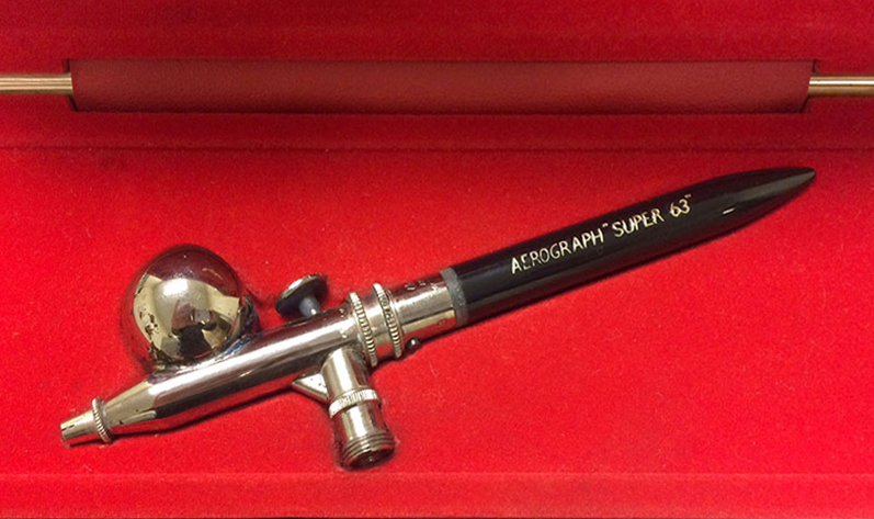
Airbrush
This is the model that I used. The DeVilbiss Aerograph Super 63. I had many exciting moments spraying paint and ink.
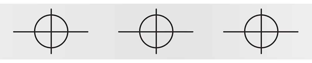
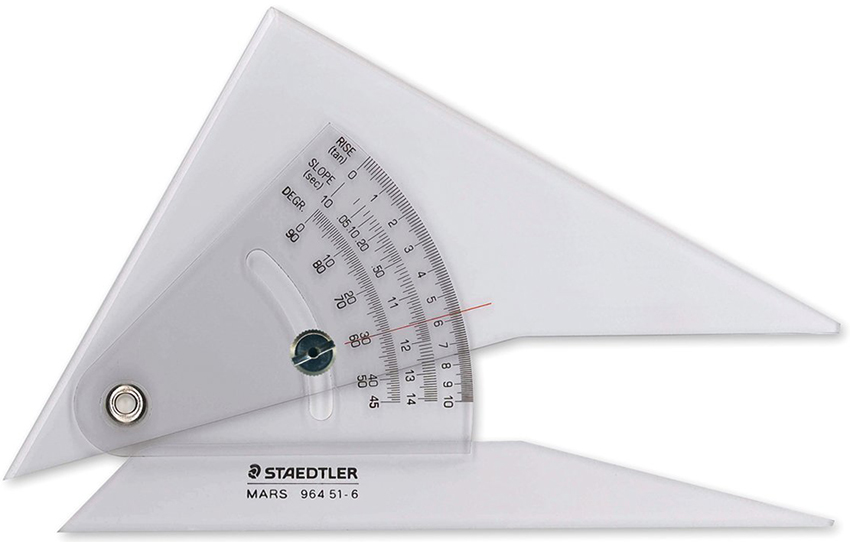
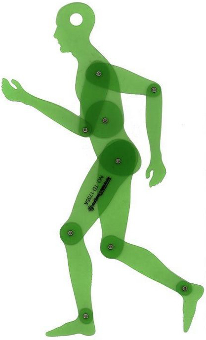
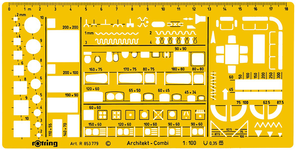
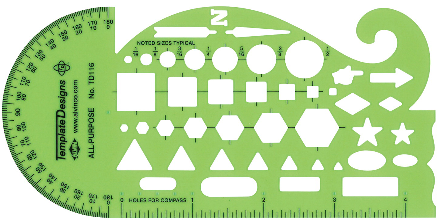
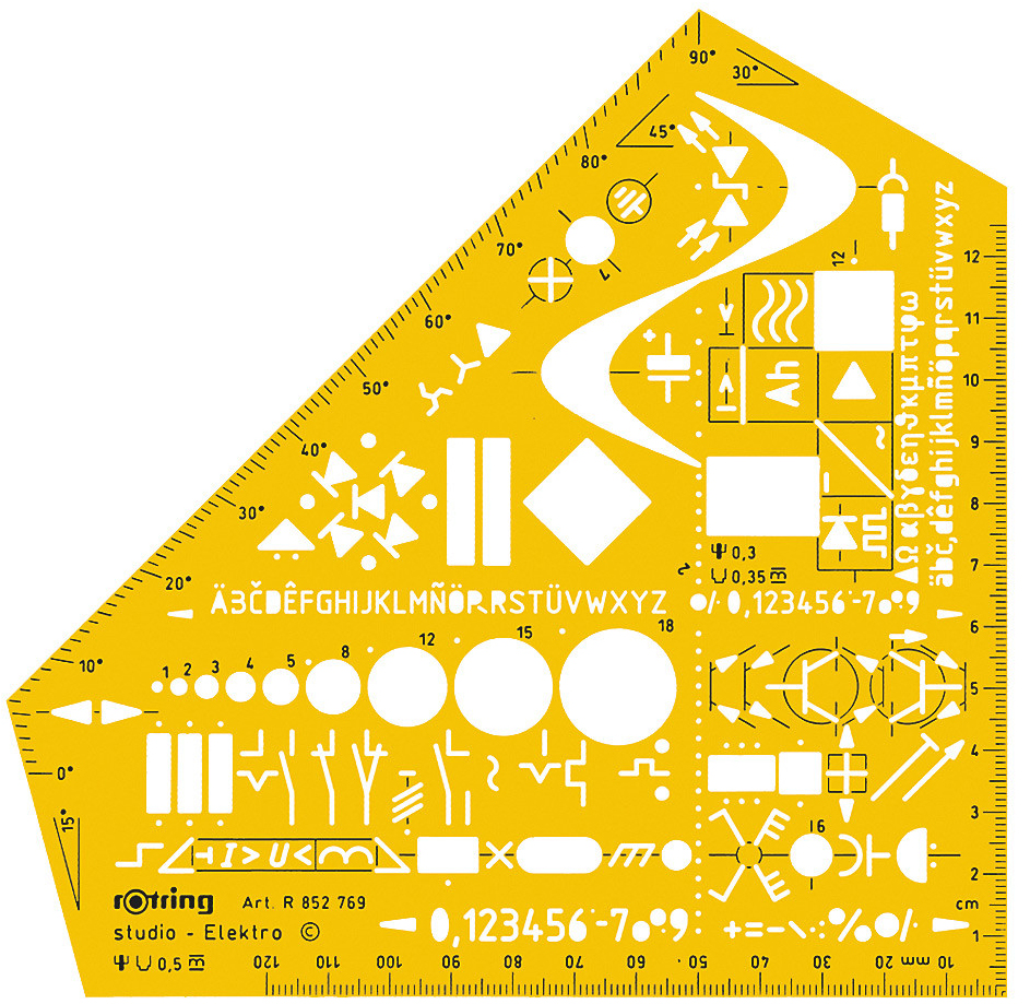
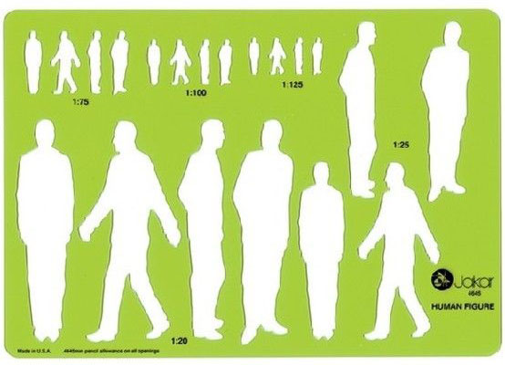
Special templates
It wasn’t all about ellipses and circles. There were many other types, for specialized use.
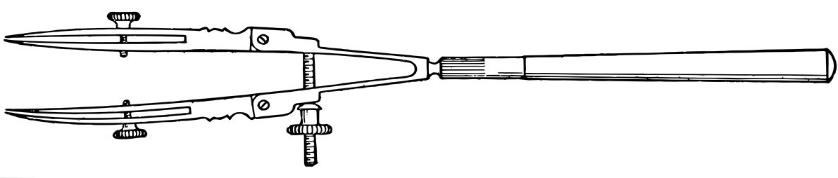
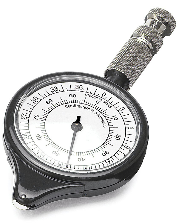
Map wheel
For measuring distances on maps. You would set the scale, and start rolling it between places. Remember, there was no internet!

Graphic tape
Adhesive-backed tape, available in many widths and styles. We could potentially create almost perfect rules and boxes using a knife such as the one shown below.
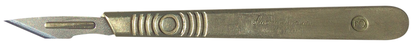
Surgical scalpel
We were like surgeons. Well, kind of. The Swann Morton scalpel is frighteningly sharp. Of course, there were accidents. (The X-Acto knife was popular in the U.S.)
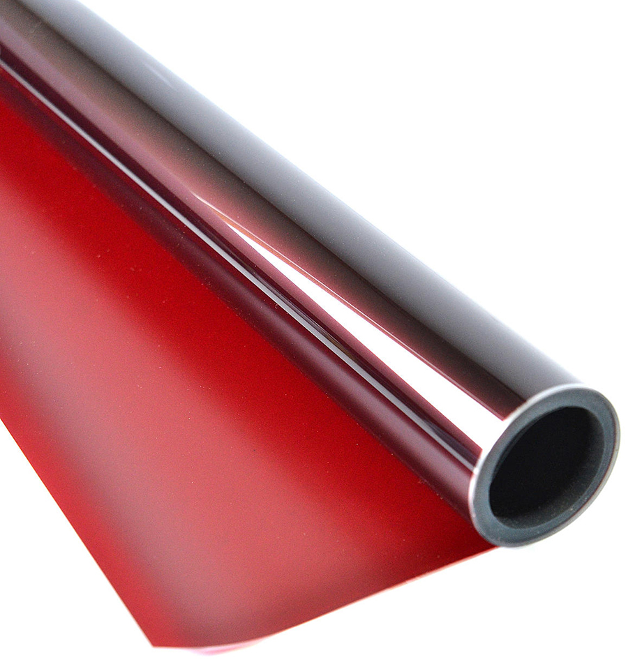
Rubylith film
Shown in previous posts about mechanical art. Essential for creating intricate overlays that would be converted to process colors for printing. I loved cutting it with the scalpel, and peeling back the red top layer. I would pretend that it was a surgical prodecure: “Hand me my scalpel!” “Yes, doctor”.
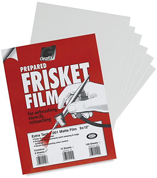
Frisket film
Adhesive film for masking when airbrushing. Did not damage the delicate paint surface.
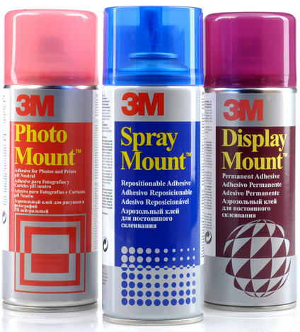
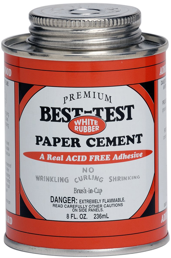
Rubber cement
Used for sticking down anything that was on paper. Surplus glue could be easily cleaned up with a ball made from… rubber cement. In the U.K. we used “Cow Gum”. There is absolutely no connection to the large animals that we see eating grass in fields. The glue was manufactured by the F.P. Cow Company.
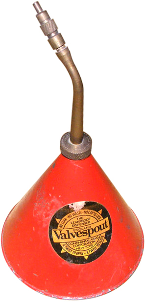
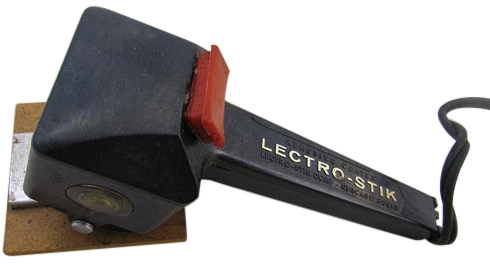
Waxer
Hot wax largely replaced rubber cement where I worked. You could reposition things easily. I love the name: ‘Lectro-Stik”.
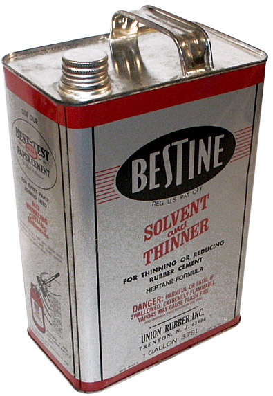
Solvent
Good for cleaning up artwork and equipment. We used to carelessly leave the cap off, and I used to smoke. I have no idea how I avoided blowing up the graphics department.
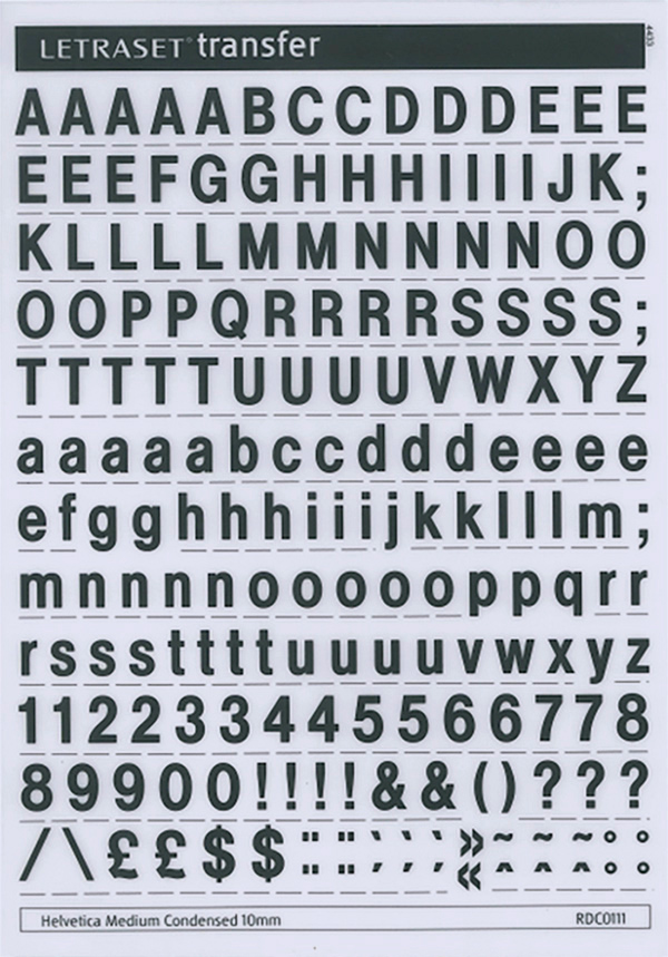
Letraset
One way to get some typesetting was to rub down each individual letter from a dry-transfer sheet. It was slow, and really only practical for headlines. We had a stack of sheets with rarely used characters on them. “Anyone have any vowels in 24 pt Helvetica?”

Railroad pen
For drawing roads. Try using this when you’ve had a few drinks.