
ASSIGNING COLOR TO “MECHANICAL” ARTWORK.
This follows on from my post last week about mechanical art: https://www.johngrimwade.com/blog/2017/02/09/mechanical/
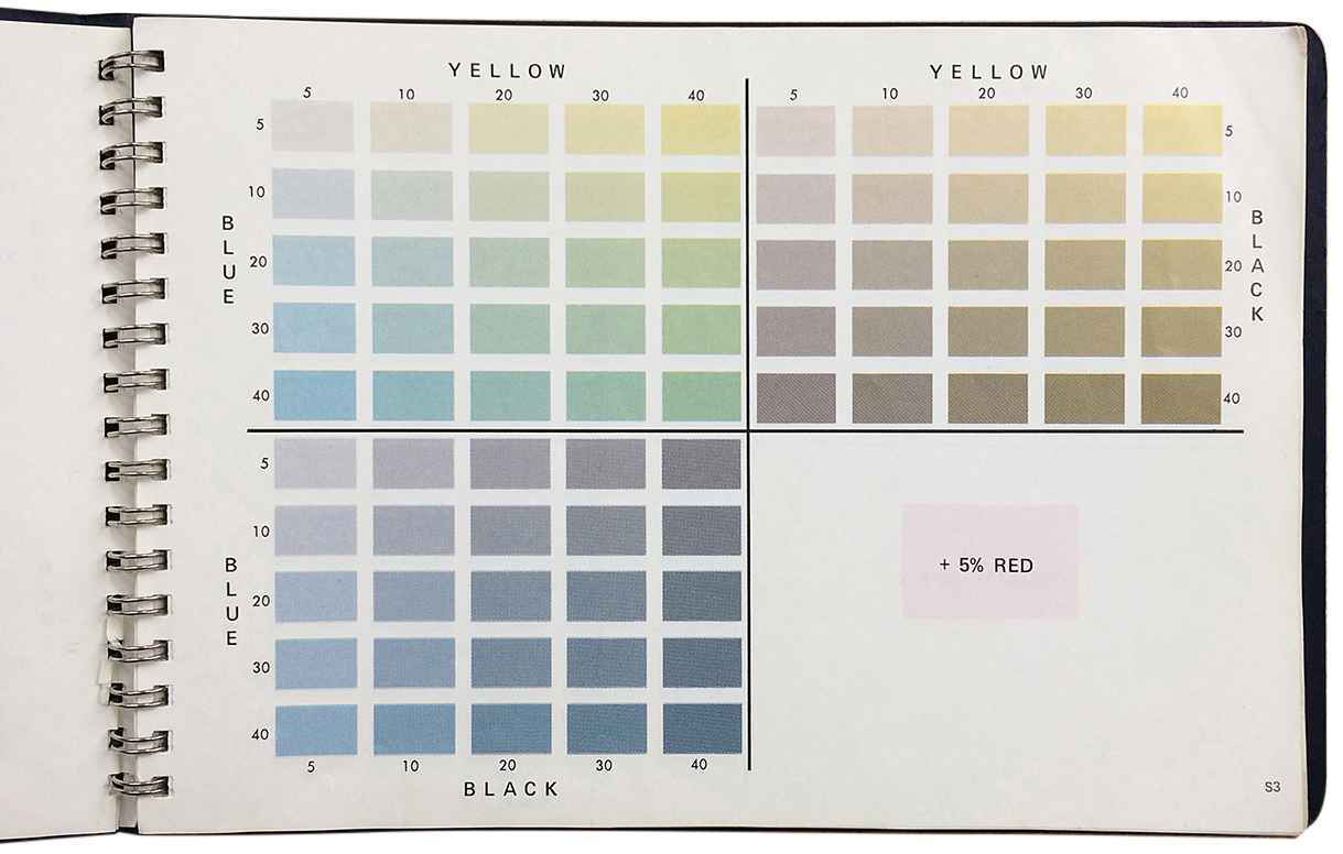
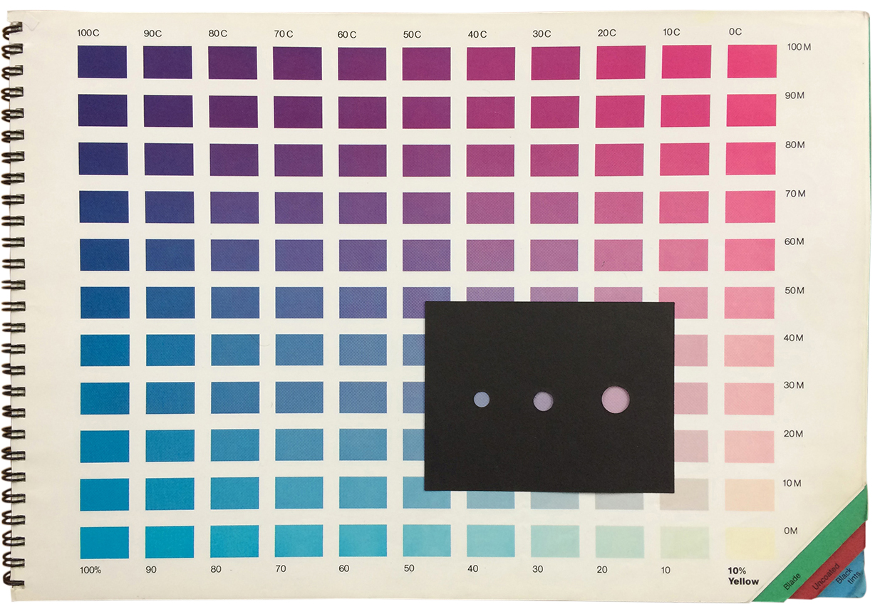
It obviously wasn’t just a matter of making overlays with pens and black ink, or cutting shapes in Rubylith film. You had to pick the CMYK colors, and try and visualize the final result. I used two process color books that displayed a huge range of possible color combinations.
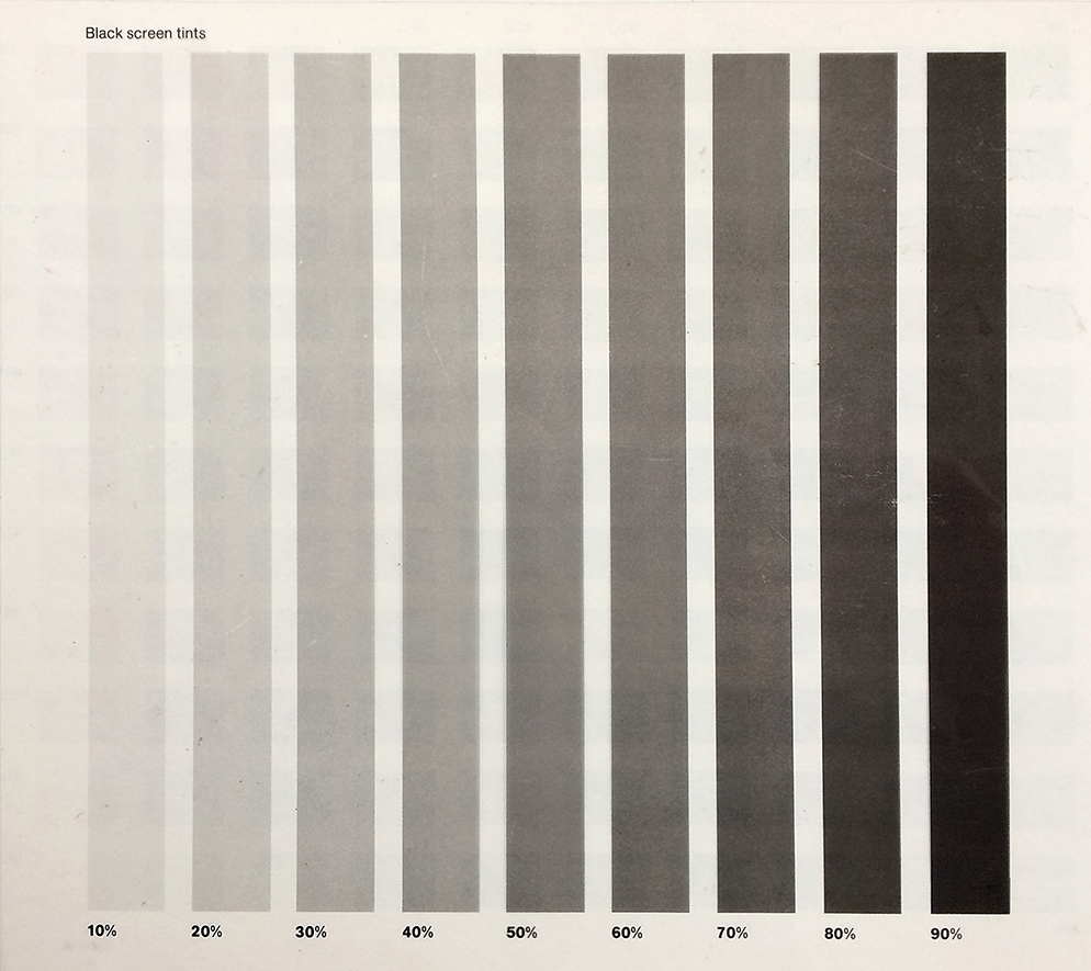
One book has black cards with cutouts to isolate colors, and a transparent sheet of black tints to estimate surprints.
Of course, you could refer to previous proofs and build up a vocabulary of color values that you knew would work. But it was not an exact science, and there were sometimes interesting results. Either I had marked up the overlays incorrectly, or there was a mistake at the pre-press company. (How they could ever get it right amazed me.) Sometimes I had selected a color, that when put next to another color, looked downright awful.
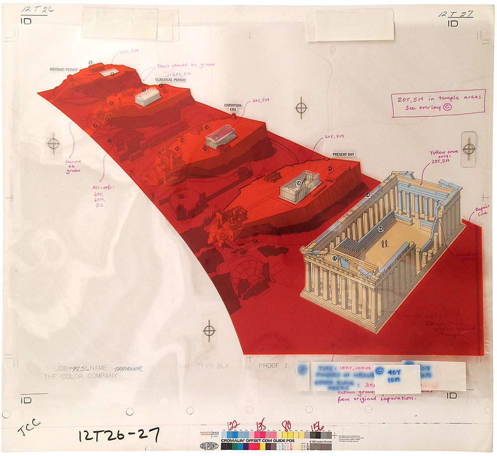
But mostly it worked. In the case of this Parthenon artwork (from 1988), I applied several layers to the first “Chromalin” proof to correct my miscalculations. I’ve shown the printed result before in a post about the pre-computer era: https://www.johngrimwade.com/blog/2016/09/26/when-infographic-dinosaurs-roamed-the-earth/
Time has taken it’s toll on this mechanical. The layers have shrunk or expanded, which is why they don’t register correctly, and the blue-inked instructions have spread out, but it still gives an good idea of the process of working with overlays.

This artwork is heading to Munich! It‘s part of an exhibition of my work. From March 9 to 11, at the EDCH and INCH conferences.
I will also be giving one of the keynote presentations at INCH, and running an information graphics workshop.
Design conference: http://www.edch-conference.com
Infographics conference: http://www.inch-conference.com
Infographic workshop: http://www.inch-conference.com/en/workshops