
ACKNOWLEDGING OUR MISTAKES, AND LEARNING FROM THEM.
I’m a bit late getting to this, as the book was published on October 15, but that’s not in any way an indication of my feelings about the latest excellent tome from my friend, Alberto Cairo (Knight Chair in Visual Communication at the University of Miami). In my opinion, everyone who is visualizing data needs to read it.
Here’s what Alberto told me last week about his main reason for writing the book:

I’ve been designing infographics for more than twenty years, and writing books about them since 2012. Recently, I’d been thinking about their common themes, and the driving forces behind them. I realized that I wrote them as if I were telling readers, “Here, these are the things that I’ve learned through study, practice and, more importantly, trial-and-error, so you don’t have to.”
“How Charts Lie,” in particular, contains tons of examples of erroneous or commonly misinterpreted graphics, and in the book I say that I think I’ve made most of the mistakes that I describe. So I know where they come from. This isn’t false modesty, but plain truth.
We celebrate our successes, so why not do the same with our fumbles? As a consequence, the book is a playful overview of graphical disasters, but also a celebration of the power that graphics have to illuminate complex information.

Below are a few of the many examples of data visualization that Alberto analyzes in detail:
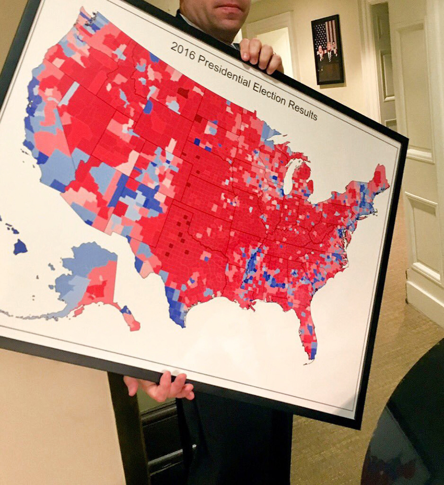
A 2016 election map with results by county. Territorial voting results do not show us how many people voted for each candidate. This one is on it’s way to be hung on a White House wall. The photograph was taken by Fox News Foreign Correspondent, Trey Yingst. (@TreyYingst) https://bit.ly/34nfh3O
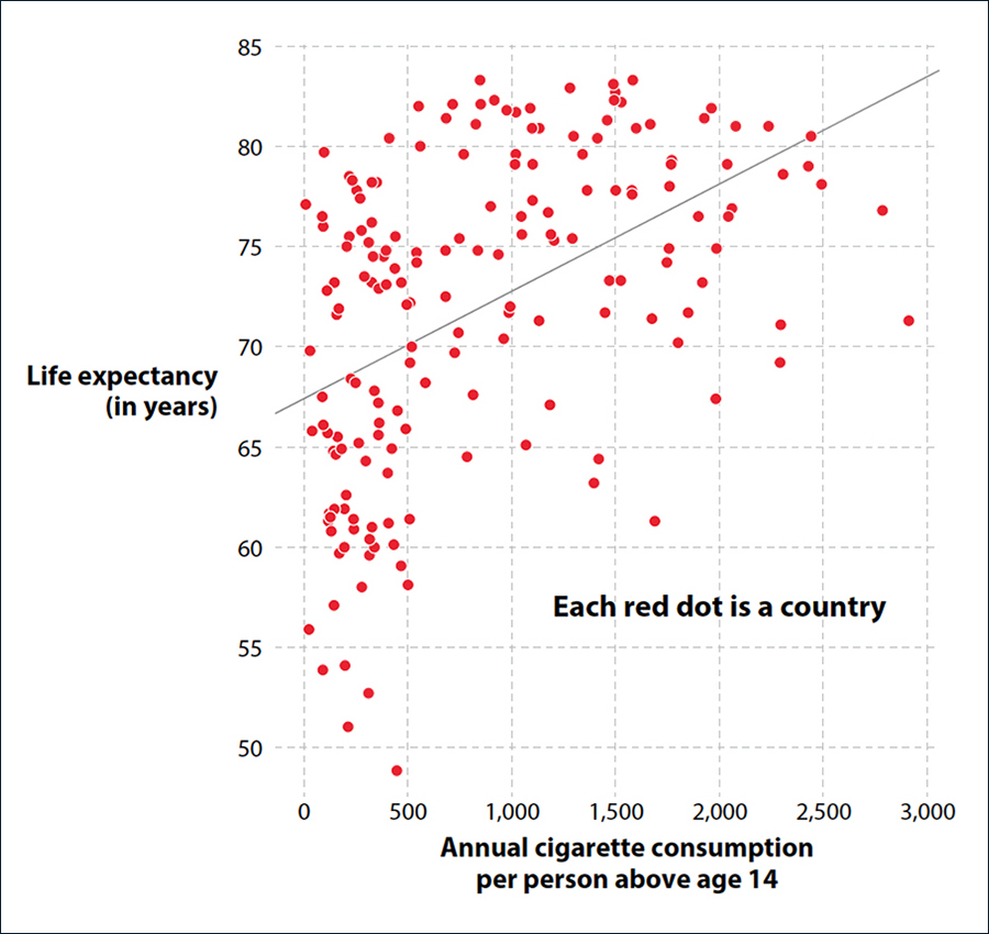
Corellation doesn’t equal causation. Does more smoking make you live longer?
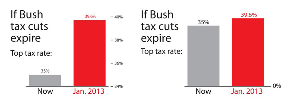
A baseline set at zero gives a clearer impression of the difference in the numbers.
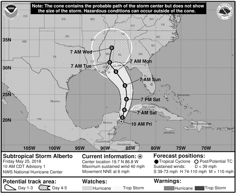
The cone of uncertainty is a frequently-misinterpreted storm warning. This is the predicted track of the aptly-named Subtropical Storm Alberto, which crossed the Gulf of Mexico in May 2018.
Buy the book: https://amzn.to/34nSEwg
A few corrections for the first edition are here: http://www.thefunctionalart.com/2019/10/how-charts-lie-few-corrections.html