
SETTING THE STANDARD FOR 3D INFOGRAPHICS.
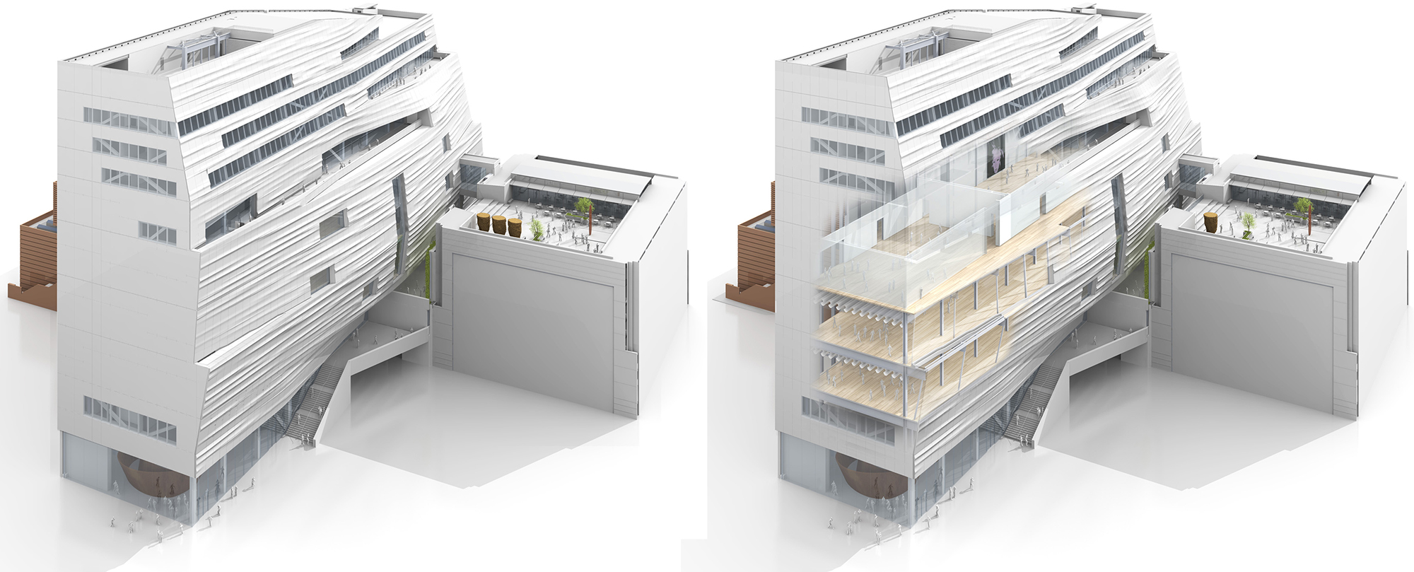
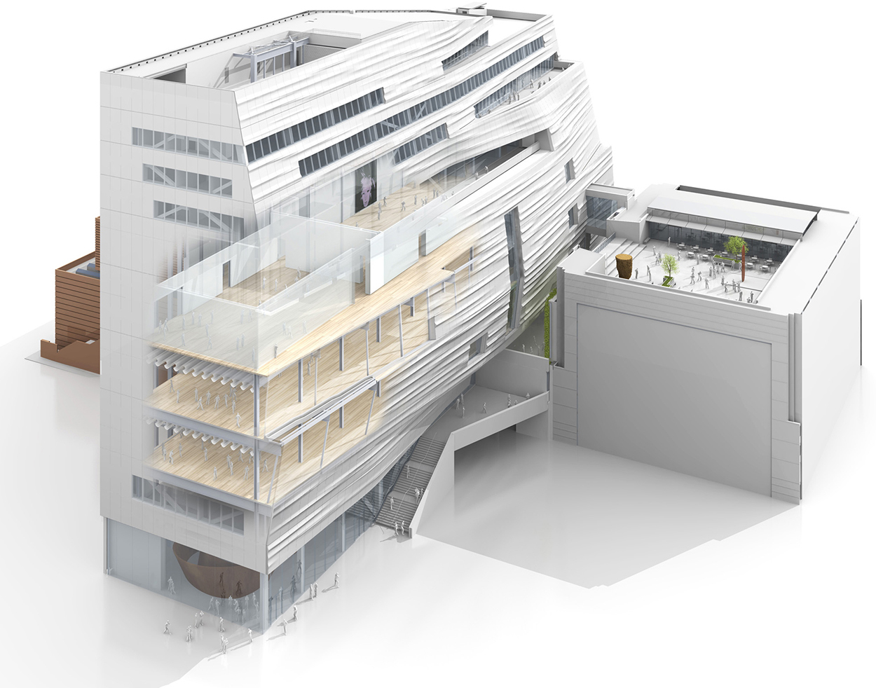
I’ve admired Bryan Christie Design’s work for a long time, and I’ll be featuring examples from their medical and scientific portfolio in future posts. (http://bryanchristiedesign.com) This architectural project features the subdued palette and sophisticated rendering that is the studio’s hallmark. It appeared in WIRED magazine’s Design Issue in May. (The inset diagrams on the second spread are by Jason Lee.)
See the online version of the project here: https://www.wired.com/2016/05/new-sfmoma/
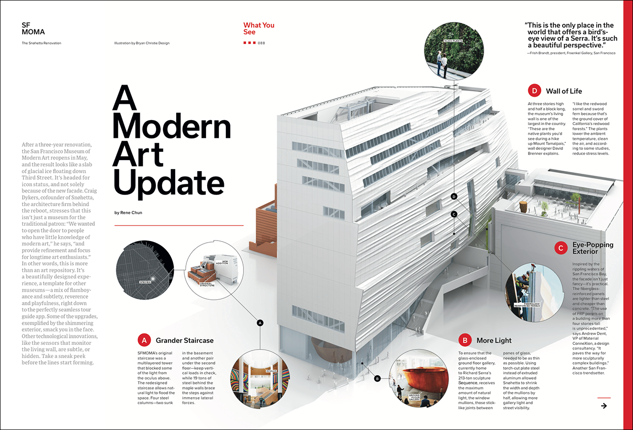
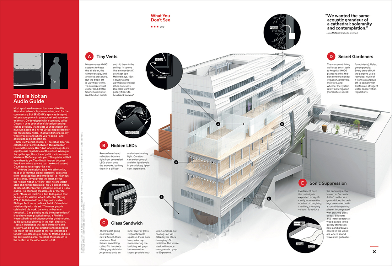
The Bryan Christie style was a breakthrough after the early years of gaudy, every-color-under-the-sun 3D graphics, and still no one does this restrained approach better. Other people’s renderings appear at first glance to be taking a similar track, but upon close inspection, they usually lack the finesse in color and lighting, and (most importantly) do not work well as information graphics.
Working on the rendering in LightWave.

Rough versions to fix the viewpoint.
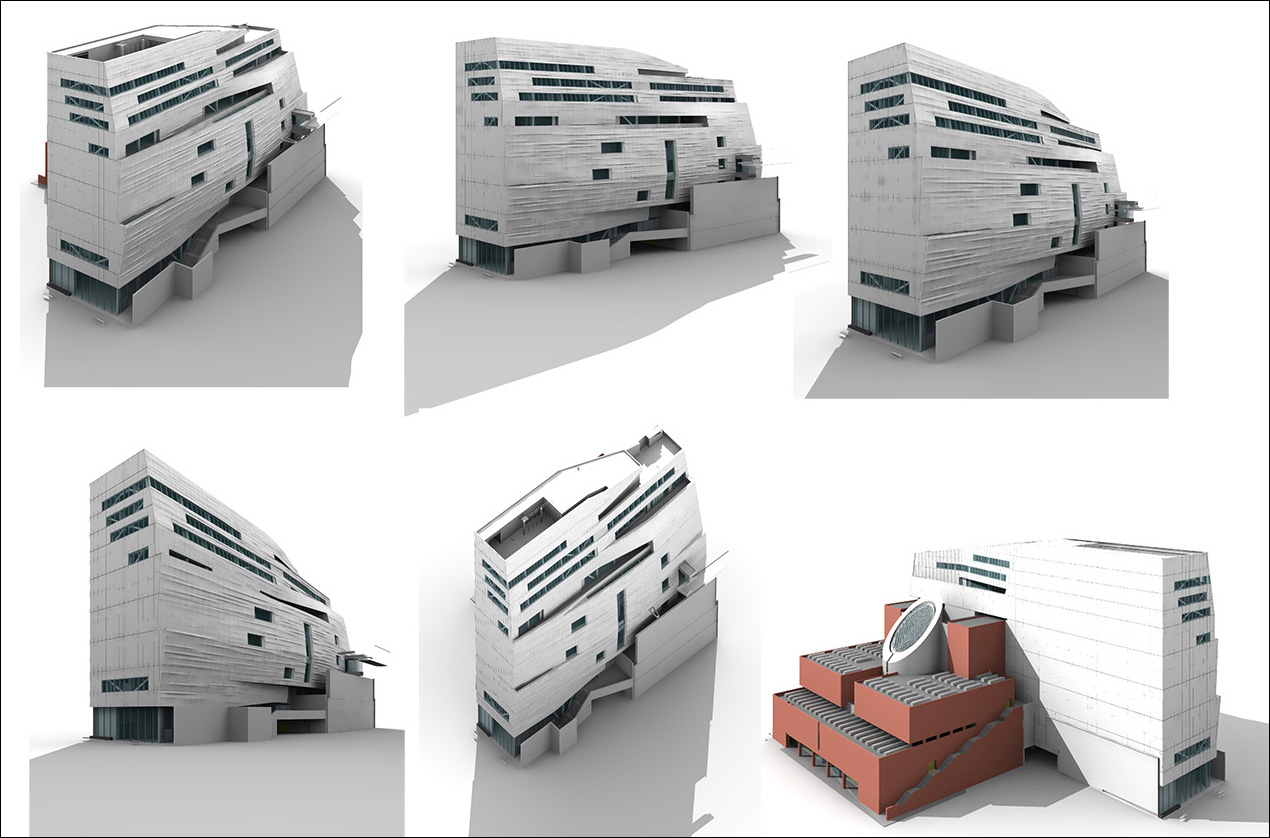
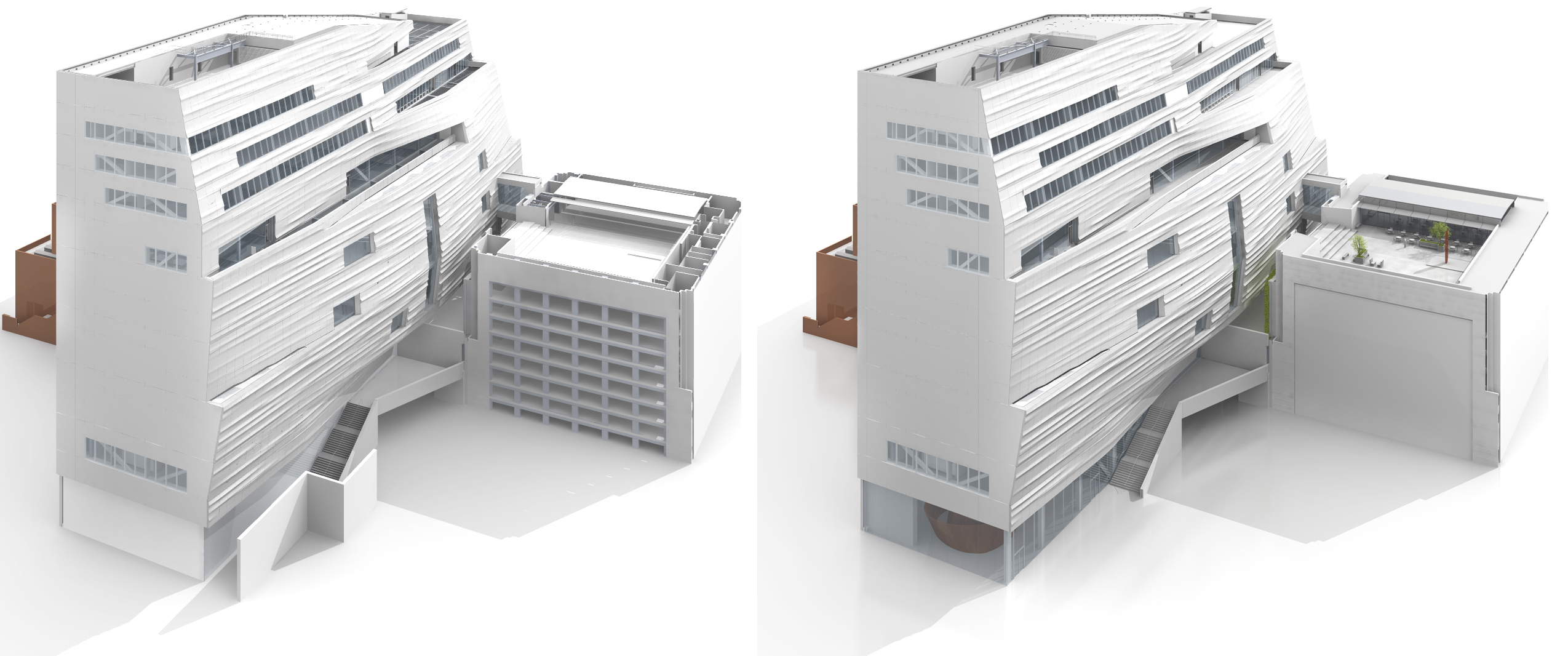
Renderings of the selected view.
The final version shown larger.
In Bryan’s words, “We received the 3D file from the architects and had to make many edits so that we could manage it in our software. Files from sources like this are always very, very heavy and detailed—way too detailed for our needs. (We tend to keep things as pared down as possible). Many angles were sent to the art director, and she choose one. From there we started refining the art. Close to deadline, (as is always the case) the editors decided that they wanted the graphic to show more of the art that’s in the museum. So we had to scramble to build the additional pieces in 3D. It was a nightmare because WIRED had to check on permissions for the works.”
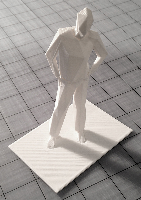
This small person is standing on a table in the Bryan Christie studio. He’s escaped from the rendering, thanks to a 3D printer. And he’s important because a sense of scale is vital (see the previous post). Sometimes, when we’re looking at infographics, it seems as if the world is completely devoid of people. That situation is improving, but there are still many examples where the simple addition of a person, or some point of reference, would help us to better understand a size relationship.