
FROM CAVE TO SUPERCOMPUTER: INFOGRAPHICS HAVE ALWAYS BEEN ALONG FOR THE RIDE. HERE’S A (BRIEF) HISTORY OF INFORMATION DESIGN.

Cave infographics It all began at least 35,000 years ago. Visual communication was off and running. Perhaps even before the spoken word, although that statement is the subject of considerable debate. I’m guessing that if the cave painters could speak to each other, they probably didn’t use the word “infographic.” (This example is from Valltorta, Spain.)

Pyramid Schemes Jump forward 28,000 years or so, to a written language based on pictograms. Modern decoding didn’t begin until 1899, with the discovery of the Rosetta Stone (dating from 196 BC), which displays the same passage of text in hieroglyphs, Demotic script, and Greek. It was the key to understanding the exact meaning of the symbols.
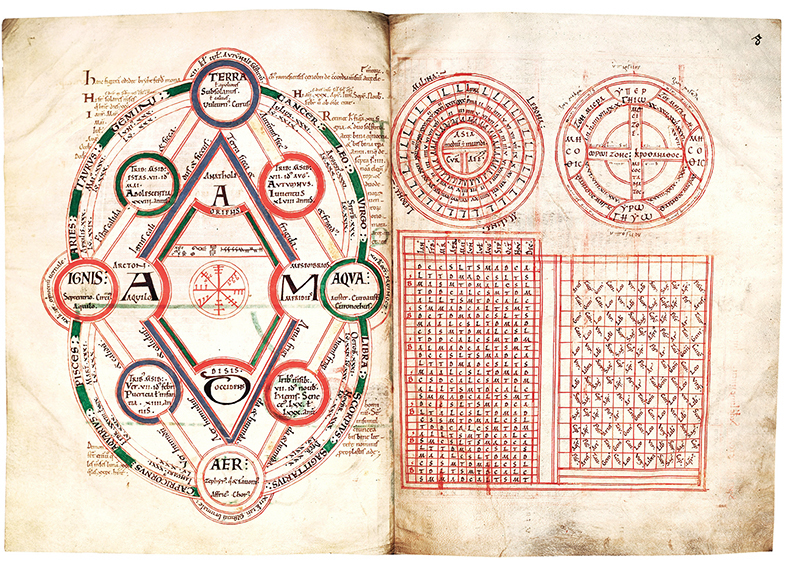
Illuminations Illuminated manuscripts were produced mainly in monasteries during the early Middle Ages. By the 14th-Century, they were mostly produced by commercial scriptoria. Exquisitely decorated, sometimes with gold and silver (hence illuminated), and worth shocking amounts of money today. They contained plenty of diagrams. The development of printing signaled the end of these masterpieces.
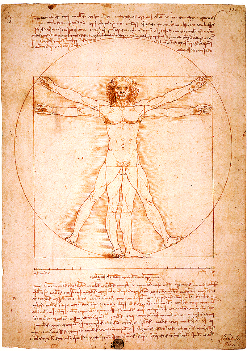
1490: Leonardo Who? A Florence-based infographics director set the bar for the next 526 years. The Vitruvian Man is based on the ideal human proportions as described by the Roman architect Vitruvius, who specified them as the principal source of the proportions used in classical architecture
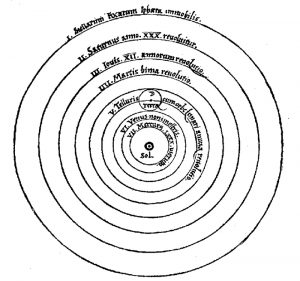
1543: The Earth is Apparently Not the Center of the Universe Nicolaus Copernicus figured out that the planets orbit the Sun, and made this diagram to demonstrate it. The book that contained it, Dē revolutionibus orbium coelestium, was not published until just before his death. To say it was a controversial viewpoint is somewhat of an understatement. A Catholic Church ban, that started in 1616, lasted 219 years.
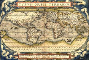
1570: Location, Location, Location Abraham Ortelius published the first modern atlas: Theatrum Orbis Terrarum (Theatre of the World). A collection of 53 maps by various cartographers.

1704: From Newton to Pink Floyd Issac Newton’s diagram in Opticks explained the spectrum of light. 269 years later, a variation of this idea became famous as the cover of Pink Floyd’s mega-selling album Dark Side of the Moon. Curiously, Newton would have looked at home as a member of the band.
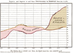
1786: “Honey, I just invented the fever chart!” William Playfair gave us the bar chart and fever chart, and the curse of boardroom presentations, the pie chart (in 1801). An internet search for “pie chart“ reveals endless scary examples. Try it.
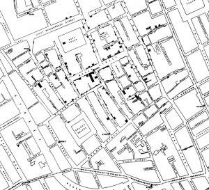
1854: Disease Control Dr. John Snow located a water pump as the source of a cholera epidemic in London, by mapping the locations of deaths from the disease.

1859: Tree of Life The only illustration in the first edition of Charles Darwin’s On the Origin of the Species was an infographic that outlined the process of natural selection.
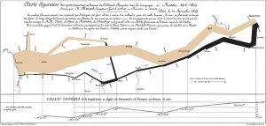
1869: Chart of Death Napoleon’s disastrous 1812 trek to Moscow and back was powerfully visualized by Charles Minard. The width of the path represents the number of surviving troops. It’s considered an infographic classic, especially by academics.

1931: Underground Diagram The style for every subway map in the world is directly descended from the work of a British technical draughtsman, Harry Beck.

1935: Pictogram Pioneer Otto Neurath’s system of pictograms, Isotype (International System of Typographic Picture Education), has had a profound influence on graphic design, and still looks surprisingly modern today. (Founded in 1935.)

1953: Double Helix The first diagram of DNA, published in the scientific journal, Nature. Infographics don’t get much more important than this. Michael Crick and James Watson discovered the DNA model. (The discovery of DNA itself occurred much earlier.) The first visualizations were drawn by Michael Crick’s wife, Odile.
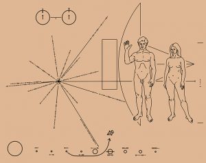
1972: Infographics for Aliens If extraterrestrials ever get to see any of our infographics, this will probably be the first one. Carried on two Pioneer spacecraft (launched in 1972 and 1973), it shows some basic details about the human race and plots our location. Pioneer 10 is currently at least 11 billion miles out into space.
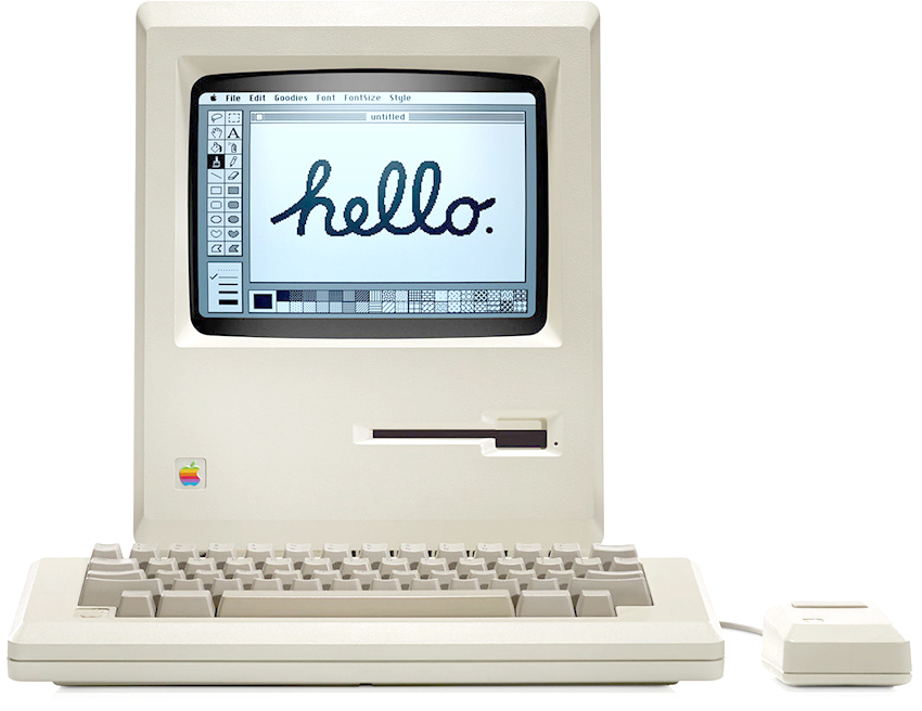
1980s/90s: OK, Computer Infographics went digital, and the tools changed dramatically. MacDraw, MacPaint, Illustrator, Photoshop. It was all happening.

Now: Multi-Platform/Big Data There’s a crazy number of presentation options, so infographics need to work effectively in multiple digital formats. “Mobile-first” is the mantra of many organizations. And then there’s Big Data. Intriguing data sets are everywhere, and everyone is looking for ways to find the truths within them, then present those revelations visually. That’s the challenge, and it will frequently be the subject of this blog.